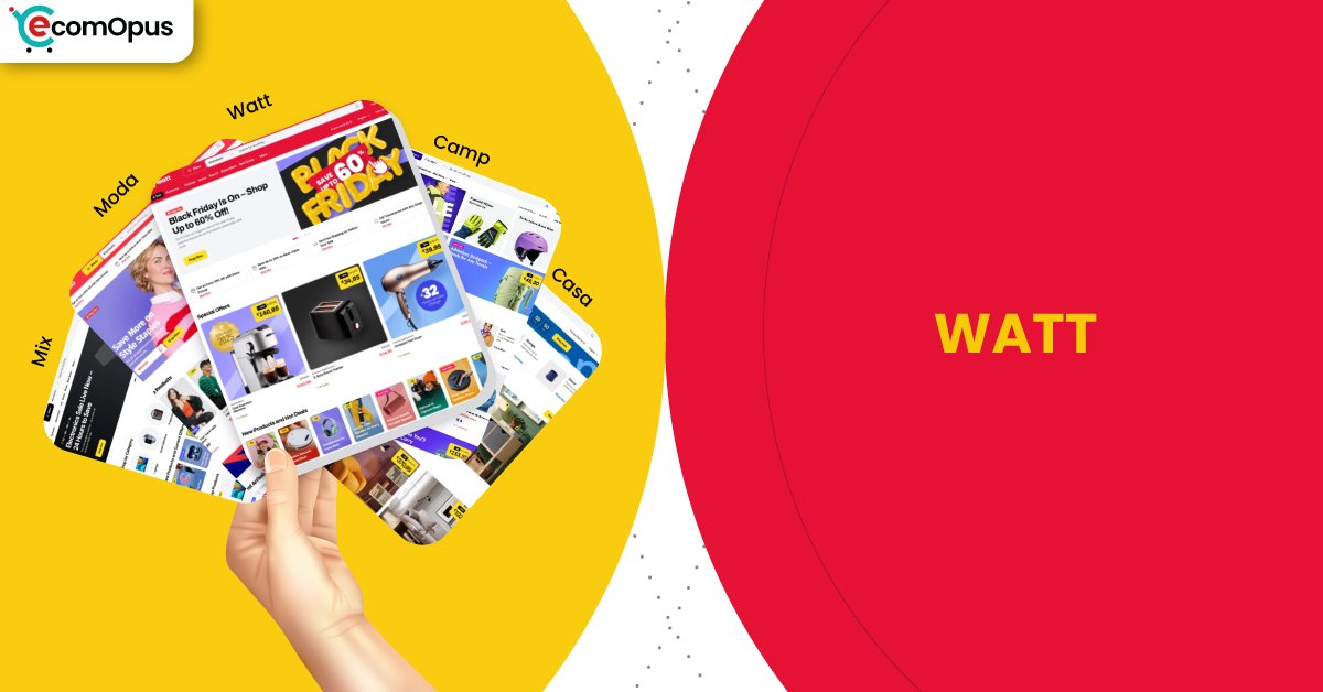
Watt Shopify Theme Review: Bold, Structured Layout for Scalable Navigation
Watt is a premium preset designed for merchants who want clean hierarchy, confident spacing, and a storefront that stays organized as catalogs grow. It suits brands that win through clarity, fast discovery, and a no clutter shopping flow rather than heavy visual theatrics.
- Bold, structured layout with strong visual hierarchy
- Product-forward sections designed for fast browsing
- Clean typography focused on clarity over decoration
- Modular homepage blocks for flexible merchandising
- Stable layouts with minimal visual distraction
- Designed for scalable catalogs and collections

Introduction
Watt is a preset within the Mix Shopify theme family that leans into bold structure, clarity-first layouts, and a product-forward visual rhythm. From the moment you explore the preview, the design feels purposeful rather than decorative, with strong blocks, confident spacing, and a layout that prioritizes products over embellishment. The overall impression is modern and controlled, built for brands that want their storefront to feel efficient, credible, and easy to navigate rather than overly stylized.
What stands out about Watt is how it balances visual weight with usability. The preset does not rely on excessive animation or visual tricks to create interest. Instead, it uses clean section separation, clear hierarchy, and deliberate pacing to guide shoppers from discovery to decision. This makes it particularly appealing for stores that carry multiple collections or functional products where clarity and comparison matter as much as branding.
Because Watt is a newer preset, live merchant data is still limited. That absence influences how this review approaches verdicts and recommendations, leaning more heavily on structural analysis, performance behavior, and real-world usability implications. Based on the preview and performance signals, Watt positions itself as a practical, growth-ready preset for merchants who value order, scalability, and a no-nonsense shopping experience.
Ideal For Niches With Supporting Features
Watt performs best in niches where shoppers want to understand products quickly and move confidently through collections. The preset’s structured layout, clear separation between sections, and emphasis on product grids support comparison-driven shopping rather than emotional browsing alone. This is especially valuable for stores that sell functional, specification-driven, or repeat-purchase products where clarity reduces hesitation. The table below outlines niches where Watt’s structure aligns naturally with shopper expectations.
| Niches | Supporting Features | Why They Matter? |
|---|---|---|
| Electronics and accessories | Clear grids, spec-friendly product pages | Shoppers often compare features and pricing before buying. A structured layout reduces friction and speeds up decisions. |
| Home utilities and essentials | Modular sections, clean hierarchy | These products benefit from straightforward presentation rather than heavy storytelling. Watt keeps focus on utility and value. |
| Fitness and lifestyle gear | Strong product emphasis, scalable collections | Buyers browse across variants and categories. Watt supports quick scanning without visual overload. |
| B2C consumables | Repeat-friendly layout, clear navigation | Customers returning to restock need efficiency. The layout makes repeat purchases feel simple and familiar. |
| DTC brands with growing catalogs | Consistent structure across pages | As catalogs expand, Watt maintains order and prevents the storefront from feeling cluttered. |
Presets
Mix includes multiple presets that share the same technical foundation but differ in visual tone and pacing. Watt is the most assertive of the group, favoring clarity and structure over softness or editorial flow. This makes it easier for merchants to choose a preset that matches their brand personality without rebuilding their store architecture. The table below highlights how Watt compares within the preset lineup.
| Preset | Aesthetic Vibe | Where It Shines | Noteable Tweaks |
|---|---|---|---|
| Watt | Bold, structured, modern | Functional and scalable storefronts | Strong section separation and product focus |
| Mix | Neutral and balanced | General-purpose DTC brands | Softer pacing with broader flexibility |
Key Features And Highlights
Watt’s feature set is designed to support clarity, consistency, and efficient merchandising rather than decorative complexity. Each feature works toward keeping the shopper oriented and reducing unnecessary friction during browsing. This approach benefits stores that prioritize usability and long-term scalability over constant visual experimentation.
| Features | What It Is And Why It Matters? |
|---|---|
| Structured homepage sections | The homepage uses clearly defined blocks to guide attention. This helps shoppers understand the store’s offering without cognitive overload. |
| Product-forward grid layouts | Product listings are clean and readable across devices. This matters because comparison-driven shoppers rely on fast visual scanning. |
| Modular content blocks | Sections can be rearranged without breaking layout consistency. This allows seasonal updates without redesigning the entire page. |
| Clear typography hierarchy | Headings and body text are easy to distinguish at a glance. This improves readability and reduces decision fatigue. |
| Consistent spacing system | Spacing remains uniform across pages and sections. Visual consistency reinforces trust and professionalism. |
| Mobile-optimized structure | Layouts adapt cleanly to smaller screens. This helps prevent mis-taps and keeps browsing comfortable on mobile devices. |
Theme Experience!
The experience Watt delivers is grounded, predictable, and confidence-building. Rather than trying to impress with motion or novelty, it focuses on making the shopping journey feel controlled and intentional. This is especially valuable for stores where shoppers want reassurance through clarity rather than excitement through visuals.
| Experience Area | What Shoppers Feel In Practice? |
|---|---|
| First impression | The storefront feels organized and professional immediately. Shoppers sense clarity rather than distraction. |
| Collection browsing | Grids are easy to scan and compare. The layout reduces visual noise during longer browsing sessions. |
| Product pages | Information feels structured and accessible. Shoppers do not need to hunt for essential details. |
| Navigation flow | Movement between sections feels logical. The site rarely feels overwhelming or confusing. |
| Mobile browsing | Pages remain stable while scrolling. This reduces accidental taps and frustration. |
| Conversion moment | The path to purchase feels straightforward. Shoppers stay focused on the decision itself. |
Performance, Explained!
From a performance perspective, Watt shows a clear contrast between mobile and desktop experiences. On mobile, Core Web Vitals currently fail, largely due to interaction responsiveness and backend response time. In real terms, this can translate into slight delays after taps, especially on slower networks or when additional apps are layered on top of the theme. While layout stability remains excellent, responsiveness is the key area merchants should monitor closely.
On desktop, performance is notably stronger. Core Web Vitals pass comfortably, interactions feel immediate, and layout stability supports a polished browsing experience. For desktop-heavy audiences, this creates a sense of speed and reliability that aligns well with Watt’s structured design philosophy.
The takeaway is practical rather than alarming. Watt can feel fast and dependable, but mobile performance depends heavily on disciplined app usage and optimized media. Treat performance as part of the build strategy, not an afterthought.
| Performance Parameters | Mobile | Desktop | Remarks |
|---|---|---|---|
| Core Web Vitals Assessment | Failed | Passed | Mobile responsiveness needs attention, while desktop performance feels reliable. |
| Largest Contentful Paint (LCP) | 2.4 s | 2.0 s | Main content appears reasonably fast across devices. Desktop feels more consistent. |
| Interaction to Next Paint (INP) | 210 ms | 66 ms | Mobile interactions may feel slightly delayed. Desktop interactions are crisp. |
| Cumulative Layout Shift (CLS) | 0 | 0.08 | Layout stability is excellent and protects user confidence. |
| First Contentful Paint (FCP) | 1.7 s | 1.4 s | Content becomes visible early, reducing bounce risk. |
| Time to First Byte (TTFB) | 1.1 s | 0.8 s | Server response is slower on mobile, amplifying perceived delays. |
Watt rewards lean builds and disciplined optimization. When performance is treated as part of the design, the experience feels controlled rather than heavy.
Pricing
Watt is available as part of the Mix Shopify theme, priced at $380. This places it firmly in the premium theme category, where the value proposition depends on long-term usability rather than surface-level aesthetics. The pricing makes the most sense for merchants who plan to rely on the theme’s native structure instead of stacking multiple layout and navigation apps.
For stores that prioritize clarity, scalability, and operational efficiency, the cost can be justified by reduced design rework and fewer third-party dependencies. However, merchants who expect extensive visual experimentation or constant layout overhauls may find the investment less compelling unless they are comfortable with custom development.
Stores Build with Watt Shopify Theme
As Watt is one of the newer presets within the Mix theme family, there is currently limited verified data on live stores using this specific preset configuration. While stores may be publicly associated with the broader Mix theme, identifying exact preset usage requires careful validation to avoid speculation.
At eComOpus, we prioritize accuracy over assumption. This section will be updated as soon as reliable, preset-level observations become available, including how real merchants structure their homepages, collections, and product pages using Watt in production environments.
Themes Similar to Watt
Watt sits in a structured, clarity-first design category. The themes below share a similar focus on usability, scalability, and controlled layouts rather than heavy editorial storytelling.
| Shopify Theme | FREE or Paid? | Why is it Similar? |
|---|---|---|
| Dawn | FREE | Dawn emphasizes clarity and structure. It shares Watt’s focus on usability, though it lacks premium modular depth. |
| Symmetry | Paid | Symmetry supports large catalogs with consistent structure. Both themes prioritize order and navigation clarity. |
| Impulse | Paid | Impulse blends structure with stronger merchandising tools. Watt is more restrained but similarly scalable. |
| Warehouse | Paid | Warehouse focuses on functional layouts for large inventories. Watt offers a cleaner, more modern take. |
| Pipeline | Paid | Pipeline shares a product-forward philosophy. Watt feels more rigid and system-driven by comparison. |
Pros and Cons
Watt offers meaningful advantages for structured storefronts, alongside predictable trade-offs for merchants seeking flexibility or visual experimentation. The pros and cons below reflect practical ownership considerations rather than surface impressions.
| Pros | Cons |
|---|---|
| Strong structure supports scalable catalogs. Stores remain organized as product counts grow. | Mobile responsiveness can suffer with heavy scripts. Optimization is essential. |
| Clean layouts reduce shopper confusion. Browsing feels efficient and confidence-building. | Limited visual flair for storytelling-heavy brands. Emotional branding may feel restrained. |
| Modular sections simplify updates. Seasonal changes do not require redesigns. | Deep visual customization may require code. Editor-only users may feel constrained. |
| Desktop performance feels fast and reliable. Interactions support smooth conversion. | Newer preset lacks merchant validation. Real-world feedback is still emerging. |
| Typography and spacing feel professional. The storefront avoids a DIY appearance. | Not ideal for experimental layouts. The design favors consistency over creativity. |
Our Rating
Watt’s ratings reflect its strengths in structure, clarity, and desktop performance, while acknowledging areas where mobile optimization and merchant data are still evolving. These scores are based on preview analysis, performance behavior, and expected real-world usability.
| Parameters | Our Ratings | Summary |
|---|---|---|
| Design Quality | 4.6/5.0 | Clean, modern, and purposeful. The layout feels intentional without being visually loud. |
| Ease Of Setup | 4.4/5.0 | Sections are logical and predictable. Merchants benefit from planning content before setup. |
| Feature Depth | 4.5/5.0 | Strong core features support most storefront needs without heavy app reliance. |
| Conversion Support | 4.4/5.0 | Clear structure helps shoppers decide confidently. Results improve with disciplined merchandising. |
| Mobile Experience | 4.1/5.0 | Visually stable but responsiveness depends on optimization and app restraint. |
| Support And Updates | 4.5/5.0 | Based on theme family reputation, ongoing updates are expected to remain consistent. |
Watt performs best as a system-driven theme rather than a visual playground. Its strengths compound over time when used thoughtfully.
User Reviews: What Merchants Say
This theme is one of the latest releases, and currently, there is limited information available about live stores and merchant feedback. At eComOpus, we focus only on sharing credible and verified insights rather than assumptions or early speculation.
Our team is actively monitoring adoption patterns and gathering real-world data from merchants and store owners who choose to build with the Watt preset. As soon as reliable feedback becomes available, including usability experiences and performance observations, this section will be updated to reflect those insights accurately.
Our Verdict
Watt is a strong choice for merchants who value structure, clarity, and long-term scalability over visual experimentation. It delivers a controlled shopping experience that feels professional and efficient, particularly on desktop, where performance and interaction responsiveness shine.
The preset works best when merchants embrace its system-driven design philosophy. Lean app stacks, optimized media, and disciplined content planning allow Watt to feel fast, confident, and dependable. For brands that prioritize usability and operational simplicity, it can become a reliable foundation rather than just a design layer.
Who Should Buy Watt
Watt is well suited for merchants who want a storefront that scales cleanly and supports comparison-driven shopping. It favors clarity, predictability, and control over expressive design.
| Best-Fit Buyer Profile | Why Watt Fits | What They Will Love Most | Smart Setup Move |
|---|---|---|---|
| DTC brands with large catalogs | Structured layouts support scale | Clean, organized browsing | Plan collections before launch |
| Electronics and utility sellers | Product clarity reduces friction | Easy comparison grids | Standardize product specs |
| Subscription and repeat-buy stores | Familiar structure aids retention | Predictable navigation | Simplify homepage sections |
| Desktop-heavy audiences | Strong desktop performance | Fast, stable interactions | Optimize mobile assets early |
| Operations-focused teams | Consistency reduces maintenance | Fewer redesign needs | Use native sections first |
Who Should Not Buy Watt
Watt may not be the right fit for merchants who rely heavily on emotional storytelling or constant visual reinvention. The preset’s strengths lie in discipline, not experimentation.
| Not-Ideal Buyer Profile | Why It Can Be A Poor Fit | What They Will Likely Struggle With | Better Approach |
|---|---|---|---|
| Storytelling-first brands | Layout feels too structured | Limited emotional expression | Choose an editorial-style theme |
| App-heavy storefronts | Scripts affect mobile feel | Interaction delays | Reduce apps or change theme |
| Experimental designers | Guardrails limit freedom | Custom layouts require code | Use a flexible framework theme |
| Mobile-first niche audiences | Mobile performance needs care | Perceived tap lag | Optimize aggressively or test alternatives |
| Early-stage concept stores | Structure demands clarity | Undefined catalogs feel exposed | Validate product structure first |
GET THE BEST APPS IN YOUR INBOX
Don't worry we don't spam