Vetro Shopify Theme Review: Minimal Luxury With Conversion Muscle
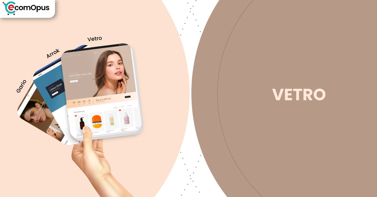
Vetro is a modern minimal storefront that makes products feel premium, easy to buy. Expect clean sections, sticky buying moments, and flexible merchandising that stays disciplined as your catalog grows.
- Polished minimal styling for premium brand perception
- Sticky cart flow that reduces buying friction
- Built-in promos that replace several small apps
- Media sections built for storytelling and trust
- Strong product discovery with filters and search
- Support-first ecosystem that helps customization move faster

Introduction
Vetro is built for brands that want elegance without the fragile, “one wrong app and it collapses” feeling. When Team eComOpus explored the preset, the design language stayed calm, airy, and product-forward, which is exactly what many Shopify storefronts need when customers are comparing variants, bundles, and benefits. It’s the kind of theme that rewards restraint, because the default spacing and typography already do a lot of heavy lifting. One merchant summed up the vibe perfectly: “Stunning design with the best support I’ve experienced.”
What also stands out is how Vetro quietly layers conversion helpers into a clean interface, rather than stapling widgets onto the page. The theme leans into smart merchandising with quick buy, sticky cart behavior, and built-in promo patterns that feel native. Vetro Shopify Theme is a strong fit when your brand visuals are sharp and your product pages need structure that scales.
Ideal For Niches With Supporting Features
Not every Shopify theme should chase every niche, and Vetro is happiest when products benefit from clean presentation and clear storytelling. We see the strongest alignment in catalogs where visuals, ingredient details, or style choices actually drive decision-making. The table below highlights niches that match the theme’s layout rhythm, along with the supporting features that make the experience feel intentional. If your store relies on trust and repeatable merchandising patterns, this is the sweet spot.
| Niches | Supporting Features | Why They Matter? |
|---|---|---|
| Beauty and skincare | Ingredients blocks, media galleries, trust badges | Beauty shoppers want proof and clarity fast. Structured details build trust without turning pages into long, messy essays. |
| Fashion and apparel | Lookbooks, color swatches, quick view | Apparel decisions are visual and comparative. These features keep browsing fluid while reducing the back-and-forth between product pages. |
| Premium accessories | High-resolution imagery, product badges, refined spacing | Accessories sell on perceived value. A composed layout makes products feel more “collected” and less like a commodity grid. |
| Home and lifestyle | Promo tiles, curated collections, mega menu | Lifestyle catalogs win when discovery is guided. Strong navigation and merchandising blocks reduce overwhelm as collections grow. |
| Specialty consumables | Tabs, usage information, FAQ patterns | Customers often need instructions and reassurance. Collapsible structure keeps education accessible without burying the buy button. |
Presets
Vetro ships with multiple preset directions that share the same minimal backbone, then shift the mood through typography, spacing, and merchandising choices. That matters because many Shopify merchants want to keep a consistent build system, but still need a different vibe when they move from beauty to fashion to jewelry. The table below breaks down how each preset tends to “behave” in real builds, plus two common stylistic directions we see merchants create through settings. Think of this section as a shortcut to picking a starting point that matches your catalog energy.
| Preset | Aesthetic Vibe | Where It Shines | Noteable Tweaks |
|---|---|---|---|
| Vetro | Clean, luxurious, editorial calm | Skincare, wellness, premium DTC basics | Works best with disciplined color palettes and product photography that highlights texture and detail. |
| Arrok | Bold, modern, fashion-forward | Apparel drops, streetwear, lookbook-led launches | Stronger contrast and “campaign” layouts benefit from tighter copy and fewer homepage sections. |
| Gario | Minimal with jewelry-style focus | Jewelry, accessories, giftable collections | Performs best when product cards emphasize closeups and variants are presented with clear swatches. |
| Soft Editorial Build | Warm, airy, story-heavy | Lifestyle brands with content and blogs | Leans on banners and storytelling blocks, so the hero needs restraint to keep pages feeling premium. |
| High-Conversion Build | Structured, promo-aware, direct | Stores running offers and bundles | Uses sticky elements and promo banners more aggressively, so spacing and font discipline prevent clutter. |
Key Features And Highlights
Vetro doesn’t win by being loud, it wins by being prepared. Team eComOpus focused on features that reduce app dependency and keep the store feeling fast, predictable, and easy to maintain. Many Shopify themes offer “a lot,” but Vetro’s advantage is that the features are organized into a coherent system that still looks premium after months of product uploads. The table below highlights the most important features and explains why they matter in practical store operations, not just in a demo.
| Features | What It Is And Why It Matters? |
|---|---|
| Sticky cart behavior | Sticky cart keeps the purchase path nearby while shoppers scroll through details and media. It improves conversion especially on mobile where scrolling can separate intent from action. |
| Slide-out cart experience | A slide-out cart reduces page reloads and keeps the browsing flow intact. It also makes upsells feel native because shoppers never “leave” the product journey. |
| Quick buy and quick view | Quick buy speeds up repeat purchasing for shoppers who already know what they want. Quick view supports faster comparison without the fatigue of opening multiple product pages. |
| Built-in cross-sell patterns | Cross-selling and recommended products can lift average order value without a heavy app stack. The best results happen when suggestions are curated and not overly automated. |
| Promo tiles, banners, and popups | Promo blocks let you highlight offers without redesigning your homepage every week. When used with restraint, they create urgency and direction without turning the store into a billboard. |
| Trust badges and product badges | Badges and trust markers are simple, but they reduce hesitation at the exact moment shoppers evaluate risk. They work best when the design remains consistent and not overly decorative. |
| Before/after image slider | Before/after sliders are perfect for beauty, skincare, and transformation-driven products. They also create “proof” without long copy, which helps shoppers decide faster. |
| Lookbooks and visual merchandising | Lookbooks help merchants sell a style, not just a single item. They’re especially useful when you want bundles to feel aspirational rather than transactional. |
| Mega menu with in-menu promos | A strong mega menu reduces hunting behavior in larger catalogs. In-menu promos also let you guide shoppers toward seasonal collections without changing core navigation. |
| Enhanced search and filtering | Filtering and sorting keep product discovery sane as inventory grows. This is where many Shopify stores either feel professional or feel chaotic, and Vetro leans professional. |
Theme Experience!
A theme can have a long feature list and still feel awkward in daily use. What matters is the shopping rhythm: how fast a customer understands the store, how easy it is to compare products, and how “calm” the checkout path feels. Team eComOpus looked at the Vetro browsing flow across collection pages, product pages, and cart behavior to understand what shoppers actually experience. The table below breaks down the most important experience areas and what they typically feel like in real stores.
| Experience Area | What Shoppers Feel In Practice? |
|---|---|
| First impression | The storefront opens with a polished, premium mood that makes products feel more valuable. Shoppers quickly understand the brand positioning without needing heavy copy. |
| Collection browsing | Grids feel breathable and readable, which makes browsing less tiring on mobile. Consistent image ratios make the store feel curated rather than randomly assembled. |
| Product page comfort | Media sections and structured details make information easy to digest. Shoppers can evaluate benefits, variants, and proof points without losing the buy button. |
| Navigation confidence | The menu structure supports growth without becoming overwhelming. When collections are grouped logically, shoppers move faster and bounce less. |
| Cart and checkout flow | Sticky and slide-out cart patterns reduce friction during decision moments. The experience stays smooth, especially when merchants avoid stacking multiple cart apps. |
| Merchandising flexibility | Promo sections and recommendations support upsells without making the store feel pushy. Shoppers feel guided, not pressured, which protects brand trust. |
Performance, Explained!
On desktop, the experience is strong and passes Core Web Vitals, which matches what we felt during testing when browsing collections and opening product media. Pages load quickly, interactions feel immediate, and layout stability stays tight, so the store feels “expensive” in a good way. On mobile, Core Web Vitals fails despite strong paint and stability metrics, and the bottleneck is interaction timing rather than load visibility. That means the store can look ready, yet taps can feel slightly delayed when the header, cart, and scripts all compete at once.
| Performance Parameters | Mobile | Desktop | Remarks |
|---|---|---|---|
| Core Web Vitals | Failed | Passed | Mobile fails mainly due to interaction delay. Desktop stays comfortably stable and responsive. |
| Performance Score | 72/100 | 96/100 | Desktop feels crisp and confident. Mobile remains usable but is more sensitive to scripts and heavier media. |
| First Contentful Paint | 1.0 s | 1.1 s | Content appears quickly, reducing early bounce risk. Shoppers can start scanning before every element finishes loading. |
| Largest Contentful Paint | 1.8 s | 1.7 s | Primary visuals load within a strong range for a premium layout. This supports fast perceived speed on both devices. |
| Interaction to Next Paint (INP) | 297 ms | 81 ms | Desktop interactions feel near-instant. Mobile taps can feel slightly heavy if the store runs too many front-end scripts. |
| Cumulative Layout Shift (CLS) | 0 | 0.02 | Layout stability is excellent. Minor desktop shifts can happen with dynamic elements, but it stays visually composed. |
| Time to First Byte (TTFB) | 0.3 s | 0.2 s | Server response is healthy, which supports reliable load behavior. Slowdowns are more likely to come from assets and scripts. |
| Accessibility Score | 98 | 99 | Strong baseline accessibility helps more shoppers navigate confidently. It also reduces the need for heavy accessibility add-ons. |
| Best Practices Score | 77 | 99 | The foundation is solid, but optimization discipline still matters. This is where merchants can squeeze extra gains with careful media and script choices. |
| SEO Score | 100 | 100 | The theme supports clean technical SEO fundamentals. Results still depend on content, structure, and product data hygiene. |
The practical move is to treat the first screen like a storefront window, not a storage room. Keep hero media compressed, limit fonts and weights, and be ruthless about third-party scripts that hook into the header or cart. Vetro Shopify Theme is performance-friendly when the build stays disciplined, and even merchants describing it as “very fast, clean and simple” tend to be the ones not piling on heavy app layers.
Pricing
Vetro is priced at $280, and it’s a one-time payment for a license tied to a single storefront. The real value is that you can build in draft, test layouts, and only pay when you publish, which lets you validate the design before committing. For many Shopify merchants, the ROI shows up in reduced app dependency because features like quick buy, sticky cart behavior, product badges, and merchandising blocks cover common “must-haves” without extra subscriptions.
If you’re serious about brand presentation, $280 is also cheaper than the hidden cost of endlessly patching a weaker theme with plugins that slow the store down. The best way to justify the spend is to launch with fewer apps, cleaner media, and stronger product pages so the theme’s native system can carry more of the conversion work. For most stores, the payback timeline is measured in weeks if the theme helps lift conversion rate or average order value even slightly.
Stores Build with Vetro Shopify Theme
Looking at live stores helps you understand how a theme behaves after real merchants add apps, expand collections, and evolve branding. It also reveals whether the theme still looks composed once product photography becomes inconsistent, which is a common reality for growing Shopify businesses. When you review these stores, pay attention to how the homepage hero is sized on mobile, how collection grids hold spacing, and whether product pages keep the buy path visible. Those three elements usually decide whether the store feels premium or feels cluttered.
- Teva Organics
- Mancave Backyard
- HWP Pharma
- Balissima Cosmetics
- Forged Ride
- Tea Leaves Dog Ears
- MEAN BLVD
- SharkNinja Australia
Themes Similar to Vetro
Comparing themes is less about finding clones and more about understanding trade-offs. Vetro leans minimal, premium, and conversion-aware, which puts it in a specific lane among Shopify themes. Some alternatives offer more creative freedom, others lean harder into merchandising, and some focus on storytelling over purchase acceleration. The table below highlights themes that overlap with Vetro’s strengths, while still giving you different “weights” of structure and flexibility.
| Shopify Theme | FREE or Paid? | Why is it Similar? |
|---|---|---|
| Prestige | Paid | Prestige also prioritizes premium visual storytelling with strong product presentation. It’s a close match when brand mood is the main driver of perceived value. |
| Impact | Paid | Impact leans conversion-first with built-in merchandising patterns that reduce app reliance. It’s similar when you want a modern feel with stronger promotional energy. |
| District | Paid | District supports structured browsing and strong navigation for growing catalogs. It overlaps with Vetro when you want a composed layout system that still scales operationally. |
| Dawn | FREE | Dawn is a clean baseline that many Shopify merchants use for performance and flexibility. It’s similar in minimal spirit, but it needs more configuration to feel as premium. |
| Craft | FREE | Craft emphasizes editorial composition and calm spacing for storytelling-heavy brands. It shares Vetro’s mood control, but conversion tooling is less baked in. |
Pros and Cons
Pros and cons only help if they reflect what you’ll actually feel after launch. Team eComOpus distilled patterns from merchant feedback and matched them against hands-on theme exploration to avoid generic claims. Vetro’s strengths revolve around premium presentation and built-in selling mechanics that don’t look “widgety.” The considerations are not deal-breakers, but they do require a plan if you want the theme to stay fast and composed over time.
| Pros | Cons |
|---|---|
| Sticky cart keeps buying intent close during long pages. It quietly improves conversion without extra apps. | Mobile interactions can feel heavier with large app stacks. Script pruning and lighter heroes usually fix it. |
| Clean spacing makes products feel premium instantly. It protects brand perception even when catalogs grow. | The design rewards strong photography more than average imagery. Weak product photos can make the layout feel empty. |
| Built-in promos replace several small marketing add-ons. The store stays cohesive instead of stitched together. | Deep customization can create maintenance work after changes. Keeping a setup checklist reduces update stress. |
| Product media sections support rich storytelling and trust. Customers can understand benefits without drowning in copy. | |
| Support feedback suggests fast, practical help during setup. It reduces the “stuck for days” launch risk. |
Our Rating
Ratings should help you decide faster, not just decorate the page. Team eComOpus scores themes based on real setup friction, how well the theme scales as your catalog grows, and whether the store still feels intentional after weeks of edits. We also weigh whether built-in features reduce your dependency on performance-heavy apps, which matters for long-term Shopify maintenance. The table below summarizes how Vetro performs across six parameters that most directly affect merchant outcomes.
| Parameters | Our Ratings | Summary |
|---|---|---|
| Feature Depth | 4.6/5.0 | Vetro brings a surprisingly complete feature toolkit for merchandising and conversion. Most stores can reduce app stacking by relying on native promo and cart patterns. |
| Design and Customization | 4.7/5.0 | The design system stays premium even after heavy content changes, which is rare. Customization feels powerful, but it rewards merchants who plan structure before styling. |
| Performance | 4.2/5.0 | Desktop performance is excellent and aligns with a high-end browsing feel. Mobile success depends on restraint, especially around scripts that affect interaction timing. |
| Value for Money | 4.4/5.0 | At $280, the theme competes well against pricier options when you account for built-in conversion tools. The value improves further when it replaces multiple small monthly app costs. |
| Support and Updates | 4.8/5.0 | Merchant feedback consistently highlights fast, hands-on support that helps stores launch confidently. This matters when you need custom sections or guidance without paying extra developers. |
| Overall | 4.6/5.0 | Vetro Shopify Theme is a premium-feeling system built for brands that want clean design plus real conversion mechanics. It’s strongest when merchants keep the build disciplined and photography consistent. |
User Reviews: What Merchants Say
Merchant feedback around Vetro Shopify Theme is remarkably consistent in what it praises. Many store owners call out the support team as a real differentiator, especially when they want custom sections or guidance without extra cost. The theme is also repeatedly described as clean and premium-looking, which matches what we saw in the preset’s typography and spacing discipline. That combination makes merchants feel like they bought a system, not just a pretty skin.
A second pattern is conversion confidence without design clutter. Merchants frequently mention features like sticky add-to-cart, before-and-after presentation, and well-structured media blocks because those elements help customers decide faster. One short line captures the sentiment we saw across multiple reviews: “very fast, clean and simple.” It’s not just praise, it’s a signal that the theme works best when the store stays lean.
What merchants rarely complain about is visual instability or messy layout behavior. Instead, the “watch-outs” are usually about managing customization scope and keeping the store from getting heavy with too many apps. When merchants respect the theme’s minimal philosophy, the reviews read like relief, as if the storefront finally feels under control.
Our Verdict
Vetro is a premium Shopify theme for merchants who care about calm design and real selling mechanics living in the same house. Team eComOpus sees it as a strong choice for beauty, fashion, accessories, and lifestyle brands that win with visual trust and structured product pages. If you want your store to feel expensive without feeling complicated, it delivers.
The key to success is disciplined implementation. Keep the hero lean, compress media, and avoid stacking multiple cart and promo apps that duplicate what the theme already provides. Do that, and Vetro Shopify Theme can feel both luxurious and fast in everyday browsing.
If your brand is ready to commit to consistent photography and a clean merchandising rhythm, we’d recommend it confidently. It’s the kind of theme that makes “premium” feel like an operational choice, not just a design mood.
Who Should Not Buy Vetro
If your brand relies on loud, experimental layouts with constant motion, Vetro may feel too restrained. The theme is designed to look composed, so merchants chasing maximalist visuals might fight the system and end up with a store that feels cluttered rather than expressive. If you want a theme that encourages playful chaos, you’ll likely be happier elsewhere.
Vetro also isn’t ideal for merchants who plan to rely on mediocre photography and heavy app overlays to “create” premium feel. This theme amplifies whatever visual assets you bring, so weak images and inconsistent sizing can make pages feel empty instead of elegant. If your plan is to bolt on multiple scripts and popups, expect mobile interaction to become the first complaint.
GET THE BEST APPS IN YOUR INBOX
Don't worry we don't spam


