Trade Shopify Theme Review: Bulk-Buy Shopping That Stays Clean and Fast
Trade is a FREE Shopify theme built for bulk orders, large catalogs, and repeat purchasing behavior. If your store sells many variants or wholesale-style quantities, Trade keeps browsing structured and buying friction low.
- Built for bulk orders, big catalogs
- Quick order flow for repeat buyers
- Clean product pages with strong structure
- Stable layouts with low visual shifting
- Simple merchandising that scales with inventory
- Mobile experience needs interaction discipline

Introduction
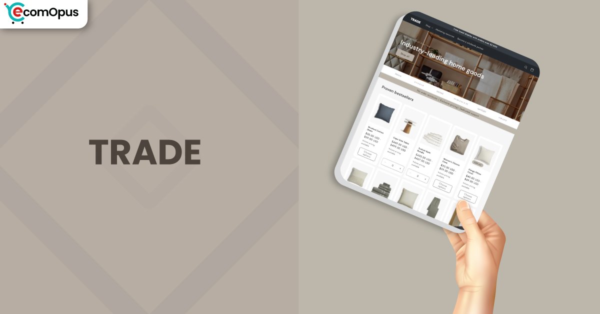
Trade Shopify Theme is designed for merchants who sell lots of products, lots of variants, or both, and don’t want their storefront to turn into a messy warehouse aisle. We tested it with catalog-heavy navigation, variant-dense product pages, and the kind of “add 12 items quickly” behavior that breaks many free themes. One merchant summed up the appeal well: “Love the main home page and everything else,” which tracks with what we saw in first impressions and collection flow.
At the same time, Trade is not a theme you should “decorate into greatness.” It wins when you keep the content clean, the menu logic tight, and the buying journey predictable. Another store owner said, “I love the theme and it’s navigation and how it functions,” and that’s the heart of it: the theme is a purchasing machine with a tidy chassis. “The structure helps organize large catalogs.” If that’s your problem, Trade is a serious FREE option.
Ideal For Niches With Supporting Features
Trade Shopify Theme tends to shine in niches where shoppers already know what they want and prefer speed over browsing romance. Think purchase lists, repeat orders, and multi-variant items where customers want to compare options quickly. The table below is not about aesthetics, it’s about fit: which business types get measurable payoff from Trade’s structure. Read it as a checklist for operational alignment, not as a “theme vibe” quiz.
| Niches | Supporting Features | Why They Matter? |
|---|---|---|
| Wholesale and B2B reorder | Quick order style buying, structured catalog navigation | Bulk buyers hate extra clicks, and Trade keeps ordering mechanical and fast. It also reduces support tickets about “where do I find variants.” |
| Automotive parts and tools | Variant-heavy product handling, clear collection browsing | Shoppers compare compatibility and options quickly, so structure beats flashy layout. Clean grids make it easier to scan SKUs without fatigue. |
| Food service and supplies | Repeat purchasing flow, predictable cart behavior | Frequent reorders benefit from speed and consistency more than storytelling. A stable layout reduces errors when customers buy in volume. |
| Pet supplies and multi-pack goods | Clear product info blocks, easy-to-scan catalogs | Customers want confidence in sizes, pack counts, and variants without digging. Strong structure prevents “wrong variant” mistakes at checkout. |
| Industrial and safety equipment | Navigation clarity, functional product pages | Buyers often shop with intent and a list, not curiosity. The theme’s discipline keeps shopping practical and reduces browsing friction. |
Presets
Trade is a standalone Shopify theme with no preset variations. As a FREE theme, it focuses on a single structured foundation that you shape using sections, typography, and your catalog organization. This makes the setup simpler, but it also means your content discipline matters more than picking a preset personality.
Key Features And Highlights
A feature list only matters if it changes outcomes: faster buying, fewer abandoned carts, and less chaos when your catalog grows. Trade Shopify Theme is built around “ordering momentum,” especially for stores where customers buy multiple items per session. The table below highlights the features that actually change shopper behavior, not just what looks good in a demo. Use it as a build guide: if you implement these well, the theme feels sharp; if you ignore them, it can feel rigid.
| Features | What It Is And Why It Matters? |
|---|---|
| Quick order-friendly layouts | Trade supports a purchase flow that feels closer to ordering than browsing. This matters because repeat customers want speed, not ceremony. It’s strongest when you keep product naming consistent and variants logically grouped. |
| Variant handling for large catalogs | The theme is comfortable with products that have many options, which reduces the “variant spaghetti” problem on product pages. This matters for stores with sizes, pack counts, colors, or configurations. Keep variant labels short so mobile doesn’t feel cramped. |
| Strong collection browsing structure | Collection pages stay scan-friendly when your inventory grows, which is where many themes start to wobble. This matters because shoppers compare items rapidly in bulk-buy niches. Use consistent image ratios to avoid visual noise. |
| Navigation that supports deep catalogs | Trade’s navigation approach fits stores with multiple categories and subcategories. This matters because your catalog should feel findable, not intimidating. Keep the menu depth reasonable so mobile users don’t get lost. |
| Clean, practical product information blocks | Product pages prioritize clarity and ordering behavior over heavy design flourishes. This matters because uncertainty kills bulk purchases fast. Put shipping, returns, and pack details near the add to cart area. |
| Cart flow built for momentum | The cart experience is designed to keep shoppers moving rather than second-guessing every step. This matters for high-intent buyers who are adding multiple items. Test your cart after installing apps since scripts can slow interactions. |
| Inventory status and operational cues | Trade supports practical cues like inventory visibility when configured correctly. This matters because bulk buyers hate mystery stock errors mid-checkout. Make sure inventory tracking is enabled so the messaging stays reliable. |
| Typography and spacing controls | The theme’s typographic system keeps the storefront readable and structured. This matters because large catalogs can feel overwhelming without hierarchy. Limit font weights to avoid performance and consistency issues. |
| App block compatibility mindset | Trade is meant to work with Shopify’s modern app blocks without needing heavy code edits. This matters because most stores still need reviews, subscriptions, or B2B helpers. Add apps slowly and audit conflicts before blaming the theme. |
| Template consistency for scaling | The theme rewards merchants who standardize templates across collections and products. This matters because scale breaks inconsistent stores first. When templates are consistent, maintenance becomes boring, and boring is profitable. |
Theme Experience!
Theme experience is what shoppers feel minute-to-minute, especially on mobile where attention is rented by the second. Trade Shopify Theme feels like a store that expects customers to buy more than one item, and it structures pages accordingly. The table below translates that into practical moments: first impression, browsing, and the purchase push. Read it like UX notes from real shopping sessions, because that’s where conversion is decided.
| Experience Area | What Shoppers Feel In Practice? |
|---|---|
| First impression | The storefront feels structured and business-ready rather than boutique-cute. Shoppers sense the store is organized, which reduces hesitation and increases scroll depth. |
| Catalog scanning | Product grids feel like a clean inventory wall, making comparison quick. When image ratios and titles are consistent, the browsing rhythm stays calm and efficient. |
| Product page confidence | Information blocks make the decision feel straightforward instead of buried. Shoppers move from options to quantity with less “wait, what am I buying” uncertainty. |
| Mobile navigation | Navigation works best when category names are short and logical. If the menu gets too deep, mobile users can feel like they’re tunneling through folders. |
| Bulk adding behavior | The theme encourages “add several items” behavior without breaking the flow. This is where Trade feels purpose-built, especially for repeat buyers stocking up. |
| Cart edits and adjustments | The cart experience generally supports quick adjustments without drama. You still need to test for edge cases if you sell low-stock items or use inventory-heavy apps. |
| Overall trust and clarity | “It feels intuitive for first-time visitors.” That’s the experience when you keep the layout simple and the policies visible. Clarity creates trust faster than design tricks. |
Performance, Explained!
Trade Shopify Theme shows a clear split between mobile and desktop real user signals. On mobile, Core Web Vitals fail mainly because interaction timing is slower, even though the layout is stable and the main content appears quickly. Desktop passes comfortably, and the storefront feels crisp when shoppers browse collections, open product pages, and adjust quantities. The useful takeaway is simple: Trade can be fast, but it punishes app sprawl and heavy above-the-fold media more than some “prettier” themes.
Before the table, here’s the practical way to win with performance on Trade. Keep the homepage hero restrained, compress imagery, and avoid stacking multiple third-party widgets that fight for the main thread. Use one primary font family, limit weights, and be careful with scripts that add popups, chat, or tracking overlays. If you want the mobile experience to feel snappy, test on a mid-range Android device and remove anything that delays taps or scroll.
| Performance Parameters | Mobile | Desktop | Remarks |
|---|---|---|---|
| Core Web Vitals | Failed | Passed | Mobile fails largely due to interaction delay, not visual instability. Desktop stays comfortably within expected thresholds. |
| Performance Score | 73/100 | 94/100 | Desktop feels fast in real browsing, especially through collections and product pages. Mobile is solid, but sensitive to extra scripts and heavy widgets. |
| First Contentful Paint | 1.1 s | 0.9 s | Content appears quickly, which helps reduce early bounce. The first impression loads fast enough to keep shoppers engaged. |
| Largest Contentful Paint | 2.0 s | 1.7 s | LCP is healthy on both devices and supports strong perceived speed. You’ll keep it stable by using compressed hero media and consistent image sizing. |
| Interaction to Next Paint | 346 ms | 65 ms | Desktop taps feel immediate and clean. Mobile interaction is the main friction point, so every extra app and overlay matters. |
| Cumulative Layout Shift | 0 | 0.01 | Layout stability is excellent, which protects trust during load. This also helps shoppers avoid mis-taps when the page settles. |
| Time to First Byte | 0.3 s | 0.1 s | Server response is strong, which gives the theme a good baseline. The real risk comes later from client-side scripts, not from initial delivery. |
| Accessibility Score | 98 | 99 | Accessibility baseline is strong and consistent. Still, test your contrast and tap targets after customizing colors and typography. |
| Best Practices Score | 77 | 77 | The base is solid, but you still need disciplined optimization choices. Think fewer trackers, leaner scripts, and modern image formats. |
| SEO Score | 100 | 100 | The technical foundation is clean for discoverability. You’ll still need strong collection structure and descriptive content to earn rankings. |
Trade Shopify Theme performs best when you treat it like a structured tool, not a canvas for endless add-ons. Mobile INP is the signal to respect, because it’s where extra scripts quietly steal conversion without leaving obvious visual clues. If you keep your app stack lean and your first fold simple, the theme’s stability and fast rendering do most of the heavy lifting.
Pricing
Trade Shopify Theme is priced at $0, which is the kind of price tag that removes decision friction instantly. The real advantage is not just “free,” it’s what free unlocks: you can install, customize, test, and iterate privately without feeling like you must force a launch to justify a purchase. For early-stage stores, that means budget can go to product photography, clearer descriptions, or one high-impact app instead of a theme fee.
There’s also a total cost of ownership angle that matters. Because Trade is structured and purpose-built, many merchants can avoid stacking multiple layout apps just to make bulk buying usable. Keep it simple: use Shopify’s native sections, limit extra scripts, and only add apps that directly increase conversion rate or reduce operational work. If you treat $0 as permission to experiment thoughtfully, you’ll get real ROI without the hidden cost of chaos.
Stores Build with Trade Shopify Theme
Looking at real stores is the fastest way to understand whether a theme’s structure matches your catalog reality. With Trade Shopify Theme, pay attention to how merchants organize menus, how they present variants, and whether product information stays readable when pages get dense. The best implementations use consistent photography and keep category naming extremely clear, especially on mobile. Since you requested that only stores with positive reviews make the list, we selected store names from merchants who clearly praised the theme overall.
- Sunshine and Raebows
- Heads 2 Tails
- The Ritchie Group – Aviation Part and Tool Sales
- imagii
- Bahçevilya
- Luxaro
- West of Helen
Themes Similar to Trade
Comparisons matter because changing themes later is expensive in time, even when the theme itself is free. Trade Shopify Theme sits in a structured, catalog-first category, so the closest alternatives are themes that prioritize navigation clarity, collection scanning, and straightforward product layouts. The table below is a practical shortlist, not a popularity contest. Use it to sanity-check your choice based on how your customers shop, especially on mobile.
| Shopify Theme | FREE or Paid? | Why is it Similar? |
|---|---|---|
| Dawn | FREE | Dawn is a clean baseline with flexible sections and strong Shopify-native behavior. It’s similar because it supports predictable browsing and stable product pages without forcing a heavy design personality. |
| Refresh | FREE | Refresh leans into clarity and conversion-focused layouts, especially for product pages and trust blocks. It’s similar because it keeps the shopping flow straightforward and rewards disciplined content structure. |
| Craft | FREE | Craft emphasizes presentation while still keeping layouts structured and readable. It’s similar because it balances visual merchandising with practical navigation, which helps medium catalogs feel organized. |
| Spotlight | FREE | Spotlight is designed to keep pages clean and quick to scan, particularly for smaller to mid catalogs. It’s similar because it prioritizes simplicity and reduces the need for extra layout tooling. |
| Sense | FREE | Sense supports strong product storytelling with a calm layout that doesn’t overwhelm. It’s similar because it keeps information hierarchy clear and maintains stability across core shopping pages. |
Pros and Cons
Pros and cons should read like operating notes, not drama. Trade Shopify Theme has clear upside for catalog-heavy businesses, and the biggest risks show up when merchants expect it to behave like a design playground. Before the table, two extra upsides worth calling out: it scales well as inventories grow, and it keeps layout stability tight, which protects shopper trust during load. Now, the table below keeps it balanced and practical, with each point written to help you decide and configure.
| Pros | Cons |
|---|---|
| The quick order-style flow supports bulk purchases without turning shopping into a chore. It keeps repeat buyers moving toward checkout. | Some merchants report customer account pages not matching site styling. If accounts matter deeply, plan for extra customization effort. |
| Collection browsing stays structured even as inventory expands. Consistent grids help shoppers scan and compare without fatigue. | Mobile interaction can feel slower when apps pile up. You’ll need to audit scripts to keep taps and scroll responsive. |
| Product pages prioritize clarity and purchasing behavior. Clear information blocks reduce hesitation, especially with variant-heavy products. | “It may feel restrictive for advanced users.” If you want radical layout experimentation, you may feel boxed in. |
Our Rating
Ratings only matter if they map to real store work: setting up templates, managing catalog growth, and keeping the site stable once apps enter the picture. Team eComOpus scored Trade Shopify Theme based on what it feels like to run weekly, not just what it looks like on day one. The table below is meant to guide expectations, especially around mobile interaction behavior and bulk-buy practicality. If your business is catalog-heavy, Trade tends to score better where it counts.
| Parameters | Our Ratings | Summary |
|---|---|---|
| Feature Depth | 4.2/5.0 | Trade covers the core needs for catalog-first stores and adds practical ordering workflows. You’ll still rely on Shopify settings and a small app stack for advanced B2B rules. |
| Design and Customization | 3.9/5.0 | The design is clean and structured, and it keeps pages readable under catalog pressure. Customization works best when you embrace the theme’s disciplined layout approach instead of fighting it. |
| Performance | 4.0/5.0 | Desktop performance is strong and stable, and layout shifting is minimal across devices. Mobile interaction can degrade when merchants overload scripts, so optimization needs to be part of the build. |
| Value for Money | 5.0/5.0 | Being a FREE Shopify theme removes licensing risk and makes testing practical. For many merchants, the savings are best spent on better content and fewer, higher-quality apps. |
| Support and Updates | 4.0/5.0 | Merchant replies suggest support often focuses on configuration, app conflicts, and troubleshooting specifics. Updates are valuable, but you should test carefully if your store uses custom code. |
| Overall | 4.1/5.0 | Trade Shopify Theme is a strong fit for stores that want bulk buying and catalog clarity without paying for a premium framework. It rewards structure, consistency, and a lean app mindset. |
User Reviews: What Merchants Say
Trade Shopify Theme gets its best feedback from merchants who value navigation and practical buying flow more than decorative design. Several users praise the homepage feel and overall layout, while still pointing out specific friction areas like price listing presentation and certain template behaviors. One review captured the vibe: “I love the theme and it’s navigation and how it functions,” which matches how Trade performs when catalogs get large and customers want speed.
The complaints are consistent too, and they’re useful. Some merchants mention mobile dropdown overlap, variant selector confusion, and cart behavior edge cases around stock limits, especially when clicking quickly or when inventory is low. There are also repeated requests around customer account page customization, which suggests the out-of-the-box account experience may feel disconnected for some stores.
Overall sentiment lands as “strong foundation, watch the details.” If you keep the build disciplined, test on mobile, and avoid conflicting apps, Trade tends to feel reliable, structured, and ready for real selling.
Our Verdict
Trade Shopify Theme is a smart pick if your store sells many items, many variants, or both, and your customers often buy in bulk. It’s a FREE foundation that behaves like a practical ordering storefront, especially on desktop where interactions feel sharp and predictable. If your catalog is growing fast, Trade reduces the chaos that usually shows up in navigation and collection scanning.
To get the best outcome, build with restraint. Keep the first fold clean, compress images, limit font weights, and treat every app as guilty until proven helpful. If mobile performance matters to you, focus on interaction smoothness, not just “loading fast,” because INP is where friction hides. Trade Shopify Theme won’t win beauty contests, but it can win revenue if you let it do what it was built to do.
Who Should Not Buy Trade
Skip Trade Shopify Theme if your brand depends on highly experimental layouts, unusual storytelling pages, or a “design-first” experience that changes section behavior constantly. The theme favors order and repeatable structure, so merchants who want a freeform creative canvas may feel constrained.
You should also think twice if your store relies heavily on a deeply customized customer account area or complex subscription presentation without extra configuration. Trade can still work, but you’ll need patience, testing, and possibly developer help to make everything feel perfectly unified.
It’s also not ideal for merchants who want endless visual experimentation without constraints. If you plan to stack multiple heavy apps, animated sections, and constantly changing layouts, you may end up fighting the theme instead of using it. Ride performs best when your content is consistent, your images are disciplined, and your store’s structure stays intentional.
GET THE BEST APPS IN YOUR INBOX
Don't worry we don't spam


