Solea Shopify Theme Review: Chic Layouts With High-Impact Conversions
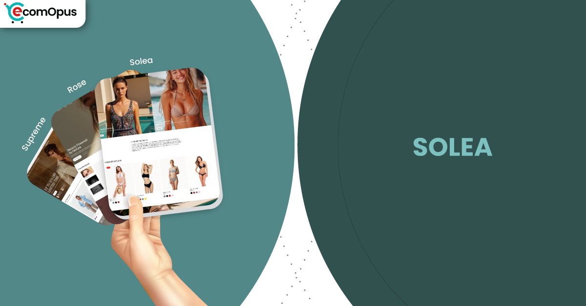
Solea is a polished preset in the Supreme theme family, tuned for beauty-forward brands that rely on clean visuals, confident spacing, and product clarity. It pairs a luxe first impression with practical Shopify features like quick buy, sticky cart, and strong discovery tools.
- Chic beauty layout built for visual focus
- High-impact hero sections for launches, drops
- Quick buy flow keeps browsing uninterrupted
- Sticky cart supports faster checkout decisions
- Mega menu navigation suits expanding collections
- Strong mobile layout with steady scrolling

Introduction
Solea feels like a boutique counter where everything is placed on purpose. The layout is airy, image-led, and designed to make products look “expensive” without needing loud design tricks. If your brand wins on presentation, Solea gives you a clean stage.
What makes this preset interesting is how it blends softness with selling mechanics. You get the calm, editorial surface, but underneath it are tools that keep shoppers moving: quick view, recommended products, product badges, and a cart experience that stays close by. That combination matters for beauty and lifestyle catalogs where people browse like they’re sampling, not hunting.
The main constraint is that Solea rewards discipline. If you stack too many popups, heavy sliders, and third-party widgets, the design can lose its composure and the experience can start feeling busy. Treated with restraint, it stays smooth, modern, and conversion-friendly.
Ideal For Niches With Supporting Features
Solea isn’t locked to beauty, but it’s clearly optimized for brands that sell through texture, routine, and trust. The preset’s spacing and hierarchy make it easy to highlight hero products, explain benefits, and keep collections from feeling like a warehouse grid. It also supports high-intent browsing through quick interactions, which helps when shoppers want to compare variants or shades without extra clicks. The table below maps niche fit to the features that do the heavy lifting.
| Niches | Supporting Features | Why They Matter? |
|---|---|---|
| Beauty and skincare | Usage information, badges, FAQs, high-res media | Beauty shoppers look for benefits, routine fit, and proof. Clean sections keep the “why buy” story readable without breaking the premium mood. |
| Haircare and fragrance | Product videos, quick view, recommended products | These categories sell through sensory cues and repeat purchase logic. Fast previews help shoppers compare options without abandoning the collection page. |
| Jewelry and accessories | Image zoom, size chart, color swatches | Small products trigger big hesitation around scale and detail. Zoom and structured info reduce uncertainty while keeping pages elegant. |
| Premium wellness brands | Press coverage blocks, blogs, promo banners | Trust signals matter when claims and ingredients are involved. Built-in credibility areas reduce the urge to bolt on heavy apps for reassurance. |
| Boutique fashion capsules | Lookbooks, image hotspots, clean collections | Capsule browsing should feel curated, not crowded. Visual storytelling tools help shoppers imagine outfits and buy sets more confidently. |
| Giftable lifestyle goods | Slide-out cart, quick buy, stock counter | Gift buyers want fast confidence and a smooth checkout path. The cart and urgency tools support decisions without turning the store into a discount circus. |
Presets
Supreme includes multiple presets that share the same feature foundation while shifting the styling, spacing, and overall “tempo.” This matters because you can keep the same underlying theme capabilities, but choose a visual personality that better matches your catalog. If you ever outgrow the initial look, switching presets can refresh the storefront without rebuilding your navigation from scratch. The table below clarifies how the three presets typically behave in real use.
| Preset | Aesthetic Vibe | Where It Shines | Noteable Tweaks |
|---|---|---|---|
| Solea | Chic beauty minimalism with luxe calm | Skincare, fragrance, boutique wellness | Softer spacing and product-first polish |
| Supreme | Modern flagship storefront with flexible balance | Multi-category lifestyle, broad catalogs | More neutral rhythm for varied merchandising |
| Rose | Warm, romantic premium styling | Fashion, gifting, accessories | Slightly richer mood for storytelling |
Key Features And Highlights
Solea’s value isn’t just that it looks refined, it’s that it keeps refinement while offering serious store functionality. Many “pretty” themes start to wobble once you add real merchandising needs like promos, filtering, and fast add-to-cart behavior. Here, the feature set is built in, so you can stay lighter on apps and keep the experience cohesive. The table below highlights the standout features and what they do for real shoppers.
| Features | What It Is And Why It Matters? |
|---|---|
| Quick buy and quick view | Shoppers can act without leaving the browsing flow. This reduces friction for shades, sizes, and fast comparisons. |
| Slide-out cart and sticky cart | Cart access stays close while shoppers scroll and explore. It supports faster checkout decisions without forcing hard navigation jumps. |
| Mega menu with in-menu promos | Navigation can scale while still feeling curated. Promo placement inside menus keeps offers visible but not noisy. |
| Infinite scroll and strong discovery | Collections can feel endless without feeling exhausting. Combined with filtering, shoppers find “the one” faster. |
| Product badges and stock counter | Helpful urgency and labeling without clutter. These cues guide decisions while keeping the storefront calm. |
| Image zoom, galleries, and high-res media | Beauty and accessories depend on detail and texture. Strong media tools build confidence, especially on mobile. |
| Lookbooks and image hotspots | Storytelling becomes shoppable instead of purely decorative. This helps bundles, routines, and “complete the set” merchandising. |
| Before/after image slider | Ideal for skincare, haircare, and transformation-led products. It communicates outcomes without forcing walls of text. |
| Age verifier and promo popups | Useful for regulated categories or brand-controlled access. When used sparingly, it protects compliance without tanking experience. |
Theme Experience!
A theme’s real quality shows up after the third scroll, not the first glance. Solea is designed to keep the shopper in a calm rhythm: see a product, understand it quickly, compare without effort, and buy without getting lost. That rhythm is especially important on mobile, where beauty shoppers often browse in short bursts and return later to purchase. The table below breaks down how Solea tends to feel across key shopping moments.
| Experience Area | What Shoppers Feel In Practice? |
|---|---|
| First impression | The store looks premium within seconds. The spacing and typography create instant trust without trying too hard. |
| Collection browsing | Grids feel easy to scan and compare. The layout stays breathable, so decision fatigue arrives later. |
| Product pages | Details feel organized instead of scattered. Shoppers can move from curiosity to confidence without extra tabs. |
| Brand storytelling | Story sections feel integrated, not like a detour. The store can “explain itself” while still selling. |
| Mobile flow | Scrolling stays steady and readable. Fewer layout surprises means fewer accidental taps. |
| Conversion moment | Buying feels direct and uncluttered. Cart behavior supports momentum instead of interrupting it. |
| Post-purchase impression | The storefront leaves a polished memory. That “clean experience” supports repeat intent in routine categories. |
Performance, Explained!
On desktop, Solea feels quick to respond, with strong interaction performance and a fast initial server response. In practical terms, menus, filters, and quick-view actions should feel snappy, which matters when shoppers are comparing products rapidly. The one caution is layout stability, where a higher shift score can make the page feel slightly jumpier during load if content repositions.
On mobile, the experience is mostly steady visually, but interaction responsiveness and server response can feel heavier on slower networks. That can translate into a small delay after taps when multiple scripts compete early. For a design that sells “clean luxury,” keeping images optimized and apps lean is the best way to protect that premium feel.
Solea’s performance story is simple: it can feel smooth and expensive, but it wants a disciplined build to stay light on its feet.
Before the table, it’s worth translating metrics into shopper reality. These numbers reflect field-style experience signals, which tend to punish stores that overload the first screen with heavy media and scripts. They also highlight the difference between “looks stable” and “feels instantly responsive,” which is where many premium stores win or lose trust. Use the table as a diagnostic compass, not a scoreboard for bragging rights.
| Performance Parameters | Mobile | Desktop | Remarks |
|---|---|---|---|
| Core Web Vitals Assessment | Failed | Failed | Mobile fails mostly due to responsiveness and backend delay signals. Desktop fails largely because layout movement is more noticeable. |
| Largest Contentful Paint (LCP) | 2.4 s | 1.4 s | The main visual appears reasonably fast on both. Desktop feels more immediate, while mobile depends more on network quality. |
| Interaction to Next Paint (INP) | 210 ms | 74 ms | Mobile taps can feel slightly delayed under load. Desktop interactions should feel crisp during browsing and cart actions. |
| Cumulative Layout Shift (CLS) | 0 | 0.24 | Mobile stays visually steady in this run. Desktop shows more movement, which can feel distracting during first load. |
| First Contentful Paint (FCP) | 1.7 s | 1.9 s | Content shows up early, reducing bounce risk. Desktop reaches “ready to browse” faster. |
| Time to First Byte (TTFB) | 1.1 s | 0.4 s | Mobile server response is slower, which can amplify perceived lag. Desktop response time supports a snappier first impression. |
Desktop stability is the clearest optimization target, because visual jumps can undermine a premium impression. On mobile, keeping scripts and media lean will do the most to protect tap responsiveness.
Pricing
Solea is priced at $250, placing it in a “serious, but not extreme” premium tier. The value makes the most sense when it replaces multiple apps you would otherwise add for quick buy behavior, cart enhancements, navigation polish, and on-page trust cues. If you’re already planning to pay for several conversion add-ons, that spend can quietly exceed the theme price while still producing a less consistent experience.
The smarter way to evaluate pricing is to ask what Solea saves you in design time and complexity. If your goal is a clean, high-end storefront with built-in merchandising tools, the one-time cost can pay itself back through fewer workarounds. If you’re still experimenting with product-market fit and constantly changing branding, you may want to wait until your content
Stores Build with Solea Shopify Theme
Live examples matter because they show what happens when real product photography, real navigation choices, and real app stacks enter the picture. They also help you see whether a theme still feels cohesive outside of demo-perfect content. Solea sits inside the Supreme theme family, so stores may adapt styling, but the structural choices still reveal how well the foundation holds up. Below are several stores publicly associated with this theme family, offering a useful window into real-world execution.
Dorian & Sage and ONIMUU show how premium spacing and strong product presentation can work even when catalogs expand. Lamerae leans into brand-led storytelling and polished visuals, which matches Solea’s strengths particularly well. Elite Couture and Oana Nutu also reinforce the point that this theme family performs best when imagery is consistent and the layout is allowed to breathe.
Themes Similar to Solea
Solea sits in the modern premium lane: clean typography, strong visuals, and conversion features that don’t feel bolted on. The closest alternatives tend to balance brand storytelling with merchandising controls, especially for beauty, fashion, and lifestyle catalogs. Similarity here is less about identical styling and more about the same job-to-be-done: make products feel premium while keeping shopping fast. The table below lists comparable themes and why they land in the same neighborhood.
| Shopify Theme | FREE or Paid? | Why is it Similar? |
|---|---|---|
| Prestige | Paid | Prestige also focuses on premium spacing and editorial storytelling. It supports high-end product presentation while keeping conversion tools close at hand. |
| Impact | Paid | Impact leans into bold visuals with modern merchandising support. It similarly rewards strong photography and clean, confident page structure. |
| Broadcast | Paid | Broadcast blends storytelling with promotional control in a polished way. Like Solea, it can sell premium without drowning the shopper in clutter. |
| Impulse | Paid | Impulse is strong for conversion mechanics and fast browsing. With disciplined styling, it can deliver a similarly refined, high-performing feel. |
| Dawn | FREE | Dawn provides a clean baseline with modern Shopify structure. It can approximate Solea’s minimal look, but you’ll do more work to match the built-in polish. |
Pros and Cons
Solea comes with real advantages for premium catalogs, but it also has predictable friction points depending on how you run your store. The pros focus on browsing rhythm, presentation quality, and built-in conversion mechanics. The cons focus on what happens when the theme is forced to carry messy assets, too many apps, or mismatched expectations. Use this as a checklist before committing.
| Pros | Cons |
|---|---|
| Hero sections feel luxe and focused. Great for launches and signature products. | Desktop layout can shift during load. That can reduce the “calm luxury” impression. |
| Quick buy speeds up product comparisons. It keeps shoppers inside the flow. | Too many popups can overwhelm pages. The design works best with restraint. |
| Slide-out cart supports momentum nicely. Checkout feels one step closer. | Inconsistent photography looks more obvious. Clean layouts amplify asset flaws. |
| Mega menu scales without looking chaotic. It suits growing catalogs well. | Heavy apps can slow mobile taps. Script overload hurts responsiveness first. |
| Rich media tools build product confidence. Details look crisp on mobile. | |
| Built-in trust cues reduce app dependence. Badges and FAQs stay tidy. |
Our Rating
Solea scores highest where premium brands care most: design clarity, browsing comfort, and built-in conversion features that don’t cheapen the layout. Setup is approachable, but the best results come from content discipline: consistent imagery, clean product info, and a lighter app stack. The table below reflects how the preset performs across the ownership factors that affect long-term satisfaction.
| Parameters | Our Ratings | Summary |
|---|---|---|
| Design Quality | 4.7/5.0 | Clean, chic presentation that elevates product perception. The layout feels curated, not crowded, especially for beauty catalogs. |
| Ease Of Setup | 4.5/5.0 | Sections are intuitive and flexible for most stores. The fastest wins come from using the theme’s native blocks before adding apps. |
| Feature Depth | 4.6/5.0 | Strong built-in tools like quick buy, filtering, and rich media. It covers most conversion needs without heavy add-ons. |
| Conversion Support | 4.6/5.0 | Sticky cart, slide-out cart, and recommendations keep momentum. The experience supports decisions without feeling pushy. |
| Mobile Experience | 4.3/5.0 | Mobile layout stability is solid in this run. Responsiveness improves noticeably when scripts and media stay lean. |
| Support And Updates | 4.8/5.0 | Merchant feedback repeatedly highlights fast, helpful support. That matters when you’re launching and need fixes under pressure. |
Solea’s ratings reflect a theme that prioritizes polish without sacrificing practical selling tools. If your content is clean and your build is disciplined, the experience feels premium end-to-end.
User Reviews: What Merchants Say
Merchant feedback around the Supreme theme family is remarkably consistent in tone: people buy it for polish, then stay happy because the support experience reduces stress. Several reviewers describe the design as sleek, modern, and “high quality,” which aligns with a preset like Solea that depends on clean structure and confident spacing. When multiple merchants independently call out that the theme has “every option you need,” it signals strong built-in coverage for common store requirements.
Support is the loudest recurring theme in the reviews, and it shows up in practical, not vague, ways. Merchants describe emailing with setup issues, getting quick help, and even receiving proactive improvements that made the store feel cleaner than before. That matters because premium themes often invite merchants to build more ambitious pages, and ambition tends to produce edge-case problems during launch.
What’s also notable is the “beginner-friendly” angle, despite the premium styling. One review highlights that the team patiently helps resolve every issue, which lowers the intimidation factor for store owners who want a sophisticated storefront without constantly touching code. The overall sentiment is clear: if you value responsiveness from the developer and want a modern theme that feels complete out of the box, this theme family earns trust quickly.
Our Verdict
Solea is a strong pick for brands that want a beauty-forward storefront with calm premium energy and real conversion infrastructure under the hood. It feels curated without being delicate, which is the sweet spot for skincare, fragrance, wellness, and boutique lifestyle catalogs. If your photography is consistent, Solea will make your products look more valuable than the effort it took to get there.
Where Solea wins is in the combination of polish and practicality. Quick buy, sticky cart, and strong discovery features help shoppers compare and commit without friction, while the layout keeps everything breathable. Treat performance like part of the design, keep apps lean, and Solea will stay smooth instead of “pretty but heavy.”
Who Should Buy Solea
Solea is best for merchants who want a premium storefront that feels clean, modern, and product-first. It rewards brands that invest in good imagery and structured product content, especially when shoppers need reassurance before buying. It also fits teams that prefer using theme-native features instead of stacking multiple apps for basic conversion tools. The table below highlights who tends to get the best value.
| Best-Fit Buyer Profile | Why Solea Fits | What They Will Love Most | Smart Setup Move |
|---|---|---|---|
| Skincare and beauty brands | Designed for chic product presentation | Calm luxury that sells routine products | Build reusable benefit and FAQ blocks |
| Fragrance and haircare stores | Supports fast comparison and discovery | Quick view plus strong media tools | Use videos and tight collection filtering |
| Jewelry and accessories | Detail tools reduce hesitation | Zoom, swatches, and clean layout | Standardize sizing and materials sections |
| Boutique wellness catalogs | Trust cues stay clean and premium | Press and badges without clutter | Keep apps minimal, lean on theme features |
| Giftable lifestyle products | Cart and urgency tools support intent | Slide-out cart and stock counter | Create curated gift collections and bundles |
Who Should Not Buy Solea
Solea is not the best match for merchants who want a loud, promotion-saturated storefront. It also isn’t ideal for stores that depend on layering multiple heavy apps, because responsiveness and visual calm can degrade when too many scripts compete. If your product imagery is inconsistent, the layout may accidentally spotlight those flaws rather than flattering them. The table below shows who should consider alternatives.
| Not-Ideal Buyer Profile | Why It Can Be A Poor Fit | What They Will Likely Struggle With | Better Approach |
|---|---|---|---|
| Discount-first stores | The layout is built for premium calm | Promo overload can feel visually messy | Pick a promotion-forward theme style |
| App-stacked storefronts | Scripts compete with theme performance | Tap delays and heavier mobile feel | Reduce apps and use native features |
| Low-quality photo catalogs | Clean design amplifies asset issues | Products can look less premium | Improve imagery before upgrading |
| Extreme layout customizers | Design guardrails preserve consistency | Needing code for deeper reshaping | Choose a framework-like theme |
GET THE BEST APPS IN YOUR INBOX
Don't worry we don't spam


