Rose Shopify Theme Review: Boutique Style With a Conversion-Focused Core
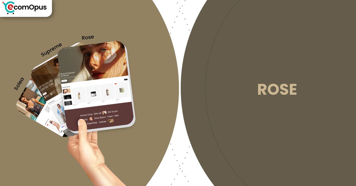
Rose is a premium preset priced at $250, built for brands that want softness and polish without losing modern storefront muscle. It brings a romantic, editorial mood to the Supreme theme foundation, so you get the aesthetic glow plus practical merchandising tools that keep shoppers moving.
- Warm boutique styling with premium visual rhythm
- Hero sections feel romantic, still conversion-ready
- Typography reads elegant across long scrolling pages
- Collections stay curated with breathing space
- Mobile stability strong, responsiveness needs discipline
- Desktop loads fast, but shifts can appear

Introduction
Rose feels like a storefront styled by someone who understands that “pretty” is not the same thing as “useful.” In the preview, the preset leans into gentle warmth, spacious composition, and a calmer merchandising cadence that suits gifting and lifestyle categories. The result is premium without feeling cold, and expressive without becoming chaotic.
The layout guides shoppers with quiet confidence instead of shouting through promo stacks. Navigation stays clear, collection grids look curated, and product presentation keeps a tidy hierarchy that makes browsing feel easy. That matters for brands that sell through mood and detail, where shoppers compare, pause, and return before buying.
Merchant feedback connected to the Supreme theme family keeps repeating two themes: the feature set feels complete, and the support experience feels unusually helpful. Multiple reviewers describe quick replies, patient problem-solving, and improvements that go beyond a basic fix. When you are investing in a premium storefront, that safety net becomes part of the value.
Ideal For Niches With Supporting Features
Rose performs best when shoppers want emotion early and clarity later. The preset’s warmth helps products feel giftable and premium, while the underlying structure supports comparison, discovery, and confident decision-making. This matters because many warm, boutique designs fail once catalogs grow and navigation gets complicated. The table below highlights niches where Rose’s mood and mechanics align naturally.
| Niches | Supporting Features | Why They Matter? |
|---|---|---|
| Fashion and apparel | Lookbooks, swatches, clean collection grids | Apparel shoppers decide visually and quickly. Rose keeps the vibe boutique while preserving fast comparison and clear variant choice. |
| Gifts and handmade | Curated collections, feature sections, quick buy | Gift shoppers need confidence fast. Warm styling increases emotional intent while quick actions reduce friction at the decision moment. |
| Beauty and skincare | FAQs, trust cues, structured product storytelling | Buyers want reassurance without a clinical feel. Rose supports education in calm blocks that keep the premium mood intact. |
| Jewelry and accessories | Zoom, size guidance, high-resolution media | Detail drives hesitation in small products. Clear visuals and tidy info reduce uncertainty and help shoppers commit sooner. |
| Home décor and lifestyle | Mega menu structure, curated grids, editorial spacing | Décor browsing is slow and comparative. Spacious layouts reduce fatigue while strong navigation prevents “lost in catalog” frustration. |
| Premium food and beverage | Bundles, promos, smooth cart flow | Shoppers often build baskets quickly. Guided merchandising and cart convenience help increase average order size without adding clutter. |
Presets
Presets matter because they set the store’s emotional tone before you customize a single section. Rose is the warmer, more romantic direction within the same theme foundation, which means the structure stays capable while the vibe becomes more boutique. This is useful if you want premium storytelling without rebuilding your information architecture from scratch. Use the table below to compare preset personalities at a glance.
| Preset | Aesthetic Vibe | Where It Shines | Noteable Tweaks |
|---|---|---|---|
| Supreme | Modern flagship storefront with flexible balance | Multi-category lifestyle, broad catalogs | More neutral rhythm for varied merchandising |
| Rose | Warm, romantic premium styling | Fashion, gifting, accessories | Slightly richer mood for storytelling |
| Solea | Chic minimalism with luxe calm | Beauty, wellness, boutique brands | Cleaner density and product-first framing |
Key Features And Highlights
Rose inherits a feature set that is built for real commerce, not just demo beauty. The best parts are the ones that reduce browsing friction and keep shoppers oriented as they compare products and collections. That matters because boutique styling can increase time-on-site, but only if discovery and cart actions stay effortless. The table below highlights the features that most directly shape shopper behavior.
| Features | What It Is And Why It Matters? |
|---|---|
| Quick buy and quick view | Shoppers can add items without leaving the collection flow. This protects momentum and reduces drop-off from extra page loads. |
| Slide-out cart and sticky cart | Cart access stays close during long browsing sessions. It supports checkout intent without interrupting discovery or storytelling. |
| Mega menu and structured navigation | Large catalogs stay organized without feeling maze-like. Clear grouping lowers bounce and improves collection-to-product pathways. |
| Filtering and sorting tools | Shoppers narrow options faster with less frustration. Better discovery reduces decision fatigue and keeps comparison comfortable. |
| Lookbooks and shoppable storytelling | Products appear in context, not just tiles. This increases perceived value and supports premium positioning naturally. |
| High-resolution media with zoom | Details become easy to inspect on any device. Better clarity reduces hesitation, especially for texture-driven products. |
| Trust cues and reusable content blocks | FAQs, policies, and proof can live in clean sections. Shoppers get reassurance without a badge explosion. |
| Controlled promotional surfaces | Offers can be shown without turning pages noisy. This preserves boutique perception while still supporting conversion moments. |
Theme Experience!
Rose is designed to feel like browsing a curated boutique, not walking through a warehouse aisle. The preset keeps the page rhythm calm, which encourages slower browsing and more intentional comparison. That experience improves when merchants avoid stacking overlapping apps that compete for attention and loading priority. The table below breaks down what shoppers typically feel when Rose is set up with discipline.
| Experience Area | What Shoppers Feel In Practice? |
|---|---|
| First impression | The store feels warm and premium quickly. The layout signals intention rather than template repetition. |
| Navigation and discovery | Menus feel organized and trustworthy. Shoppers reach collections without second-guessing where to click. |
| Collection browsing | Grids feel scannable and not exhausting. Spacing reduces visual noise while still keeping products central. |
| Product pages | Details feel structured and reassuring. Shoppers find answers without hunting across tabs and popups. |
| Brand storytelling | Brand content feels integrated into shopping. The store explains value without pulling shoppers away from products. |
| Mobile browsing flow | Pages stay readable during fast scrolling. Stable stacking reduces accidental taps and frustration. |
| Conversion moment | Buying feels close and uncomplicated. Cart behavior supports momentum instead of breaking it. |
Performance, Explained!
Rose’s performance signals a store that can feel premium, but only if the build stays lean. On mobile, Core Web Vitals fail here mostly because responsiveness and server timing can feel heavier, even though layout stability is excellent. In practical terms, the page may look calm, but taps can feel slightly delayed when scripts compete early.
On desktop, the store loads fast and interactions are crisp, but layout shift is the main concern. Even small jumps during load can reduce perceived polish, especially near the hero and navigation. If you treat performance as part of the aesthetic, Rose can keep its boutique feel without carrying unnecessary weight.
| Performance Parameters | Mobile | Desktop | Remarks |
|---|---|---|---|
| Core Web Vitals Assessment | Failed | Failed | Mobile needs responsiveness discipline. Desktop needs stability tuning to preserve premium trust. |
| Largest Contentful Paint (LCP) | 2.4 s | 1.5 s | Mobile loads the main visual reasonably fast. Desktop renders hero content quickly, supporting strong first impressions. |
| Interaction to Next Paint (INP) | 210 ms | 78 ms | Mobile interactions can feel slightly delayed under load. Desktop interactions should feel crisp during browsing and cart actions. |
| Cumulative Layout Shift (CLS) | 0 | 0.22 | Mobile stability is excellent in this run. Desktop movement can distract and cause misclicks during early browsing. |
| First Contentful Paint (FCP) | 1.7 s | 0.9 s | Content appears early on both devices. Desktop reaches “ready to browse” faster and more reliably. |
| Time to First Byte (TTFB) | 1.1 s | 0.2 s | Mobile server response is slower and can amplify perceived delay. Desktop response time looks healthy and consistent. |
Rose’s biggest win is visual stability on mobile, which protects browsing comfort. The biggest risk is desktop layout movement, which can quietly erode premium perception if left unmanaged.
Pricing
Rose is priced at $250, which sits in the premium tier that typically makes sense when the theme reduces your need for extra tools. The strongest value comes from using the built-in merchandising and conversion features instead of layering multiple apps that duplicate cart behavior, quick views, or navigation enhancements. A lighter stack usually improves consistency, reduces conflicts, and keeps the storefront feeling cohesive.
The price is easier to justify if your brand already has stable photography and a clear visual identity. Rose can get you closer to a boutique mood quickly, which saves time otherwise spent wrestling a generic base into something emotional. If your store is still changing branding weekly, you may want to stabilize content first so the preset can do its best work.
Stores Build with Rose Shopify Theme
Live store examples are most useful when we can verify what is being used and how it is configured, especially because Rose is a preset inside a broader theme family. In many public cases, stores can be associated with the Supreme theme, but preset styling may be customized enough that it becomes difficult to attribute confidently. To keep this review credible, we avoid claiming specific preset usage unless it can be clearly validated.
What we can say is that merchant feedback indicates real-world use across different brand types and catalog sizes. That variety suggests the underlying foundation holds up beyond the demo environment, especially when merchants keep photography consistent and avoid cluttered app stacks. As more verifiable examples emerge through reliable observation, this section can be expanded with practical notes on layout choices and collection behavior.
Themes Similar to Rose
Rose sits in the premium editorial lane where typography, spacing, and storytelling matter as much as conversion mechanics. Similar themes tend to offer strong media presentation and structured merchandising surfaces, but they vary in how bold or restrained their default tone feels. Choosing between them usually comes down to whether you want calm boutique warmth or a more campaign-forward energy. The table below highlights close alternatives and why they overlap meaningfully.
| Shopify Theme | FREE or Paid? | Why is it Similar? |
|---|---|---|
| Prestige | Paid | Prestige emphasizes premium spacing and editorial storytelling. It also supports trust-first product pages that help reduce hesitation on higher-priced items. |
| Impact | Paid | Impact blends modern visuals with strong merchandising tools. It rewards clean content structure and supports bold product presentation without feeling chaotic. |
| Broadcast | Paid | Broadcast balances storytelling with promotional flexibility. It keeps navigation structured while supporting brand-led sections that feel curated. |
| Impulse | Paid | Impulse is built for fast browsing and conversion mechanics. With disciplined styling, it can deliver a similarly premium shopping rhythm at scale. |
| Dawn | FREE | Dawn offers a clean modern baseline with strong fundamentals. It can mimic boutique calm, but usually needs more setup to match depth and polish. |
Pros and Cons
Rose offers a clear aesthetic advantage, but it also rewards discipline in setup and content quality. The pros below focus on what merchants and shoppers tend to feel after launch, especially when the theme’s built-in features are used instead of duplicated by apps. The cons highlight where the preset can lose its composure, either through performance friction or mismatched expectations. Use this as a practical checklist before committing.
| Pros | Cons |
|---|---|
| Warm boutique styling feels intentional. It elevates products without looking sugary. | Desktop layout can shift during load. It can cause misclicks and reduce polish. |
| Quick buy keeps browsing smooth. It reduces drop-off during comparison-heavy shopping. | Mobile taps can feel heavier with apps. Script overload hurts responsiveness first. |
| Cart tools feel close and clean. They support checkout without interrupting discovery. | Inconsistent photos look more obvious. Clean layouts amplify asset gaps quickly. |
| Navigation scales with structure. It helps large catalogs feel curated, not chaotic. | Deep layout reshaping may need code. Guardrails protect design, but limit extremes. |
| Story sections feel shoppable. They add emotion while still selling clearly. | |
| Support reputation is a standout. It reduces stress during setup and changes. |
Our Rating
Ratings matter most when they reflect the day-to-day ownership experience, not just the demo’s first impression. Rose scores highest in design quality and overall feature coverage, because it blends boutique mood with practical selling mechanics. Performance is the main caution area, because responsiveness and layout stability depend heavily on media discipline and app restraint. The table below breaks down Rose across key categories that influence long-term satisfaction.
| Parameters | Our Ratings | Summary |
|---|---|---|
| Design Quality | 4.7/5.0 | Warm editorial styling feels premium and composed. The layout flatters products without forcing aggressive merchandising. |
| Ease Of Setup | 4.6/5.0 | Section configuration is approachable for most merchants. Support sentiment suggests help arrives quickly when needed. |
| Feature Depth | 4.7/5.0 | Conversion and discovery tools feel complete. Many stores can reduce app dependence without losing capability. |
| Conversion Support | 4.6/5.0 | Cart tools and quick actions protect momentum. The structure encourages confidence instead of pressure-based tactics. |
| Mobile Experience | 4.2/5.0 | Visual stability is excellent in this run. Responsiveness improves noticeably when scripts and media are kept lean. |
| Support And Updates | 4.8/5.0 | Merchant feedback repeatedly highlights fast, helpful support. That reduces launch risk and lowers ongoing troubleshooting stress. |
Rose is a strong fit for merchants who value boutique presentation but still want serious commerce mechanics. If you keep performance disciplined, the preset’s warmth reads as premium, not heavy.
User Reviews: What Merchants Say
Merchant feedback connected to the Supreme theme family is unusually consistent in tone and emphasis. Reviewers frequently mention that the theme feels modern, clean, and loaded with useful options, which aligns well with Rose’s boutique presentation. Several comments also describe the theme as fast and highly customizable, suggesting the foundation can handle real catalog needs without constant workarounds.
Support is the recurring headline across the reviews. Merchants describe quick replies, patient guidance, and help that feels practical rather than scripted. One store owner even noted that while resolving an issue, the team made additional improvements that left the site looking cleaner than before.
There is also a clear “relief” undertone in the praise, which is often the most meaningful signal. When merchants say a theme has everything they need, they usually mean fewer surprises after purchase and fewer forced app installs. For a preset like Rose, that matters because the warm aesthetic works best when the store stays uncluttered and cohesive.
Our Verdict
Rose is a strong recommendation for brands that want boutique warmth without sacrificing modern commerce fundamentals. It blends a romantic, editorial mood with a capable feature foundation, so the store can feel emotional while still being efficient. That combination fits categories where shoppers browse slowly, compare thoughtfully, and notice small presentation details.
The main caution is performance discipline, especially on mobile responsiveness and desktop layout stability. Rose can feel light and premium when media is optimized and apps are restrained, but it can feel heavier if the build becomes script-stacked. Treat performance as part of design, and the preset’s polish holds up in motion.
If your brand depends on premium perception, Rose helps you get there faster than building from a neutral base. Pair it with consistent photography and tidy product content, and it becomes a long-term storefront foundation instead of a short-term makeover.
Who Should Buy Rose
Rose is best for merchants who want their storefront to feel warm, curated, and premium while still supporting serious merchandising. It fits brands that sell through mood and visual consistency, but still need shoppers to browse quickly and buy without friction. It also works well for teams who want to rely on theme-native features rather than stacking apps for basic conversion tools. The table below outlines the buyer profiles most likely to get strong value from Rose.
| Best-Fit Buyer Profile | Why Rose Fits | What They Will Love Most | Smart Setup Move |
|---|---|---|---|
| Boutique fashion brands | Warm editorial pacing flatters apparel | Romantic feel with scannable grids | Standardize imagery and swatch styling |
| Gift and handmade stores | Mood supports gifting decisions | Curated browsing that feels personal | Build seasonal gift collections early |
| Beauty and skincare brands | Education blocks stay calm and tidy | Trust cues without clinical design | Turn FAQs into reusable templates |
| Jewelry and accessories | Detail-first selling is supported | Zoom and structured product clarity | Standardize materials and sizing sections |
| Lifestyle multi-collections | Navigation scales without chaos | Curated discovery at catalog size | Build a clean mega menu taxonomy |
Who Should Not Buy Rose
Rose is not ideal for merchants who want a loud, discount-saturated storefront where banners dominate every scroll. It is also a risky fit for app-heavy builds that inject late-loading elements, because desktop layout shift can become more noticeable and break the premium illusion. Another mismatch is buyers who expect unlimited layout experimentation through toggles alone, since boutique polish often comes with design guardrails. The table below highlights profiles that should consider alternatives.
| Not-Ideal Buyer Profile | Why It Can Be A Poor Fit | What They Will Likely Struggle With | Better Approach |
|---|---|---|---|
| Discount-first retailers | Boutique pacing clashes with promo noise | Banner stacks look cluttered quickly | Choose a promotion-forward theme style |
| App-stacked storefronts | Scripts can compete during load | Tap delay and unstable first impression | Reduce apps and use native features |
| Extreme layout customizers | Guardrails limit editor freedom | Needing code for deep reshaping | Pick a framework-like theme approach |
| Stores with weak photography | Clean design exposes asset gaps | Products look less premium than intended | Upgrade imagery before switching |
| Buyers who want zero optimization | Performance needs discipline | Desktop shift undermines trust | Reserve image space and simplify scripts |
GET THE BEST APPS IN YOUR INBOX
Don't worry we don't spam


