Ride Shopify Theme Review: Sporty Minimal Design Built For Quick Decisions
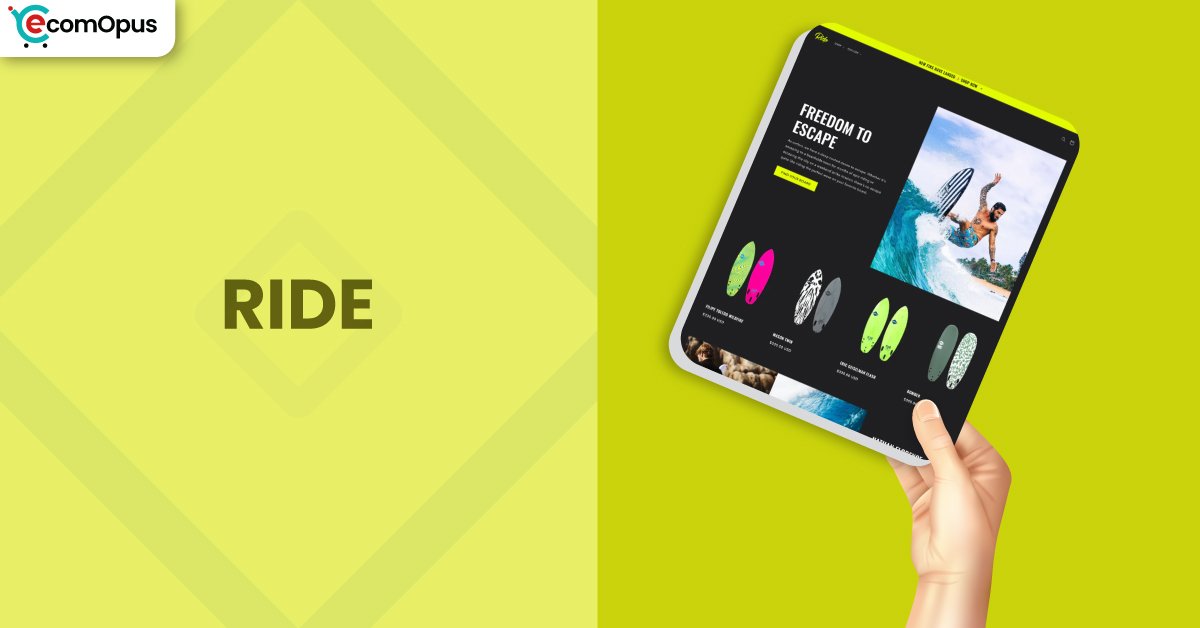
Ride is a FREE Shopify theme that blends bold visuals with clean structure for product-focused stores. We tested it for speed, navigation flow, and daily editing sanity.
- Bold, sporty layout for visual-first brands
- Clean product pages that reduce hesitation
- Quick buy flow for faster checkout momentum
- Strong mobile feel with stable layouts
- Flexible sections for simple storytelling
- FREE foundation that scales with discipline

Introduction
Team eComOpus keeps coming back to Ride for one reason: it looks confident without acting complicated. One long-term merchant summed it up as “worked great for a FREE theme,” and that kind of quiet reliability is exactly what most stores need when the catalog and marketing stack start growing. “I didn’t expect to like this, but here we are.”
Ride Shopify Theme also attracts builders who like to tinker, because it doesn’t crumble the moment you add custom code or push the editor a bit. A busy-store owner described it plainly: “no issues,” even while expanding the setup with custom additions. That said, Ride rewards clean decisions, not endless experiments, so the best results usually come from clear product hierarchy and consistent visuals.
Ideal For Niches With Supporting Features
Ride tends to shine when products need presence, not clutter. It’s especially useful for stores that want a bold first impression, then a straightforward path to purchase once the shopper starts browsing. The table below pairs common niches with practical features that support real buying behavior. Use it to match your catalog type with the sections and layout patterns that will actually get used.
| Niches | Supporting Features | Why They Matter? |
|---|---|---|
| Streetwear and apparel | Large hero media, clean product grids | Strong imagery sells the vibe quickly. Simple grids help shoppers compare sizes and colors without getting lost. |
| Supplements and wellness | Structured product info blocks, clear CTAs | Customers look for ingredients and usage fast. A tidy layout reduces doubt and keeps attention near the buy action. |
| Sports gear and accessories | Bold typography, feature callouts | Shoppers want quick scanning of specs. Visual callouts make benefits feel immediate, not buried in long text. |
| Automotive and utility products | Clean navigation, predictable templates | Buyers often browse by category first. Consistent templates keep trust high when products vary in price and complexity. |
| Art prints and creator goods | Story sections, media-forward product pages | Brand story influences conversion here. A controlled layout makes galleries feel intentional instead of chaotic. |
Presets
Ride is a standalone Shopify theme with no preset variations, which is a good thing if you hate “choose a style first” pressure. As a FREE Shopify theme, it gives you one cohesive system that you shape through sections, spacing, and content rhythm.
Key Features And Highlights
Ride isn’t trying to be a everything-and-the-kitchen-sink template. It focuses on the store building blocks that affect daily selling: how products are framed, how collections flow, and how quickly shoppers can act. The table below highlights the features that actually change outcomes, not the ones that just look good in a demo. Read it like a checklist for what you will lean on once you’re posting products weekly.
| Features | What It Is And Why It Matters? |
|---|---|
| Bold hero media layout | Hero sections are designed to lead with product energy, not delicate decoration. This helps strong photography do the heavy lifting without requiring extra design apps. |
| Quick buy behavior | Quick buy reduces the number of steps between interest and action. It’s most effective when your variants are simple and your product page answers questions fast. |
| Cart drawer flow | A cart drawer keeps shoppers in the browsing mindset instead of bouncing between pages. This can lift add-on purchases when you place recommendations thoughtfully, not aggressively. |
| Modular product information blocks | Product pages are built with movable blocks so details can follow your buyer’s logic. This matters for reducing returns because shoppers see sizing, materials, and policies in the right order. |
| Collection grid consistency | Consistent grids help catalogs feel organized even when product photos vary. It’s a subtle trust cue: the store feels maintained, not stitched together. |
| Announcement and promo areas | Built-in announcement areas support lightweight promotion without turning the header into a billboard. That balance keeps the brand tone intact while still enabling urgency. |
| Section-driven pages | Pages can be assembled through sections rather than custom templates for every idea. This lowers maintenance, especially when you want to launch new landing pages quickly. |
| Image gallery and zoom patterns | Media presentation is intentionally bold, which suits products that rely on detail and texture. The key is keeping image aspect ratios consistent so the gallery feels polished. |
| Localization readiness | Currency and language elements are part of the expected storefront toolkit. When configured cleanly, it helps international shoppers feel “at home” instead of second-guessing pricing context. |
| Shopify-native update stability | Updates tend to align with Shopify’s direction, which reduces long-term risk. The practical win is fewer surprises when your store evolves and new features roll out. |
Theme Experience!
A theme’s real value shows up in the moments shoppers don’t announce out loud: when they decide the site feels trustworthy, when they understand where to click, and when they don’t feel punished for scrolling on mobile. Ride leans into confident spacing and bold presentation, which can make even simple catalogs feel “serious.” The table below breaks down what shoppers tend to feel as they move through a Ride-based store. Treat these as experience signals you can reinforce with good content.
| Experience Area | What Shoppers Feel In Practice? |
|---|---|
| First impression | The storefront feels bold and purposeful right away. Shoppers assume the brand knows what it’s selling and why it matters. |
| Navigation confidence | Menus feel straightforward when categories are kept clean. Shoppers spend less time hunting because the layout behaves predictably across pages. |
| Collection browsing | Product grids encourage quick scanning without visual noise. This makes comparison easier, especially when shoppers open multiple items in a short session. |
| Product page clarity | Information feels structured instead of dumped in one long block. Shoppers can absorb details in layers and still stay close to the purchase decision. |
| Add to cart moment | The buying action feels immediate and responsive when the page is kept light. That small sense of “instant feedback” reduces second thoughts. |
| Brand trust over time | The overall presentation feels consistent, not patchy. Repeat visitors sense stability, which quietly supports conversion and retention. |
Performance, Explained!
On mobile, the Core Web Vitals assessment shows as failed even though the page loads quickly, because interaction timing is the sticking point. Ride posts an LCP of 1.6 seconds and a perfectly stable CLS of 0, but its INP sits at 232 ms, which can make taps feel slightly less crisp on some phones. Desktop tells a cleaner story: Core Web Vitals passes, INP drops to 55 ms, and the overall experience feels snappy and composed.
| Performance Parameters | Mobile | Desktop | Remarks |
|---|---|---|---|
| Performance Score | 78/100 | 82/100 | Desktop feels steadily responsive during browsing. Mobile is fast to load, but interaction can feel a touch heavier under real-world tapping. |
| First Contentful Paint (FCP) | 1.0s | 0.9 s | Content shows up quickly, which reduces early abandonment. Shoppers get a “site is working” signal almost immediately. |
| Largest Contentful Paint (LCP) | 1.6 s | 1.5s | The main visual lands within a strong window for a media-forward layout. This supports a confident first impression without delaying browsing. |
| Cumulative Layout Shift (CLS) | 0.00 | 0.04 | Visual stability is a strength here, especially on mobile. That reduces mis-taps and keeps the page feeling controlled. |
| Interaction to Next Paint | 232 ms | 55 ms | Desktop clicks feel instant and clean. Mobile responsiveness can soften if apps, animations, or heavy headers stack up. |
| Time to First Byte | 0.2 s | 0.1 s | Server response is quick, so the bottleneck is rarely hosting alone. The bigger lever is reducing extra scripts and keeping media disciplined. |
Ride Shopify Theme performs best when merchants resist the urge to bolt on five “nice-to-have” apps at launch. Keep your first fold calm, compress hero images, stick to one or two font weights, and prune unused app code so taps stay sharp on mid-range Android. “You can feel the difference when it’s set up right.”
Pricing
Ride costs $0, and that changes the decision math in your favor. You can install it, build in draft, test your navigation and product templates, and only publish when the flow feels stable. The license works per storefront, which is standard for Shopify themes, but you’re not risking a paid theme purchase while you’re still validating your catalog and positioning.
The real “cost” is time, especially if you over-customize or rely on heavy app layers that slow editing down. If you use Ride’s native sections, keep your design consistent, and choose only a few high-impact apps, you’ll often save more than a paid theme would have cost.
Stores Build with Ride Shopify Theme
Live stores are the truth serum, because they show what happens when real product photos, real navigation, and real promotions hit the theme. When you review these names, focus on mobile category flow, product grid consistency, and whether the product page answers questions without scrolling forever. Strong implementations usually have consistent image ratios and a tight menu structure that mirrors how people shop. Based on positive merchant feedback provided, here are store names associated with Ride.
- Poggerz Supplies
- Arttribute
- Thrive Protein
- Atlantic Built
- Plain Clothing Store
- Blazetray
- 3rd Day
Themes Similar to Ride
Comparing close alternatives saves pain later, because switching themes is rarely about money, it’s about rebuilding templates, sections, and layout habits. The themes below are selected based on how they handle product presentation, browsing rhythm, and visual confidence, not just how modern they look. You’ll see a mix of FREE and paid options because the best choice is fit, not ego. Use this table to spot whether you want more flexibility, more minimalism, or more promotion power than Ride Shopify Theme typically aims for.
| Shopify Theme | FREE or Paid? | Why is it Similar? |
|---|---|---|
| Dawn | FREE | Dawn is a flexible baseline with dependable structure and broad compatibility. It’s a strong alternative if you want a calmer visual tone with similar Shopify-native logic. |
| Horizon | FREE | Horizon shares a modern, block-driven approach that supports bold presentation. It’s similar if you like contemporary layouts, but it can feel more experimental in rhythm. |
| Refresh | FREE | Refresh leans into strong typography and punchy contrast while staying clean. It overlaps with Ride if you want energy and clarity, just with a slightly different visual attitude. |
| Impulse | Paid | Impulse is built for promotion-heavy stores that run campaigns frequently. It’s similar when you want urgency tools baked in, not just a strong product frame. |
| Impact | Paid | Impact emphasizes bold visuals and brand presence with a more premium edge. It’s a close match if you want Ride’s confidence, but with deeper merchandising controls. |
Pros and Cons
Every theme choice is a trade: you’re picking a set of defaults you can live with while your store grows. Ride’s strengths show up in clarity, bold presentation, and a shopping flow that doesn’t overcomplicate itself. The considerations are mostly about how far you plan to push customization and how tidy your content will be. Read the table below as operating notes, not drama, so you can commit with open eyes.
| Pros | Cons |
|---|---|
| Bold layout spotlights hero products fast. It suits brands with strong photography and clear positioning. | Some click effects can feel visually loud. A light touch with motion keeps interactions feeling cleaner. |
| Quick buy flow reduces steps to purchase. It works best for simple variants and fast rememberable products. | Certain layout settings can be misunderstood at first. A quick editor check prevents “why isn’t it changing” moments. |
| Product pages stay structured under real content. Shoppers find sizing and details without digging through clutter. | Collection behavior can feel opinionated for some catalogs. Testing sorting and pagination early avoids surprises later. |
| FREE setup encourages experimentation without regret. You can iterate in draft until the flow feels correct. | |
| Stable visual load reduces mis-taps on mobile. A controlled CLS helps the store feel professionally maintained. |
Our Rating
Ratings only matter if they reflect what happens after launch week. Team eComOpus scores themes by how they behave with real content: messy photo libraries, growing collections, and merchants who update the store at 11 PM before a sale. We also look at operational sanity, because a theme that looks great but requires constant patchwork is not a win. The table below explains what each score means in practice, so you can map it to your store’s reality.
| Parameters | Our Ratings | Summary |
|---|---|---|
| Feature Depth | 4.1/5.0 | Ride covers the essentials well and supports practical selling workflows. It stays strongest if you rely on its native sections instead of stacking heavy builders. |
| Design and Customization | 4.2/5.0 | The design language feels bold and modern without being chaotic. Customization works best when you amplify the existing structure rather than fighting it. |
| Performance | 4.3/5.0 | Load behavior is strong and layouts stay stable, especially on mobile. Interaction can soften if scripts pile up, so app discipline matters more than tweaks. |
| Value for Money | 5.0/5.0 | Being FREE removes licensing risk and encourages smarter experimentation. Most stores can invest savings into photography, copy, and a tighter app stack instead. |
| Support and Updates | 4.1/5.0 | Shopify-backed updates add confidence, but customizations should be handled carefully. When issues show up, they often come from store-specific setups and conflicts. |
| Overall | 4.3/5.0 | Ride is a confident, product-first theme that rewards clean execution. If you keep your store lean, it feels like a reliable tool, not a constant project. |
User Reviews: What Merchants Say
Merchant feedback around Ride often splits into two themes: love for the look, and questions about specific behaviors. One store owner wrote, “i love this dynamic design,” and another described running a busy store with “no issues,” which points to solid day-to-day stability when the build stays clean. Positive reviews repeatedly frame it as a strong option “for a FREE theme,” especially for merchants who want bold presentation without paying upfront.
Constructive notes tend to be specific, not catastrophic, which is an important signal. A few merchants mention button effects, editor behavior, or layout expectations, and those are usually solvable through setup choices, light CSS adjustments, or simplifying sections. The loudest complaints are rare, and many long-term users explicitly question the low ratings, saying the theme “worked flawlessly” when migrating from older setups.
Our Verdict
Ride Shopify Theme is a strong pick for merchants who want bold visuals, clean structure, and a buying flow that stays focused. It’s not trying to be a theme for every niche, it’s trying to help product-first brands look confident and move shoppers toward action. That clarity is its edge.
“This is the kind of theme that rewards patience.” Keep your homepage restrained, build product pages with a clear hierarchy, and avoid app overload, and Ride tends to feel far more premium than its $0 price tag suggests. If you want a FREE Shopify theme that can grow with you without constant babysitting, we’d put Ride on your short list.
Who Should Not Buy Ride
Ride may not be the best fit if your brand relies on ultra-minimal, editorial softness rather than bold energy. If your catalog depends on complex filtering, dense collections, or highly specialized merchandising controls, you might prefer a theme designed specifically for that scale. Stores that need highly customized collection sorting behaviors should test those flows early before committing.
It’s also not ideal for merchants who want endless visual experimentation without constraints. If you plan to stack multiple heavy apps, animated sections, and constantly changing layouts, you may end up fighting the theme instead of using it. Ride performs best when your content is consistent, your images are disciplined, and your store’s structure stays intentional.
GET THE BEST APPS IN YOUR INBOX
Don't worry we don't spam


