Moda Shopify Theme Review: Bold Layouts Built for Fast Browsing and High-Conversion
Moda is a premium preset designed for merchants who want bold campaigns, clear hierarchy, and a storefront that keeps shoppers moving from hero offers to product grids without hesitation. It suits brands that win through fast discovery, strong merchandising, and a promo-forward shopping flow rather than slow, story-heavy browsing.
- Bold promo-first layout with strong visual hierarchy
- Quick browsing paths for fast-moving collections
- Header and banners support constant campaign rotation
- Product grids feel modern, dense, and tidy
- Mobile-first navigation stays simple and tappable
- Best with disciplined apps and optimized media

Introduction
Moda is the kind of preset that walks into the room wearing a bright headline and a confident grin. It’s built for merchants who want fast browsing, obvious calls-to-action, and a storefront that feels like a live campaign, not a quiet catalogue. In our preview pass as Team ProQuotient, the strongest impression was how quickly it pushes shoppers toward “what’s new,” “what’s on offer,” and “what’s worth tapping next,” which suits brands that rotate collections often. If you sell fashion, lifestyle, or trend-led drops, this is the type of Shopify experience that can keep momentum high without needing constant custom work.
What makes the Moda Shopify Theme feel practical is how it balances bold merchandising with a structured layout rhythm. You can spotlight hero offers, highlight collections, and keep product discovery moving without turning the homepage into chaos. The theme’s biggest payoff comes when you treat it like a system: build a clean navigation plan, keep media optimized, and let the built-in sections do the conversion heavy lifting.
Because merchant feedback is not yet widely available for this release, our review leans on what’s observable in the preset design flow and the performance signals provided. The goal here is not hype, it’s fit: who Moda serves best, where it can frustrate, and what build choices will keep it feeling sharp on Shopify.
Ideal For Niches With Supporting Features
Moda has a clear retail heartbeat: fast scanning, high visibility promos, and easy pathways into collections. It tends to suit brands that win by staying current, launching often, and keeping shoppers in a browsing loop that feels effortless. The supporting features matter most when your storefront is part catalogue, part announcement board, and part conversion funnel. The table below maps niches where this preset’s structure feels like a natural advantage rather than a styling gamble.
| Niches | Supporting Features | Why They Matter? |
|---|---|---|
| Fashion boutiques and apparel drops | Promo banners, collection grids, quick buy | Apparel shoppers browse in bursts and decide quickly. Promos and fast grids keep intent high without extra clicks. |
| Beauty and everyday lifestyle | Product highlights, badges, clean product media | These shoppers want quick trust cues and clarity. Badges and clean layouts reduce hesitation at the moment of comparison. |
| Streetwear and limited releases | Announcement sections, strong hero, navigation clarity | Drop culture is driven by urgency and visibility. Clear hero messaging and navigation reduce friction during peak traffic moments. |
| Accessories and small-ticket gifting | Product cards, cross-sell sections, tidy collections | Gift buyers need speed and confidence, not long reading. Cross-sells and tidy collections help them build a basket naturally. |
| Home decor with seasonal rotations | Collection storytelling blocks, featured rows | Decor shoppers are inspired by scenes and seasonal edits. Featured rows help guide them without requiring complex custom pages. |
| Multi-collection brands with frequent promos | Flexible sections, campaign-friendly homepage | Promo-heavy stores need frequent edits without breakage. Flexible sections make weekly changes feel manageable on Shopify. |
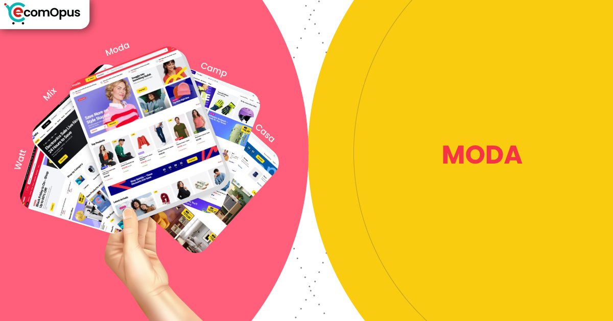
Presets
Presets matter because they change the mood before a shopper reads a single word. Even within the same theme family, a preset can shift how bold the typography feels, how dense product grids appear, and how promotional the layout behaves. This helps if your brand evolves over time or you want different vibes for different audiences without rebuilding the entire structure. The table below highlights the presets available and how they typically “feel” once real products replace demo content.
| Preset | Aesthetic Vibe | Where It Shines | Noteable Tweaks |
|---|---|---|---|
| Moda | Bold, promo-forward, energetic | Fashion campaigns, launches, fast trend cycles | Louder headline rhythm and strong offer framing |
| Mix | Modern retail balance, versatile | General retail with rotating categories | A steadier layout cadence for broader catalogs |
| Camp | Outdoorsy, rugged, product-led | Activewear, gear, adventure brands | More grounded tone that fits utility products |
| Casa | Warm, home-first, curated | Decor, home goods, cozy lifestyle | Softer presentation that supports story sections |
| Watt | Sleek, tech-leaning, crisp | Electronics, gadgets, performance products | Cleaner edge with sharper product emphasis |
Key Features And Highlights
Moda is strongest when you use its built-in mechanics instead of stacking overlapping apps. A lot of Shopify stores start clean and end up feeling like a patchwork of popups, carts, and widgets competing for attention. This theme family’s value shows up when you keep the build intentional and let native sections handle the selling narrative. The table below focuses on features that influence conversion confidence, browsing speed, and day-to-day editing comfort.
| Features | What It Is And Why It Matters? |
|---|---|
| Promotional banners and announcement areas | These give you controlled space for offers, shipping notes, and drop messaging. Used well, they reduce surprise and build urgency without shouting. Keep copy short so the first screen stays readable on mobile. |
| Campaign-ready hero sections | The hero area is designed to carry a clear “what’s happening now” message. It helps when your Shopify store lives on launches, limited offers, or seasonal rotations. Pair it with one primary CTA to avoid choice overload. |
| Collection-first navigation structure | Collection pathways are built to move shoppers quickly from browsing to product grids. This matters when your catalog is broad and discovery is the main job-to-be-done. A tidy menu plan prevents the theme’s boldness from feeling chaotic. |
| Product card clarity and merchandising cues | Strong cards help shoppers compare quickly and trust what they see. This supports faster decision-making, especially for apparel and accessories. Keep badges consistent so they feel like signals, not noise. |
| Quick-buy style purchasing flow | Quick-buy patterns reduce steps for repeat buyers and impulse adds. That can lift conversion when products are simple and well-photographed. Avoid running multiple cart apps that duplicate this behavior. |
| Cross-sell and featured product sections | These sections encourage “one more item” behavior without forcing it. They work best when recommendations are tightly related, like matching accessories or bundles. Treat them like a curated suggestion, not a clearance rack. |
| Flexible homepage section library | A flexible section set lets you rearrange the story without touching code. This is a big deal when you update campaigns weekly or run frequent promos. Consistent spacing keeps the site feeling intentional as you change content. |
| Media-forward product presentation | The layout supports product imagery that does the persuasion work. That’s ideal for brands where texture, color, and styling matter. You still need disciplined compression so the store stays responsive on Shopify. |
| Mobile-first header and navigation patterns | Mobile navigation is designed to stay straightforward while keeping key actions accessible. This protects conversions because most browsing starts on phones. Keep the header lean so tap response stays crisp. |
| Localization and international readiness | The theme is positioned to support global selling expectations. That matters when you want multi-region pricing, language changes, and locale-friendly shopping patterns. Plan translations early so your layout does not break under longer text. |
Theme Experience!
Moda feels like a store that expects shoppers to scroll, scan, and act quickly. The experience is most convincing when product photography is consistent and the first screen tells a simple story: offer, category, and next step. For Shopify merchants, the biggest experience lever is restraint: fewer competing elements create a cleaner sense of control. The table below breaks down how the shopping experience typically lands in practice.
| Experience Area | What Shoppers Feel In Practice? |
|---|---|
| First impression | The store feels energetic and current, like a live promotion. Shoppers quickly understand what to click first. |
| Navigation and discovery | Browsing feels guided instead of endless and random. Categories stay easy to reach without hunting. |
| Product grid browsing | Product lists feel dense but not messy, which suits fast scanning. Shoppers can compare items without losing their place. |
| Product page confidence | The layout encourages quick trust through clear structure and media. Shoppers feel less friction when choosing variants or add-ons. |
| Cart and checkout momentum | The flow keeps buying intent visible while shoppers browse. Fewer interruptions means fewer abandoned decisions. |
| Mobile comfort and tap clarity | Tap targets feel predictable and the layout stays readable. The store feels easier to use when the header stays uncluttered. |
Performance, Explained!
Moda’s performance story is split: desktop feels confidently smooth, while mobile shows a small friction point around interaction responsiveness and server response timing. In real shopper terms, that can look like a tiny delay after taps when the first screen is busy with scripts, large images, or multiple widgets competing early. The good news is that layout stability is strong in this run, which protects trust because the page does not jump around while loading.
For the Moda Shopify Theme, the practical takeaway is simple: keep your app stack lean and treat media optimization as part of the design. If you avoid overlapping cart, popup, and tracking tools, the storefront is more likely to feel “snappy” where it counts, especially on mobile browsing and collection scrolling.
| Performance Parameters | Mobile | Desktop | Remarks |
|---|---|---|---|
| Core Web Vitals Assessment | Failed | Passed | Mobile falls short mainly due to interaction and response signals. Desktop clears the bar and feels more dependable during browsing. |
| Largest Contentful Paint (LCP) | 2.4 s | 2 s | The main visual appears quickly enough to keep attention. Desktop feels slightly more immediate when loading the first screen. |
| Interaction to Next Paint (INP) | 210 ms | 66 ms | Mobile taps can feel a bit delayed under load. Desktop interactions should feel crisp during filters, carts, and navigation. |
| Cumulative Layout Shift (CLS) | 0 | 0.08 | Mobile stays visually steady and reduces mis-taps. Desktop shows mild movement that can feel distracting on first load. |
| First Contentful Paint (FCP) | 1.7 s | 1.4 s | Content appears early, lowering bounce risk. Desktop reaches “ready to browse” faster and more consistently. |
| Time to First Byte (TTFB) | 1.1 s | 0.8 s | Server response is heavier on mobile networks. Faster response improves the feeling of instant control for shoppers. |
Mobile optimization should focus on protecting tap responsiveness, because that is where impatience turns into exits. Desktop is already strong, so the goal is keeping it stable as you add apps, tracking, and richer media.
Pricing
Moda is priced at $380, placing it in the premium Shopify theme tier where the question is return on simplicity, not just looks. The value makes sense when the theme’s built-in promotional structure replaces multiple paid apps for banners, quick-buy patterns, cross-sells, and merchandising sections that often pile up over time. If you already plan to run frequent campaigns, launches, and seasonal edits, the cost can be easier to justify because it saves design time and reduces “fixing the Frankenstein stack” later.
The smarter evaluation is total ownership cost. If your build stays disciplined and you rely on native sections first, Moda can feel like a one-time investment that keeps your store consistent as you grow. If your brand identity is still changing weekly, waiting until your content and photography stabilize can prevent purchase regret.
Stores Build with Moda Shopify Theme
Because this preset is still gaining adoption, verifiable live-store examples are currently limited. We avoid listing stores unless we can reliably validate usage, since Shopify storefronts often customize a theme heavily and can drift far from the original preset feel. What you can do today is use the demo structure as your baseline, then test your own build with real products, real photography, and your actual app stack. As more confirmable examples emerge, this section will be updated with practical observations about homepage pacing, collection behavior, and product page clarity in real-world conditions.
Themes Similar to Moda
Moda sits in the energetic retail lane: bold messaging, fast discovery, and campaign-friendly structure. Themes that feel similar usually overlap in two ways: they make promotions easy to run, and they keep product browsing efficient at scale. The difference is often in tone, some lean more premium and editorial, others lean more high-volume and sales-driven. The table below lists comparable themes and explains why they land in the same neighborhood.
| Shopify Theme | FREE or Paid? | Why is it Similar? |
|---|---|---|
| Impulse | Paid | Impulse is built for promotions, urgency, and fast product discovery. It similarly supports campaign-heavy stores that need conversion mechanics without excessive custom work. |
| Broadcast | Paid | Broadcast blends brand storytelling with strong merchandising control. Like Moda, it helps stores run frequent campaigns while keeping the layout structured and readable. |
| Prestige | Paid | Prestige targets high-end presentation with strong visual rhythm and sections. It overlaps when you want bold hero storytelling, but it leans more luxe than loud. |
| Symmetry | Paid | Symmetry focuses on scalable navigation and reliable collection browsing. It is similar when your priority is clean structure that stays consistent as catalogs grow. |
| Dawn | FREE | Dawn offers a clean baseline that can be styled toward many retail looks. It can approximate Moda’s clarity, but you will do more work to reach the same campaign punch. |
Pros and Cons
Moda shines when your storefront is meant to feel active, current, and easy to shop quickly. The strongest wins come from its campaign-friendly structure, scannable product browsing, and layout rhythm that keeps calls-to-action obvious. The main risks are not “bad design,” but build discipline: heavy apps, messy headers, and oversized media can dull responsiveness. The table below balances the practical advantages against the most common friction points.
| Pros | Cons |
|---|---|
| Promo layout makes offers feel unmistakable. Shoppers find the deal fast. | Mobile taps can lag with heavy scripts. Extra widgets amplify delay. |
| Product grids support quick scanning. Comparisons feel easy and calm. | Bright layouts punish inconsistent photography. Weak assets look more obvious. |
| Sections simplify frequent homepage updates. Campaign swaps stay manageable. | Too many promo blocks feel noisy. Shoppers can lose focus. |
| Navigation stays clear for many collections. Discovery feels guided, not random. | Custom edge cases may need code. Non-technical teams might need help. |
| Quick-buy flow reduces checkout friction. Repeat buyers move faster. | |
| Desktop experience feels confident and smooth. Browsing stays comfortable at scale. | |
| Built-in merchandising cuts app dependency. The store feels more consistent. |
Our Rating
Ratings only matter if they reflect long-term store ownership, not demo-page charm. We scored Moda based on how well it supports frequent merchandising, how comfortable it feels to edit month after month, and what the performance signals imply for real shoppers. Because broad merchant sentiment is not yet available, these ratings emphasize observable structure and practical build outcomes. The table below summarizes how the Moda Shopify Theme performs across the six categories that most often decide whether a paid theme feels worth it.
| Parameters | Our Ratings | Summary |
|---|---|---|
| Feature depth | 4.6/5.0 | The section set supports promotions, discovery, and fast browsing patterns. Most stores can reduce add-on apps by using native merchandising blocks first. |
| Design and customization | 4.5/5.0 | The preset is bold but still structured, which makes it easier to keep consistent. Customization feels safer when you keep typography and spacing disciplined. |
| Performance | 4.2/5.0 | Desktop performance is strong and should feel smooth in most builds. Mobile responsiveness depends heavily on keeping scripts and media lean. |
| Value for money | 4.3/5.0 | The price is easier to justify when it replaces multiple conversion and promo apps. If your store updates weekly, the saved design time becomes real value. |
| Support and updates | 4.1/5.0 | As a newer release, broad support sentiment is still forming publicly. Plan for a careful staging process so updates and changes stay predictable. |
| Overall | 4.4/5.0 | Moda is a strong fit for campaign-driven retail brands that value speed and clarity. It performs best when merchants build with restraint and consistency on Shopify. |
User Reviews: What Merchants Say
This theme is one of the latest releases, and currently, there is limited information available about live stores and merchant feedback. At eComOpus, we focus only on sharing credible and verified insights. Our team is actively working on gathering real-world data from merchants and store owners using this theme. This section will be updated as soon as reliable information becomes available.
From an editorial standpoint, this lack of feedback should be treated as a neutral signal, not a negative one. Newer themes often take time to accumulate meaningful reviews because merchants need weeks of real selling, editing, and troubleshooting before they can judge the ownership experience. If you are considering Moda, the best substitute for public sentiment is careful testing with your own catalog, your own photography, and the exact apps you plan to run.
Team ProQuotient’s recommendation is to stage the build, test mobile browsing flows, and validate conversion behavior before committing fully. Focus on whether the theme’s campaign-forward rhythm matches how your brand actually sells. As verified merchant patterns emerge, we will add what people praise, what they struggle with, and what setup choices consistently lead to better outcomes.
Our Verdict
Moda is built for merchants who treat their storefront like an active retail floor, not a static brochure. If you run frequent launches, rotate collections often, and want promotions to feel native rather than bolted on, this theme’s structure can be a genuine advantage on Shopify. The preset’s strength is clarity at speed: it helps shoppers scan, choose, and move forward without second-guessing what to do next. In our review pass, the best results come when you keep the story simple and the layout consistent.
Performance is the one area where your build choices decide the outcome. Desktop looks strong, while mobile shows sensitivity around interaction timing and response, which is often where app sprawl and heavy media cause trouble. If you treat the Moda Shopify Theme as a system, rely on native sections first, and keep the header and cart behavior uncluttered, you can preserve the energetic feel without sacrificing comfort. If you want a quiet, minimal gallery-like store, Moda may feel too “on” for your brand’s tone.
Who Should Buy Moda
Moda is a strong buy for merchants who live in campaigns, launches, and seasonal refresh cycles. It suits brands that want promotions to feel like part of the design, not an interruption layered on top. The theme rewards consistent photography, tidy category planning, and a restrained approach to apps that affect carts and popups. If your Shopify strategy depends on keeping shoppers moving fast through collections, Moda’s structure supports that goal.
| Best-Fit Buyer Profile | Why Moda Fits | What They Will Love Most | Smart Setup Move |
|---|---|---|---|
| Fashion brand with weekly drops | Promo rhythm matches launch cadence | Fast browsing and obvious CTAs | Keep hero copy short and direct |
| Lifestyle store running frequent promos | Sections support constant offer rotation | Campaign edits without rebuilding | Use native promo blocks before apps |
| Accessories brand with broad catalog | Product grids help quick comparison | Scannable collections that convert | Build a clean collection hierarchy first |
| Streetwear store with high traffic spikes | Structure reduces browsing confusion | Clear navigation under urgency | Limit scripts on the first screen |
| Multi-region brand expanding globally | Layout supports scalable storefront logic | Consistent experience across markets | Plan translations early for longer text |
Who Should Not Buy Moda
Moda is not ideal for merchants who want extreme minimalism, slow storytelling, or a boutique gallery vibe with very few promotional cues. It can also be a poor fit if your brand assets are inconsistent, because bold layouts make weak photography and messy typography stand out quickly. If you dislike structured design systems and want unlimited freedom to rearrange everything, you may feel boxed in by a theme built for predictable retail patterns. For Shopify builders who stack many overlapping apps, the experience can become noisy and less responsive.
| Not-Ideal Buyer Profile | Why It Can Be A Poor Fit | What They Will Likely Struggle With | Better Approach |
|---|---|---|---|
| Ultra-minimal luxury brands | The vibe is more energetic than quiet | Keeping the tone calm and airy | Choose a more editorial premium theme |
| Brands with inconsistent photography | Bold structure exposes asset gaps | Making pages feel cohesive | Fix imagery standards before switching |
| Heavy app stack merchants | Overlaps can create conflicts | Mobile responsiveness and clutter | Audit apps and reduce duplicates first |
| Extreme layout customizers | Theme system favors structure | Pure freedom without constraints | Pick a developer-first flexible theme |
| Story-first content publishers | Promotions may feel too frequent | Long-form storytelling pacing | Use a narrative-led theme approach |
GET THE BEST APPS IN YOUR INBOX
Don't worry we don't spam