Local Shopify Theme Review: Retail-Ready Design for Food & Multi-Location Sales
Local is a premium theme for food, retail, and multi-location brands, blending clean design with practical pickup, discovery, and conversion tools.
- Built for local selling with store selector
- Food-first features: nutrition, ingredients, and age gates
- Sticky cart and quick buy reduce friction
- Mega menu plus filters keep browsing tidy
- Flexible sections let pages evolve fast seasonally
- Responsive support reputation lowers build stress greatly

Introduction
Local is built for merchants who sell online but still think in real-world terms, pickup windows, store shelves, tasting tables, and staff answering “Is this in stock?” without needing a detective badge. In the theme preview, the layout rhythm feels intentional and organized, with enough breathing room for premium photography while still keeping the shopping path obvious. It’s the kind of design that can look boutique-simple on the surface, yet hides a surprisingly robust toolkit underneath.
What makes Local feel different from many “clean” themes is that it’s not only chasing aesthetics, it’s chasing practical retail moments. You can surface local availability, guide customers toward pickup, and keep key product info like ingredients, nutrition, or usage details readable instead of buried. That matters most for food, drink, wellness, and any brand where trust is built through clarity.
Merchant feedback reinforces that same story from the field. Repeatedly, store owners describe the theme as flexible, easy to use, and strongly supported by a fast human team when customization gets tricky. There’s also a realistic note that highly specific demands may require some coding, which is fair for a theme that offers a deeper set of options than a “set it and forget it” template.
Ideal For Niches With Supporting Features
Local has a very specific kind of confidence: it doesn’t try to become everything for everyone, but it does cover a lot of “real store” scenarios exceptionally well. The theme’s feature set naturally supports brands where product education, availability, and fast repeat purchasing matter as much as the hero image. It also suits catalogs that need clean navigation, since discovery tools are built in rather than bolted on later. The table below shows niches where Local’s default strengths translate into smoother shopping and fewer extra apps.
| Niches | Supporting Features | Why They Matter? |
|---|---|---|
| Food and drink brands | Ingredients or nutritional information, age verifier, product videos | Food shoppers decide with details, not vibes, so structured info reduces hesitation. Age gates protect compliance without wrecking the shopping flow. |
| Multi-location retailers | Store selector, in-store pickups, enhanced search | Shoppers want to know what’s available nearby before they commit. A store selector turns location into confidence instead of confusion. |
| Specialty grocery and pantry goods | Quick buy, stock counter, product tabs | Many purchases here are repeat-driven, so quick buy keeps friction low. Tabs and counters help shoppers compare without endless scrolling. |
| Coffee, tea, and subscription consumables | Cross-selling, recommended products, slide-out cart | Bundles and add-ons raise order value when they feel natural. A slide-out cart keeps the “add more” moment alive without derailing browsing. |
| Wellness, supplements, and functional products | Usage information, trust badges, FAQ page | These buyers need reassurance and instructions in the same breath. Clear guidance plus visible trust cues improves decision comfort. |
| Beauty and skincare with ingredient focus | Before/after image slider, high-resolution images, product badges | Visual proof and ingredient clarity often make the sale here. Strong media tools let proof live on-page instead of hiding behind extra apps. |
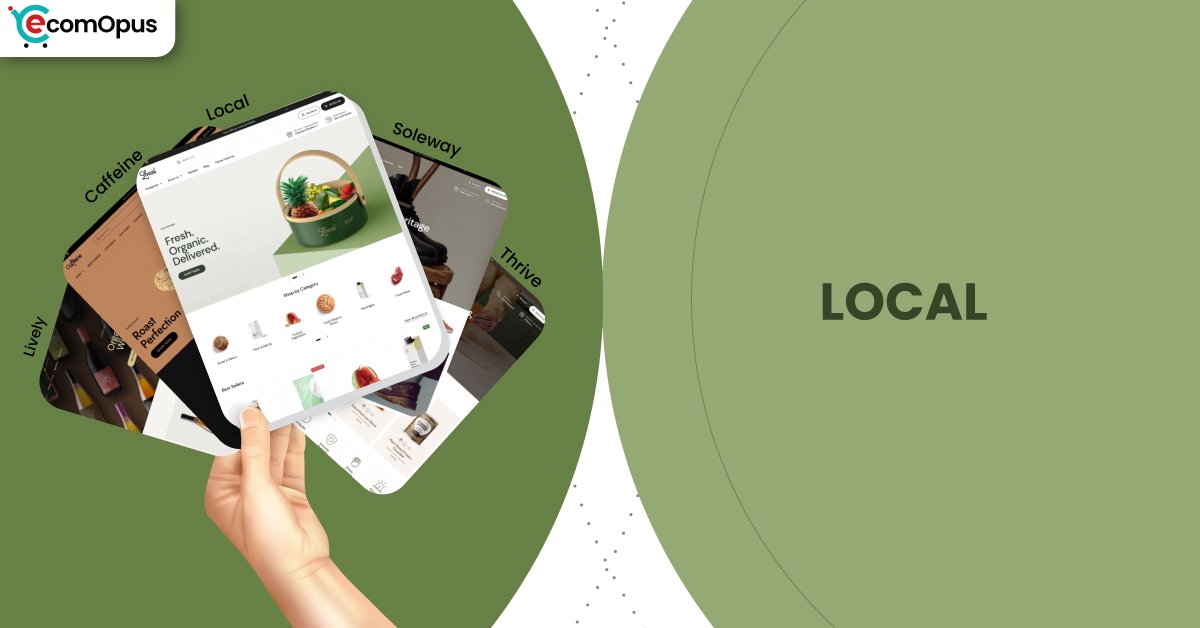
Presets
Presets matter because they decide your store’s starting “tempo,” how much whitespace you get, how bold the typography feels, and how quickly a shopper’s eye lands on products versus storytelling. Local includes multiple ready-made designs that share the same engine, so you can switch vibes without rebuilding your store architecture. This is especially useful if your catalog evolves from simple product pages to content-heavy launches, seasonal edits, and promotional campaigns. The table below breaks down the included presets and what they tend to do best.
| Preset | Aesthetic Vibe | Where It Shines | Noteable Tweaks |
|---|---|---|---|
| Local | Clean retail clarity with modern warmth | Food, drink, local-first storefronts | Balanced homepage pacing and practical selling blocks |
| Soleway | Minimal, airy, boutique-sleek | Premium goods, curated catalogs | Extra whitespace and calmer visual density |
| Thrive | Energetic and promo-aware | Campaigns, launches, seasonal pushes | Stronger callouts and bolder merchandising rhythm |
| Caffeine | Cozy editorial with product-forward focus | Coffee, tea, roasters, subscriptions | Content-friendly sections with a tactile feel |
| Lively | Bright, playful, approachable | Small brands, community-driven shops | Lighter mood with friendly browsing cues |
Key Features And Highlights
Local’s feature list is long, but the real advantage is how those features connect into a single shopping system rather than a pile of disconnected tricks. Many themes can technically do “quick buy” or “badges,” yet still feel messy once you add real content and start running promotions. Local keeps the experience structured: discovery stays tidy, product pages stay readable, and cart moments stay close to the shopper’s thumb. The table below highlights the features that most directly impact conversion, trust, and day-to-day store operations.
| Features | What It Is And Why It Matters? |
|---|---|
| Store selector | The store selector helps shoppers connect availability to a location context rather than guessing. It supports in-person selling without turning your online store into a separate universe. |
| In-store pickups | Pickup options add a “buy now, get soon” pathway that can reduce shipping anxiety. It also helps local shoppers feel the brand is nearby, not faceless. |
| Ingredients and nutritional information | Dedicated info patterns keep sensitive details readable and consistent across products. This improves trust because shoppers can validate what they’re buying without hunting. |
| Age verifier | Age gating is handled as a native conversion checkpoint rather than a clunky popup add-on. It keeps compliance in place while preserving a smooth path back to shopping. |
| Sticky cart and slide-out cart | Sticky and slide-out cart behavior keeps checkout intent visible during long reads. It reduces the “where did my cart go?” moment, especially on mobile. |
| Quick buy and quick view | Quick buy supports repeat purchases and fast restocks from collection pages. Quick view speeds comparison, which is valuable when shoppers are choosing flavors, sizes, or bundles. |
| Cross-selling and recommended products | Built-in recommendations create a clean upsell moment without heavy app stacking. When paired with good merchandising, it can lift average order value naturally. |
| Mega menu and in-menu promos | A mega menu makes larger catalogs feel organized instead of overwhelming. In-menu promos guide shoppers to seasonal collections without redesigning the whole header. |
| Before/after slider and rich media support | Before/after sections turn proof into an interactive story, not a wall of claims. Strong video and gallery support keeps product pages persuasive without clutter. |
Theme Experience!
Theme experience is the “felt sense” of shopping: how quickly things make sense, how calm the pages stay, and how often a shopper gets interrupted by friction. Local generally feels composed and deliberate, with features that support discovery and decision-making rather than distracting from it. It also stays friendly to catalogs that grow over time, since navigation tools and product page structure don’t collapse as you add more SKUs. The table below breaks down the key experience areas and what shoppers typically feel in practice.
| Experience Area | What Shoppers Feel In Practice? |
|---|---|
| First impression | The store feels clean and trustworthy from the first screen. Shoppers see product intent quickly without feeling pushed. |
| Navigation and discovery | Menus feel structured, which reduces “lost in the header” browsing. Shoppers reach the right collection faster with fewer taps. |
| Collection browsing | Grids stay readable, and scanning feels calm over long scrolls. Shoppers can compare items without layout chaos or visual fatigue. |
| Product page clarity | Details like ingredients, usage, and delivery can be presented in a predictable order. Shoppers get answers without losing the buying path. |
| Local pickup confidence | Pickup options make the store feel nearby and practical. Shoppers feel reassured when fulfillment choices are transparent. |
| Cart and checkout flow | Sticky and slide-out cart patterns keep momentum intact. Shoppers feel in control because cart edits don’t require page hopping. |
| Promotional guidance | Badges, timers, and promo blocks feel integrated when used with restraint. Shoppers notice offers without the store turning into a banner maze. |
Performance, Explained!
Local’s desktop experience feels more confident than mobile in real-user terms, which matches the Core Web Vitals outcome shown in the screenshots. On mobile, the page loads and stabilizes well, but interaction responsiveness is the likely culprit behind the failing assessment, meaning taps can feel slightly delayed when multiple scripts compete. Desktop passes comfortably, so browsing, filtering, and cart interactions tend to feel crisp during longer sessions.
The practical takeaway is simple: Local gives you a solid foundation, but your app stack and media discipline will decide the final feel on phones. Keep animations purposeful, compress large imagery, and avoid stacking multiple cart or popup tools that fight the theme’s native behavior. If you treat the theme like a system, not a scrapbook, the experience stays smooth.
| Performance Parameters | Mobile | Desktop | Remarks |
|---|---|---|---|
| Core Web Vitals Assessment | Failed | Passed | Mobile is sensitive to interaction timing under load. Desktop stays stable and responsive for most shopping flows. |
| Largest Contentful Paint (LCP) | 2.1 s | 1.8 s | Main content appears quickly on both devices. This supports strong first impressions for image-led storefronts. |
| Interaction to Next Paint (INP) | 240 ms | 75 ms | Mobile taps can feel slightly delayed during heavier pages. Desktop interactions feel immediate and clean. |
| Cumulative Layout Shift (CLS) | 0 | 0.08 | Mobile layout stability is excellent and reduces mis-clicks. Desktop shows mild movement, usually not disruptive in practice. |
| First Contentful Paint (FCP) | 1.1 s | 1.2 s | Shoppers see content early, which helps reduce bounce risk. The store feels “alive” quickly even before everything finishes loading. |
| Time to First Byte (TTFB) | 0.3 s | 0.3 s | Server response is healthy and consistent across devices. Most slowdowns will come from assets and scripts, not the initial handshake. |
Mobile success here is mostly a discipline story, not a theme flaw. If you keep third-party scripts lean, Local’s interactions can feel far closer to its desktop experience.
Pricing
Local is priced at $360, and it sits in the premium tier where the real question is not “Is it pretty?” but “Does it replace recurring app costs and reduce build headaches?” The theme includes serious conversion and merchandising tools like sticky cart, slide-out cart, cross-selling, quick buy, strong discovery features, and food-friendly detail blocks, which can reduce the need for multiple add-ons. If you sell in person, pickup-focused features and the store selector can also replace custom development that many merchants otherwise pay for. The best value shows up when you use what’s built in and avoid stacking overlapping apps that slow mobile interactions.
Stores Build with Local Shopify Theme
Live usage signals matter because they show whether a theme holds up beyond a demo environment, with real products, real imagery, and real operational pressure. Local is currently used by storefronts that fit its strengths, food and drink, local-first retail, and brands that benefit from clear product detail. Examples include Craft a Brew, Brentos, Sweet Greek, and Field Tacoma, each showing a different way to balance story and shopping. The variety suggests the theme can flex across boutique catalogs and broader collections, as long as the build stays intentional and not app-heavy.
Themes Similar to Local
Themes are rarely true twins, but you can group them by “intent,” and Local’s intent is clear: structured product storytelling, strong discovery, and conversion helpers that don’t clutter the page. Some alternatives lean more editorial, while others lean more promotional, but they overlap with Local’s focus on clarity and practical selling tools. The comparison table below highlights themes that are commonly cross-shopped in the same decision space. Use it to evaluate trade-offs in vibe, flexibility, and how much you’ll need to add through apps.
| Shopify Theme | FREE or Paid? | Why is it Similar? |
|---|---|---|
| Taste | FREE | Taste also suits food brands with an emphasis on product clarity. It’s simpler than Local, so you may rely more on apps for advanced selling features. |
| Crave | FREE | Crave supports bold food merchandising and quick browsing patterns. It overlaps on industry fit, but Local offers deeper local-selling tools and structure. |
| Craft | FREE | Craft shares a calm, trust-forward layout style that rewards good imagery. Local goes further with practical conversion and pickup-oriented features. |
| Prestige | Paid | Prestige also targets premium presentation with strong storytelling sections. Local is more operationally focused for local retail and food-specific needs. |
| Broadcast | Paid | Broadcast overlaps on merchandising and promotional flexibility. Local feels more grounded in structured details and in-person selling workflows. |
Pros and Cons
Local’s strengths show up when you want a store that behaves like a real retail operation, not just a pretty landing page. It gives you the tools to explain products clearly, guide shoppers toward pickup, and keep buying actions visible while people browse. Its limitations are mostly about complexity and discipline: the theme can do a lot, but you still need to keep your build intentional. The table below balances the practical advantages against the most common friction points merchants run into.
| Pros | Cons |
|---|---|
| Store selector makes local availability obvious. Shoppers feel confident choosing pickup or delivery. | Very specific custom demands may need coding. Non-technical merchants might require help for edge cases. |
| Food-friendly info blocks keep details scannable. Shoppers trust products faster when facts are visible. | Overloaded apps can hurt mobile responsiveness. Tap delays appear when scripts compete in the header or cart. |
| Sticky and slide-out cart reduce drop-offs. Shoppers keep checkout intent even while reading. | Heavy imagery can slow first impressions. Large photos need compression to stay snappy. |
| Presets offer different moods without rebuilds. Merchants can refresh branding seasonally with less work. | |
| Support reputation reduces launch-week stress. Merchants get answers quickly when blocked. |
Our Rating
Ratings are useful only if they reflect real setup behavior, day-to-day editing, and what happens when your catalog grows. Local scores strongest when merchants use its built-in selling mechanics instead of adding multiple overlapping apps. It also benefits from a clear theme identity: it knows what it’s for, so you spend less time wrestling the design into shape. Merchant sentiment around support strengthens the rating, because reliable help reduces launch risk. The table below breaks down our scoring across the six areas that most directly affect long-term satisfaction.
| Parameters | Our Ratings | Summary |
|---|---|---|
| Design Quality | 4.6/5.0 | Clean spacing and hierarchy make products feel credible and premium. Presets give flexibility without breaking consistency. |
| Ease Of Setup | 4.5/5.0 | Sections are approachable, especially if you follow a simple homepage plan first. More advanced builds may need light technical confidence. |
| Feature Depth | 4.7/5.0 | The theme includes strong merchandising, conversion, and food-friendly detail tools. Many stores can reduce app dependency by using these native features. |
| Conversion Support | 4.6/5.0 | Sticky cart, quick buy, and cross-sell patterns help shoppers commit faster. Results are strongest when promo elements are used with restraint. |
| Mobile Experience | 4.2/5.0 | Layout stability is excellent and readability stays high. Interaction responsiveness depends heavily on scripts and app choices. |
| Support And Updates | 4.8/5.0 | Merchant feedback consistently highlights fast, helpful responses. Frequent improvements reduce the “theme goes stale” risk over time. |
User Reviews: What Merchants Say
Merchant sentiment around Local is overwhelmingly positive, and the praise clusters around two themes: the design feels clean and modern, and the support team responds quickly with real solutions. Several reviews highlight that the theme is easy to customize even for non-experts, while still being flexible enough for stores that need more complex layouts. One merchant specifically called out “very fast and competent human support team,” which matches the broader pattern of people feeling looked after during setup.
A second pattern is industry fit, especially for food and drink. Multiple store owners mention that Local works beautifully for food ecommerce, and that the theme makes their products look refined without clutter. There’s also a practical note that if you have highly specific demands, you may need some coding knowledge, but that the support team often bridges that gap quickly.
Even the rare negative feedback reads like a solvable bump rather than a deal-breaker, such as image presentation issues in collections that required support attention. The most useful takeaway is that merchants aren’t only complimenting the “demo look,” they’re describing ongoing improvements, fast fixes, and a theme that stays usable as their store evolves.
Our Verdict
Local is a strong recommendation for merchants who want a modern storefront that sells with clarity and supports local-first workflows without awkward workarounds. Its biggest strength is how well it blends product storytelling with practical selling mechanics, quick buy, sticky cart, cross-sells, and structured information blocks that keep trust high. If you sell food, drink, wellness, or anything that benefits from “proof and process,” Local makes those details feel native rather than bolted on.
Desktop performance looks solid, and the overall experience feels composed when the build stays disciplined. On mobile, the main watch-out is interaction responsiveness, which is less about the theme’s layout and more about what you add on top of it. If you keep your app stack lean, compress your media, and avoid duplicating cart and popup functionality, Local can feel smooth and premium on phones too.
Merchant feedback strengthens the verdict because it repeatedly points to fast, reliable support, which is one of the biggest hidden ROI factors in any paid theme. In short, Local isn’t just a nice storefront, it’s a practical retail toolkit wearing a clean design suit.
Who Should Buy Local
Local is best for merchants who want a storefront that feels calm and premium while still behaving like a practical sales machine. It shines when you need clear product education, fast repeat buying, and local-friendly fulfillment options without custom development. It also fits teams that value reliable support, because complex builds become easier when answers arrive quickly. The table below shows the buyer profiles that tend to get the most value from Local.
| Best-Fit Buyer Profile | Why Local Fits | What They Will Love Most | Smart Setup Move |
|---|---|---|---|
| Food and beverage brands | Built-in nutrition and ingredient patterns suit the category | Clean product pages that build trust fast | Standardize product info blocks across SKUs |
| Multi-location retailers | Store selector supports local availability and context | A “near me” feeling without hacks | Configure locations early, then map inventory logic |
| Subscription consumables | Cross-sell and quick buy support add-ons and repeats | Higher cart volume with fewer clicks | Use bundles sparingly and keep pages uncluttered |
| Wellness and functional products | Usage info and trust cues reduce hesitation | Clarity that feels guided, not salesy | Turn FAQs into a reusable product template section |
| Merchants who sell in person | Pickup features make local conversion smoother | A seamless bridge between online and offline | Highlight pickup benefits near the buy button |
Who Should Not Buy Local
Local is not ideal for merchants who want a highly experimental, animation-heavy, “anything goes” layout style. It’s built to be structured and readable, so brands chasing chaotic maximalism may feel constrained by its disciplined rhythm. It can also be a poor fit if your strategy depends on stacking many overlapping apps, because mobile interaction performance is the first place that can suffer. The table below shows profiles that should consider a different approach.
| Not-Ideal Buyer Profile | Why It Can Be A Poor Fit | What They Will Likely Struggle With | Better Approach |
|---|---|---|---|
| Maximalist, collage-style brands | The design system favors clarity over visual chaos | Making the layout feel intentionally “messy” | Choose a theme designed for high-motion creativity |
| App-heavy conversion stack users | Extra scripts can degrade mobile responsiveness | Tap delays and competing cart behavior | Use fewer apps, or pick a theme built for overlays |
| Stores with weak product photography | Clean layouts expose content quality quickly | Making products look premium without assets | Invest in imagery first, then keep sections minimal |
| Merchants needing extreme custom logic | Edge cases can require coding beyond settings | Spending time in developer loops | Use a more developer-first framework theme |
| Brands with huge catalogs and deep taxonomy | Local can handle growth, but requires strong IA | Keeping navigation perfectly organized | Plan collections carefully, use filters thoughtfully |
GET THE BEST APPS IN YOUR INBOX
Don't worry we don't spam


