Horizon Shopify Theme Review: Modern AI Blocks With Clean, Conversion Flow
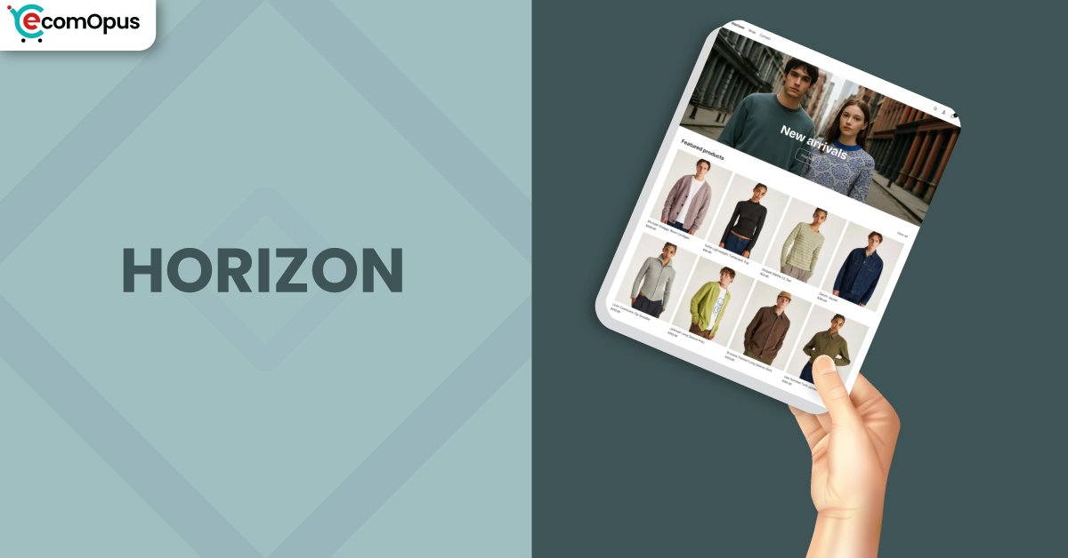
Horizon is a FREE Shopify theme designed for brands that want a modern storefront without the paid-theme overhead. It blends polished typography, flexible sections, and AI block generation to speed up iteration.
- FREE theme with modern, editorial styling
- AI block generation for quicker builds
- Strong mobile layout with clean spacing
- Desktop navigation needs thoughtful setup
- Solid product pages with rich media
- Best for brands evolving their catalog

Introduction
Horizon sits in Shopify’s free theme lineup as the “new-school” option: bolder layouts, more modular sections, and a stronger bias toward product-first storytelling. If you have a catalog that needs structure more than decoration, this theme tends to keep your pages tidy while still feeling current. It also nudges you into Shopify’s newer workflows, which can be a win for stability, but a surprise if you’re coming from older setups.
Where Horizon Shopify Theme really stands out is momentum. You can assemble a credible homepage, collection layout, and product page quickly, then refine it in layers instead of rebuilding from scratch. The catch is that some merchants report friction around updates, mobile edge cases, and navigation control, so it rewards a slightly methodical build process.
Ideal For Niches With Supporting Features
Horizon can flex across categories, but it shines brightest when you lean into its clean grids and content blocks rather than forcing heavy, app-like behavior into every section. The table below highlights niches where the theme’s default layout decisions feel naturally aligned with how shoppers browse. Each niche also reflects common patterns found in merchant feedback, especially around navigation, image handling, and product discovery. Use this as a quick “fit check” before you invest time in fine-tuning.
| Niches | Supporting Features | Why They Matter? |
|---|---|---|
| Apparel and fashion | Variant buttons, quick-buy cards, bold grids | Clothing stores live and die by skimmability, and Horizon keeps collections readable without visual clutter. The variant UI is clean, though you may need extra work for more advanced swatch behavior. |
| Beauty and fragrances | Story sections, clean typography, promos | Beauty shoppers respond to clarity and trust signals, and Horizon’s spacing helps products feel premium without trying too hard. It also supports layered content, so you can explain benefits without turning pages into essays. |
| Posters and home decor | Media-forward hero, image grids, simple blocks | Decor catalogs often mix portrait and landscape images, and Horizon is meant to adapt to mixed media. If your cards look uneven, you’ll likely adjust image ratios early to keep browsing smooth. |
| Fitness and sports gear | Strong CTA layouts, structured product pages | Activewear and gear stores need direct calls-to-action and straightforward product info, and Horizon makes that feel natural. It supports fast decision paths, but large catalogs may require careful collection optimization. |
| Gifts and specialty goods | Multi-column features, badges, announcements | Gift stores benefit from bundles, highlights, and quick context, and Horizon’s sections help you package that neatly. You may still rely on apps for deeper upsell mechanics, but the base layout stays clean. |
Presets
Horizon is presented as a single, modern preset style that leans into clean typography, roomy spacing, and confident product grids. Instead of giving you multiple “skins,” it focuses on flexible building blocks and expects you to shape the vibe using color schemes, content sections, and imagery. That approach keeps the theme cohesive, but it also means the personality comes from your brand assets more than from preset variety.
If you like to test layouts quickly, Horizon’s structure supports that workflow well, especially when you treat sections like modules you can rearrange and refine. For brands migrating from older free themes, the biggest adjustment is learning where settings live and how desktop and mobile behaviors sometimes require separate attention.
Key Features And Highlights
Horizon Shopify Theme is built around the idea that a storefront should be assembled in “chunks” that you can swap, tune, and upgrade without unraveling your entire design. The theme emphasizes modular sections, crisp presentation, and a layout rhythm that keeps product browsing predictable. It also introduces AI block generation as a practical shortcut, not a decorative gimmick, when you need new sections fast. The table below breaks down the features that matter most in real builds, not just demos.
| Features | What It Is And Why It Matters? |
|---|---|
| AI block generation | Horizon includes AI-assisted blocks that help you generate new layout sections quickly without starting from a blank canvas. This matters when you’re iterating on landing pages or seasonal promos and want speed without sacrificing structure. Treat it as a draft tool, then refine spacing and hierarchy for your brand. |
| Modern section library | The theme ships with contemporary sections like multi-column layouts, media blocks, and content modules that feel designed for today’s scrolling habits. This matters because you can build depth without installing a pile of extra page-builder apps. It also helps keep visual consistency as your site grows. |
| Flexible header behavior | Horizon provides header layout options that let you adjust logo position and balance navigation elements across desktop layouts. This matters because many stores want a “brand-first” header without losing utility icons and menus. It’s powerful, but you may spend time tuning desktop navigation to match your ideal. |
| Collection browsing structure | Product grids are clean and modern, with layouts that prioritize scanning and quick comparisons. This matters because collections are where most shoppers decide whether your store feels easy or exhausting. If you have a large catalog, the theme’s organization helps, but performance depends on how heavy your pages become. |
| Product media presentation | Horizon is designed to make product media feel intentional, with galleries that support a modern shopping flow. This matters because shoppers want clarity, especially when variants or details change the look of a product. Keep your media sizing disciplined, or you can end up with inconsistent cards across collections. |
| Variant selection UI | Variant selectors are styled to look clean and modern, especially when using button-style options. This matters for apparel and multi-option products because it reduces “choice friction” during selection. Some merchants still want more granular control, so advanced behaviors may need extra customization. |
| Cart and checkout flow | Horizon supports a streamlined cart experience that keeps checkout intent high and distractions low. This matters because a clean cart interaction can reduce abandonment, especially on mobile. If you require deep cart editing or complex upsells, you may still rely on apps. |
| Styling and typography control | The theme’s fonts and spacing choices feel polished out of the box, and color schemes let you shift mood without redesigning structure. This matters because many free themes look generic until you fight the styling system. Horizon’s base is strong, but your brand assets still do the heavy lifting. |
| Search and discovery | Search and browsing behaviors are built to feel quick and predictable, which helps shoppers find products without wandering. This matters for catalogs that rely on exploration rather than single-product ads. If you want advanced filtering logic, the theme can support it, but your setup discipline matters. |
| Update-driven improvements | Horizon is actively refined through updates that add sections and fix rough edges over time. This matters because free themes can stagnate, but Horizon is clearly evolving. The trade-off is that some custom elements, especially AI-generated blocks, may require reapplying after updates. |
Theme Experience!
Horizon is the kind of theme that can feel instantly “put together,” but the day-to-day experience depends on how carefully you configure navigation, media sizing, and section behavior. Many merchants like the modern look, yet some report that certain editor decisions take time to learn, especially when shifting from older Shopify themes. The table below translates the experience into shopper-facing outcomes, because that’s where theme choices become sales or hesitation. Think of this as the practical layer beneath the visual polish.
| Experience Area | What Shoppers Feel In Practice? |
|---|---|
| First impression | The storefront feels modern and structured, with spacing that makes products easier to trust at a glance. Shoppers tend to understand where to look next, which reduces early bounce risk. |
| Collection browsing | Grids feel clean and “scan-friendly,” so shoppers can compare items without visual noise. If pages get heavy, some users may notice a hint of drag while scrolling. |
| Product page clarity | Product pages read like a guided path: media first, then details, then action. The experience stays polished when your content is consistent and your images follow a clear ratio. |
| Variant interaction | Variant selection feels tidy and straightforward, especially for button-based options. If your product setup is complex, shoppers may still hit moments where a choice feels slower than expected. |
| Mobile navigation | Mobile layouts feel clean and organized, which supports fast browsing. Some users on certain devices may experience header oddities, so testing matters if mobile is your main channel. |
Performance, Explained!
Horizon’s real-user results suggest a theme that feels responsive when the site is kept lean, but can stumble on mobile when pages become heavy or interactions stack up. The mobile report shows Core Web Vitals failing, driven more by interaction delay and rendering load than by server response, which hints that front-end complexity is the main pressure point. Desktop performance looks far healthier, which fits the pattern of “great on powerful devices, sensitive on weaker ones.”
In practice, Horizon Shopify Theme performs best when you treat media as a budget and keep sections purposeful. Responsive images, disciplined animations, and fewer “always-on” elements help the theme feel crisp, especially on mobile scroll and variant interactions. If you rely on many apps, large variant sets, or dense metafield-driven layouts, plan on performance tuning as part of launch, not as an afterthought.
| Performance Parameters | Mobile | Desktop | Remarks |
|---|---|---|---|
| Core Web Vitals | Failed | Failed | This suggests the theme can miss consistency thresholds, especially once real browsing patterns kick in. Tightening media weight and interaction load usually yields the biggest wins. |
| Performance Score | 74 | 98 | Mobile performance is respectable but not carefree, meaning heavier sections can tip it into sluggishness. Desktop looks strong, so most friction will show up first on phones. |
| Largest Contentful Paint (LCP) | 3.3s | 2.5s | The main content loads reasonably, but mobile can feel “almost fast” rather than instant. Keeping hero media lightweight helps the first impression land cleanly. |
| Interaction to Next Paint (INP) | 307ms | 73ms | Mobile interaction delay is the key risk: taps can feel slightly behind intent on busy pages. Desktop responsiveness is sharp, reinforcing that device power changes the story. |
| Cumulative Layout Shift (CLS) | 0 | 0.01 | Layout stability is strong, which helps the site feel polished and reduces accidental mis-clicks. Small desktop shifts are minor, but consistent media sizing keeps it cleaner. |
| First Contentful Paint (FCP) | 2.4s | 2.0s | Shoppers see content fairly quickly, so the site does not feel empty for long. The improvement path is usually reducing render-blocking elements and heavy sections. |
| Time to First Byte (TTFB) | 1.6s | 1.1s | The initial response is not the biggest bottleneck, but mobile still carries a noticeable delay. Cleaner assets and fewer third-party scripts often improve perceived speed more than server tweaks. |
| Accessibility Score | 95 | 95 | Strong accessibility signals usually mean cleaner UX for everyone, not just compliance. It also reduces “friction moments” like confusing focus states and unclear hierarchy. |
| Best Practices Score | 77 | 77 | This score suggests there’s room to refine how resources load and behave under stress. Merchants often improve it by trimming third-party scripts and optimizing media delivery. |
| SEO Score | 100 | 100 | Solid SEO hygiene means the theme is not fighting Shopify’s baseline search fundamentals. Your results still depend on content, structure, and how you manage apps and scripts. |
Pricing
Horizon is free, which changes the entire risk equation in your favor. You can launch, learn, and iterate without worrying whether your theme cost is quietly pressuring your timeline or forcing compromises elsewhere. For new stores, that alone makes Horizon Shopify Theme a practical starting point.
The real “cost” is time: navigation tuning, image ratio discipline, and occasional workarounds if you expect premium conveniences baked in. If you’re comfortable treating your first build as a version you’ll refine, Horizon offers strong value without the financial commitment of a paid theme.
Stores Build with Horizon Shopify Theme
It’s easier to trust a theme when you can see how real merchants describe it after the honeymoon phase. Horizon has drawn attention for its modern layouts and the speed at which stores can get to a polished baseline. The most consistent “real-world” positives focus on clean design, strong fundamentals for the price, and the feeling that the theme is actively evolving. Below are examples of merchants who shared positive outcomes while using Horizon.
- Trackify
- Sahara Specialty Foods
- NTrendSic Mystic
- Total Awesomeness
- Alphaside Studios
- The Alternative Bead
Themes Similar to Horizon
Horizon’s closest alternatives usually share two traits: clean grids that prioritize products and a section library designed for modern storytelling. Some themes feel similar in layout philosophy, while others overlap in performance intent or customization depth. The table below gives you comparable options, including both free and paid themes, so you can choose based on how much control you need versus how quickly you want to launch. Think of this as “neighboring streets,” not identical houses.
| Shopify Theme | FREE or Paid? | Why is it Similar? |
|---|---|---|
| Dawn | FREE | Dawn is the classic clean baseline, and Horizon feels like a more modern cousin with bolder section styling. If you value simplicity and stability over newer layout patterns, Dawn can feel calmer to manage. |
| Craft | FREE | Craft shares Horizon’s editorial polish and spacing, especially for brands that want products to feel curated. It’s a good alternative if you prefer a softer aesthetic and a slightly more traditional flow. |
| Sense | FREE | Sense and Horizon both aim for clarity and conversion without visual noise. Sense can feel more straightforward for merchants who want fewer moving parts in navigation and layout behavior. |
| Impulse | Paid | Impulse targets conversion-focused merchandising with strong promotional layouts and product discovery tools. It’s a natural upgrade path if you want more built-in selling mechanics without relying on apps. |
| Prestige | Paid | Prestige overlaps with Horizon’s premium feel and typography-forward presentation. It suits brands that want luxury storytelling and deeper design refinement out of the box. |
Pros and Cons
Pros and cons matter most when they connect to daily operations: editing, updating, browsing, and conversion flow. Horizon has clear strengths in modern design and fast setup, but it also has recurring complaints around navigation and certain mobile behaviors. The table below keeps each point practical and specific so you can map it to your store’s needs. If your “cons” match your non-negotiables, consider a more mature theme or a paid option.
| Pros | Cons |
|---|---|
| Modern layouts look premium fast. Branding clicks quickly. | Mobile performance can feel laggy. Heavy sections amplify it. |
| AI blocks accelerate page experiments. Iteration feels quicker. | Updates may disrupt AI blocks. Reapplying work can be tedious. |
| Strong product pages guide decisions. The flow feels intentional. | Desktop navigation needs patience. Some settings feel unintuitive. |
| Clean spacing improves readability. Shoppers scan collections easily. | |
| Great value as a free theme. Budget stays focused elsewhere. |
Our Rating
A theme rating should reflect how it behaves once your store has real products, real variants, and real apps attached to it. Horizon scores well on design freshness and overall value, while performance and navigation control can vary depending on how complex your setup becomes. The table below summarizes our view across the areas merchants typically feel most strongly about. If your priorities match the higher-rated categories, Horizon Shopify Theme can be a very efficient pick.
| Parameters | Our Ratings | Summary |
|---|---|---|
| Feature Depth | 4.0/5.0 | The section library feels modern and capable for a free theme. Advanced behaviors still rely on apps or customization for many stores. |
| Design and Customization | 4.4/5.0 | The visual baseline is polished and doesn’t look “free” when branded well. Some layout preferences, especially navigation, may require extra tuning. |
| Performance | 3.8/5.0 | Desktop performance looks excellent in real-user signals and feels snappy. Mobile can be sensitive to heavy sections, variants, and third-party scripts. |
| Value for Money | 5.0/5.0 | You get a high-quality Shopify theme without upfront cost pressure. The trade-off is investing time instead of money when you want premium extras. |
| Support and Updates | 4.1/5.0 | The theme appears actively improved, and merchant feedback is acknowledged. Updates can introduce workflow friction if you rely heavily on generated or custom blocks. |
| Overall | 4.2/5.0 | Horizon is a strong modern base for many brands. It’s best when you build with discipline and test mobile behavior early. |
User Reviews: What Merchants Say
Merchant sentiment around Horizon is mixed, with a noticeable cluster of users praising the modern layout and the “paid-theme vibe,” while others flag usability friction once they push the theme beyond simple setups. Several reviewers describe Horizon as a meaningful upgrade from older free themes, especially for mobile presentation and cleaner section styling. At the same time, multiple comments suggest the editor can feel less intuitive at first, particularly when merchants try to make desktop navigation behave like their ideal reference store.
Performance feedback is the loudest dividing line. Some stores describe the theme as fast and polished, while others report lag on mobile devices, especially on scroll-heavy collection pages or when interacting with variants. There are also repeated requests for finer control over mobile and desktop behavior, like separate hero imagery, smoother header interactions, and more flexible carousel handling in content sections. When merchants love the theme, they often love its direction; when they’re frustrated, it’s usually because small UX gaps slow down daily work.
Support experiences range from appreciative to impatient, but the overall pattern suggests Horizon is evolving. One merchant summed up the optimism well: “I think it’s great and consistently getting better.” The safest takeaway is that Horizon works best for merchants who like modern structure and are comfortable testing mobile behavior early, rather than expecting every convenience to be natively built in.
Our Verdict
Horizon Shopify Theme is a strong free option for brands that want a modern storefront without paying for polish. Its layouts feel current, its sections are genuinely useful, and the overall build experience can move quickly when you keep your structure clean.
The theme’s weak spots tend to appear when you demand premium-level control over navigation, cart behavior, or mobile nuance. If you are willing to tune image ratios, keep apps lean, and test on real devices, Horizon becomes a dependable base rather than a constant project.
For most new and mid-sized Shopify stores, Horizon is a practical “launch and refine” theme. It’s not perfect, but it’s pointed in the right direction and offers real value at zero cost.
Who Should Not Buy Horizon
You should avoid Horizon if your store depends on very specific navigation patterns, deep cart editing, or highly customized collection behavior right out of the box. In those cases, a paid theme with mature merchandising features can reduce the amount of custom work you’ll need.
Horizon is also a risky pick if your audience is overwhelmingly mobile and your catalog is heavy with variants, large media, and multiple scripts. You can absolutely optimize it, but if you want performance certainty without tuning, you may prefer a simpler Shopify theme that stays lean by default.
GET THE BEST APPS IN YOUR INBOX
Don't worry we don't spam


