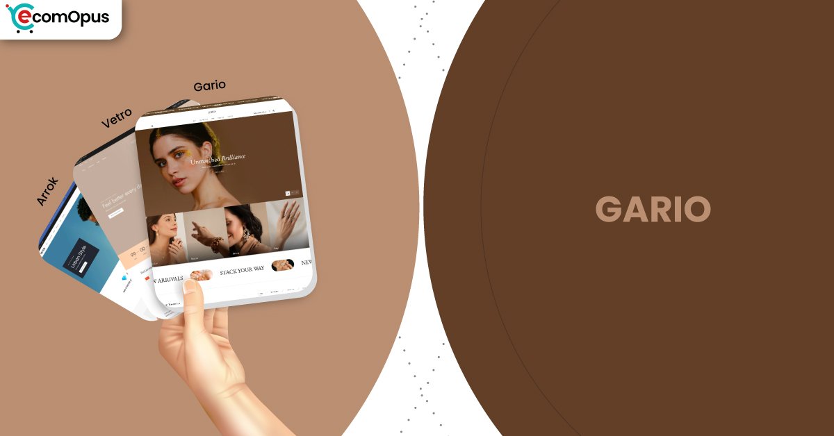
Gario Shopify Theme Review: Luxe Minimal Layouts That Sell Effortlessly
Gario is a premium Shopify theme preset built for brands that want a clean, modern storefront with conversion-friendly details baked in. It pairs a luxurious visual rhythm with practical sections so you can launch fast, then refine without rebuilding everything.
- Luxury-minimal layout that feels premium instantly
- Product media blocks built for storytelling clarity
- Sticky purchase moments keep intent from fading
- Upsell-friendly sections without app-heavy clutter at checkout
- Clean typography and spacing guide browsing calmly
- Support praised for fast human responses always

Introduction
Gario is the kind of Shopify theme preset that doesn’t beg for attention, it earns it. When Team eComOpus explored the layout flow, the first thing we noticed was how confidently it frames products, with generous spacing, crisp type, and sections that make “premium” feel believable. One merchant summed up the experience perfectly: “Stunning design with the best support I’ve experienced.” That line matches what this preset is trying to do, look expensive and behave predictably.
What makes the Gario Shopify Theme feel practical is that it blends polish with real selling mechanics. The sticky add-to-cart behavior, the media-friendly product area, and the built-in highlight moments are designed to keep shoppers moving from curiosity to checkout without friction. If you’re building on Shopify and you want a storefront that looks calm but sells with intent, Gario is built for that lane.
Ideal For Niches With Supporting Features
Gario tends to fit best when your brand benefits from restraint, strong imagery, and structured product storytelling. We looked at how the preset handles browsing, product-page depth, and “decision points” like comparisons and add-ons. The theme’s section library supports both curated catalogs and scalable collections, as long as you keep the presentation disciplined. The table below breaks down where the theme feels most natural and why the fit is strong.
| Niches | Supporting Features | Why They Matter? |
|---|---|---|
| Beauty and skincare | Minimal product pages, structured highlights, clean media blocks | Shoppers want benefits fast, then proof. This layout keeps ingredients and results readable without turning pages into clutter. |
| Premium apparel and accessories | Strong typography hierarchy, image-first merchandising, refined spacing | Fashion sells through mood and detail. Gario’s spacing and grid discipline make products feel curated, not dumped into a catalog. |
| Home decor and lifestyle | Editorial sections, collection framing, large imagery rhythm | Decor buyers compare style and context. The theme gives images room to persuade while keeping navigation predictable during long browsing. |
| Specialty food and small-batch goods | Collapsible detail areas, tidy product templates, quick discovery flow | Food and craft brands need clarity on ingredients and origin. Structured sections help shoppers trust the product without endless scrolling. |
| Tech accessories and modern gadgets | Clean grids, focused product media, conversion-ready add-ons | Gadget buyers skim specs and reviews quickly. A stable grid plus clear product framing reduces hesitation and keeps the path to cart short. |
Presets
Vetro’s preset family is designed around a modern, minimal luxury baseline, then tuned for different merchandising “moods.” Even within the same Shopify theme foundation, each preset direction changes how content density, imagery, and typography feel at first glance. For merchants, presets matter because they decide your default pacing, how fast shoppers scan, and where the page asks for attention. The table below maps the preset options, plus two common build directions merchants often create using the same section system.
| Preset | Aesthetic Vibe | Where It Shines | Noteable Tweaks |
|---|---|---|---|
| Gario | Clean luxury with calm spacing | Beauty, premium goods, brand-led stores | Balanced sections, strong media rhythm, refined hierarchy |
| Vetro | Modern flagship and flexible | General DTC, multi-collection storefronts | Versatile homepage composition, adaptable product framing |
| Arrok | Bold contrast with sharper energy | Streetwear, launches, statement branding | Stronger visual punch, tighter emphasis blocks |
| Gario (Warm Neutral Build) | Soft editorial with cozy polish | Home goods, lifestyle collections | Warmer palette, softer contrast, mood-first photography |
| Gario (High Contrast Build) | Minimal but more decisive | Tech accessories, monochrome brands | Stronger type contrast, sharper buttons, punchier CTAs |
Key Features And Highlights
Gario looks elegant, but its real value shows up in the small mechanics that keep shoppers engaged. Team eComOpus focused on features that reduce the need for extra Shopify apps, strengthen product understanding, and keep the storefront consistent as you add more SKUs. Many themes can look good on a demo homepage, yet feel messy in daily operations when you start updating content weekly. The table below highlights the features that matter most and explains how they affect real store behavior.
| Features | What It Is And Why It Matters? |
|---|---|
| Sticky add-to-cart behavior | This keeps the purchase action visible while shoppers scroll long product pages, which protects intent on mobile where backtracking is common. It also supports faster add-to-cart decisions when your product information is detailed and layered. |
| Before/After slider support | This feature helps visually prove outcomes, which is powerful for beauty, restoration, and transformation-based products. It reduces the need for extra apps and keeps proof embedded in the product story instead of hidden in a gallery. |
| Product highlight description blocks | Highlight blocks turn key benefits into scannable moments so shoppers don’t have to dig through long paragraphs. They also let merchants standardize messaging across products, which improves consistency as catalogs expand. |
| Media-first product gallery layout | The product media area is designed to feel structured, not chaotic, which matters when you use multiple images, videos, or lifestyle shots. A clean gallery makes products feel premium and prevents decision fatigue during comparison shopping. |
| Quick add and streamlined buying moments | Quick add reduces friction for repeat buyers and collection-driven shopping, especially when customers already know what they want. It also supports higher cart volume by cutting extra clicks from the browse-to-buy loop. |
| Navigation clarity and menu support | Clean navigation patterns keep discovery from turning into a maze as you add collections and subcategories. This matters on Shopify because mobile browsing drops fast when shoppers can’t find what they expected in two taps. |
| Built-in upsell and cross-sell touchpoints | Native recommendation areas can lift AOV without feeling pushy because they appear at natural decision points. Keeping these tools inside the theme also reduces performance risk compared to stacking multiple scripts. |
| Flexible sections and modular page building | Sections let merchants build landing pages, seasonal edits, and collection storytelling without developer dependency. This reduces build time and prevents the “everything looks different” drift that can happen after months of edits. |
| Promotional badges and clean campaign blocks | Badges and promo blocks help signal offers without turning the storefront into a banner wall. The best impact is when promos feel integrated, letting products remain the hero while the discount stays visible. |
| Support responsiveness and setup assistance | Merchant feedback repeatedly highlights fast support, which lowers the risk of getting stuck during setup. That matters because theme value isn’t just design, it’s how quickly you can resolve friction and keep building. |
Theme Experience!
Theme experience is what shoppers feel hour-to-hour, not what a homepage looks like in a screenshot. We evaluated how the preset handles browsing momentum, product-page depth, and the emotional “calm” that keeps people scrolling. Gario generally rewards brands that keep their content intentional and avoid stuffing every section into a single page. The table below breaks down key experience moments and the shopper impact in practice.
| Experience Area | What Shoppers Feel In Practice? |
|---|---|
| First impression | The store feels premium and controlled, with clear hierarchy that makes the brand look established. Shoppers are guided toward hero products quickly without feeling rushed or overwhelmed. |
| Collection browsing | Grids feel tidy and predictable, which keeps scanning comfortable during long scroll sessions. Shoppers can compare products faster because spacing and card structure remain consistent across collections. |
| Product page comfort | The product page feels like a guided walkthrough where media, benefits, and details appear in a logical order. This reduces hesitation for higher-priced items because information is easy to find and trust signals stay visible. |
| Add-to-cart momentum | Purchase actions stay accessible, which keeps intent alive when shoppers read details or review media. The flow feels smooth because the theme avoids abrupt layout surprises that interrupt decision-making. |
| Mobile navigation | Mobile browsing stays readable when menus are kept structured and the header isn’t overloaded with extras. Shoppers are less likely to mis-tap or lose context because interactions feel deliberate and thumb-friendly. |
| Repeat visit familiarity | Returning shoppers benefit from stable page patterns that feel familiar across product types. Familiarity reduces cognitive load, helping repeat buyers move from discovery to checkout with fewer doubts. |
Performance, Explained!
From a real-user perspective, the Gario Shopify Theme shows a strong desktop experience and a slightly more sensitive mobile profile. On mobile, Core Web Vitals land in a failed assessment mainly due to interaction responsiveness, not visual instability, which means the site can feel a touch less snappy during heavier moments. Desktop passes Core Web Vitals comfortably, and interactions feel crisp, which supports long browsing sessions and quick cart actions.
| Performance Parameters | Mobile | Desktop | Remarks |
|---|---|---|---|
| Performance Score | 76/100 | 93/100 | Desktop feels fast and confident. Mobile remains solid but can feel less responsive under interaction-heavy sections. |
| Core Web Vitals Assessment | Failed | Passed | The gap comes from interaction timing, not layout chaos. That’s often improved by keeping apps and animations disciplined. |
| Largest Contentful Paint (LCP) | 2.4 s | 2.0 s | Main content appears quickly on both devices. This supports strong first impressions for image-led storefronts. |
| Interaction to Next Paint (INP) | 210 ms | 66 ms | Desktop taps feel immediate. Mobile can feel slightly delayed when multiple scripts or interactive elements are present. |
| Cumulative Layout Shift (CLS) | 0 | 0.08 | Mobile is extremely stable during load. Desktop remains stable too, with only mild movement that rarely feels disruptive. |
| First Contentful Paint (FCP) | 1.7 s | 1.4 s | Early content shows up fast, which reduces bounce risk. It helps shoppers feel like the store is “alive” quickly. |
| Time to First Byte (TTFB) | 1.1 s | 0.8 s | Server response is decent and better on desktop. Fast hosting and fewer heavy apps can improve this noticeably. |
In practice, this performance profile suits Shopify merchants who want premium visuals without gambling on slow browsing. The key is restraint: keep third-party scripts lean and optimize your media, especially on mobile where interaction timing can slip. If you treat the Gario Shopify Theme like a polished foundation instead of a place to stack ten extra widgets, it holds up well.
Pricing
Gario is priced at $280, which puts it in the “serious brand” tier of the Shopify theme ecosystem. The real question isn’t the sticker price, it’s whether the theme reduces your dependence on extra conversion apps and messy customizations. If you use the built-in selling mechanics well, like sticky purchase actions, structured highlights, and clean upsell moments, the ROI can show up quickly through better conversion confidence and fewer abandoned sessions. For merchants who care about design polish and support reliability, the Gario Shopify Theme is priced like a tool, not a decoration.
Stores Build with Gario Shopify Theme
Looking at live stores helps you understand how a Shopify theme behaves when real products, real images, and real merchandising choices enter the picture. In the merchant feedback for this preset family, we repeatedly saw stores praising both design quality and support speed, which usually signals healthy adoption. These store names reflect merchants actively using the theme and sharing real-world experiences. If you’re comparing Shopify themes, it’s worth checking how these brands translate the same structure into different aesthetics.
- Forged Ride
- Tea Leaves Dog Ears
- GlamTask
- Mancave Backyard
- Noire Soie
- LoneThread
- MEAN BLVD
Themes Similar to Gario
Gario sits in that modern premium zone where the store feels calm, product-led, and conversion-aware without shouting. To help you compare fairly, we picked themes that share either the luxury-minimal presentation, the structured product storytelling, or the built-in selling rhythm. Some are FREE, some are paid, and each one has a slightly different “personality” even when the outcomes look similar. The table below explains what overlaps and where the differences usually show up in day-to-day use.
| Shopify Theme | FREE or Paid? | Why is it Similar? |
|---|---|---|
| Dawn | FREE | Dawn shares the clean Shopify-native structure that rewards good content discipline. It’s a strong baseline if you want minimalism, but it won’t feel as luxe out of the box. |
| Refresh | FREE | Refresh also leans into modern clarity with readable sections and structured product flow. It’s less premium-feeling by default, yet very capable when your imagery is strong. |
| Prestige | Paid | Prestige targets the same luxury market and uses spacing, typography, and storytelling to elevate products. It’s ideal if you want a more editorial feel with premium merchandising polish. |
| Symmetry | Paid | Symmetry offers a similarly balanced blend of clean design and practical selling tools. It’s often chosen for brands that want structured navigation and scalable collection browsing. |
| Impulse | Paid | Impulse overlaps with Gario on conversion-ready mechanics and strong merchandising control. It can feel more energetic and promo-ready, depending on how you configure sections. |
Pros and Cons
Every Shopify theme has a personality, and the real win is choosing one that matches how you sell. Gario’s strengths are obvious when you build with intention and let the structure do its job. Its limitations show up mostly when merchants try to force it into a chaotic, app-heavy experience. The table below gives a balanced view based on testing signals and merchant feedback, so you can decide with clear eyes.
| Pros | Cons |
|---|---|
| Premium minimal design makes products feel more valuable. | Too many apps can reduce mobile responsiveness. |
| Sticky buying moments keep purchase intent visible. | Best results require strong imagery and copy. |
| Product media layout supports clean, confident storytelling. | Over-customizing can break the calm visual rhythm. |
| Support reputation reduces setup risk during launch weeks. |
Our Rating
Ratings only matter when they map to real merchant outcomes, not just aesthetic preferences. We scored Gario based on build speed, operational clarity, conversion support, and how forgiving it is when real content gets added. This Shopify theme preset is strongest when you value structure, premium presentation, and built-in mechanics that keep the store feeling intentional. The table below breaks down how the Gario Shopify Theme performs across the areas that tend to decide success.
| Parameters | Our Ratings | Summary |
|---|---|---|
| Design Quality | 4.4/5.0 | The layout feels premium and controlled, with spacing and typography that make products look expensive without visual noise. It’s especially strong for brands that rely on imagery and clean hierarchy. |
| Ease Of Setup | 4.5/5.0 | The section system is approachable, but the depth can feel like a lot until you decide your content rhythm. Once your structure is set, updates feel faster and more predictable. |
| Conversion Features | 4.6/5.0 | Sticky purchase actions and built-in upsell moments support real buying behavior without heavy app dependence. The best results come when you keep your pages focused and avoid stacking competing CTAs. |
| Mobile Experience | 4.3/5.0 | Mobile layouts remain stable and readable, which protects browsing comfort during long sessions. Interaction responsiveness can dip if you overload scripts, so restraint matters more on phones. |
| Performance | 4.4/5.0 | Desktop performance is strong and supports smooth navigation and quick cart flow. Mobile performance is still solid, but interaction timing is the main lever to watch as you add features. |
| Support And Updates | 4.8/5.0 | Merchant feedback consistently highlights fast, helpful support that reduces setup risk. That kind of responsiveness is a real asset when your storefront needs changes under time pressure. |
User Reviews: What Merchants Say
Merchant feedback around this preset family leans heavily positive, and the pattern is consistent: design quality plus support quality. Multiple store owners describe the theme as clean, modern, and easy to shape into a branded look without deep technical knowledge. A recurring theme is speed of help when something needs adjusting, which matters because theme success often depends on the first few weeks of setup.
Support praise shows up repeatedly, sometimes with specific callouts, which suggests merchants are getting real assistance rather than generic replies. We also noticed that several merchants highlight the theme’s built-in selling mechanics, especially how product media and highlight sections are laid out. One review captured the sentiment bluntly: “amazing theme and most important amazing support team.”
When you see reviews praising both the look and the workflow, that’s usually the signal of a theme that holds up after the demo phase. The Gario Shopify Theme doesn’t just aim to impress on day one, it aims to stay usable when your catalog grows and your homepage needs frequent updates.
Our Verdict
Gario is a confident recommendation for Shopify merchants who want a luxury-minimal storefront with real selling tools built into the structure. It’s not trying to be loud, it’s trying to be convincing, and that’s a better long-term strategy for most premium brands. The layout rhythm, product media framing, and sticky purchase mechanics are the kind of details that quietly lift conversion confidence.
Team eComOpus sees the best fit for beauty, apparel, home, and modern product lines where presentation matters and storytelling needs structure. If you’re the type of merchant who prefers a clean foundation over constant layout experimentation, this preset will feel like a strong partner. The biggest performance unlock is also simple: keep your Shopify app stack lean so the mobile experience stays responsive.
If your goal is a storefront that looks expensive, feels organized, and converts without turning into a plugin collage, the Gario Shopify Theme is worth the price. It rewards discipline and good content with a store that feels calm, credible, and ready to scale.
Who Should Not Buy Gario
Gario is not the best match for merchants who want highly experimental layouts, chaotic motion, or aggressive visual gimmicks. If your brand identity depends on unconventional grids, constant animation, or a “design-first at all costs” approach, this preset’s controlled structure may feel limiting. It’s built to guide shoppers, not to entertain them.
It may also disappoint merchants who plan to stack many conversion apps and overlays on top of the theme. The mobile Core Web Vitals sensitivity suggests you’ll get better results by using the theme’s native tools and keeping scripts disciplined. If you need a theme that hides weak photography or compensates for inconsistent copy, this isn’t it, because Gario amplifies your content rather than masking it.
GET THE BEST APPS IN YOUR INBOX
Don't worry we don't spam


