Colorblock Shopify Theme Review: Bold Color Blocks For Lookbook Style Stores
Colorblock is a FREE Shopify theme built for editorial, fashion-forward storefronts. It uses atypical typography and customizable color blocks to spotlight products while keeping navigation friendly for growing catalogs.
- Bold color blocks frame hero storytelling
- Atypical typography supports editorial brand voice
- Built for larger catalogs and filtering
- Mega menu navigation keeps browsing simple
- Swatches and zoom boost product clarity
- Customization controls work without touching code
Introduction
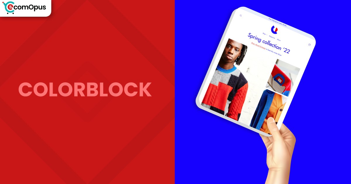
Team eComOpus tested Colorblock Shopify Theme by setting up a demo store with multiple collections, variants, and media-heavy product pages to see how it behaves under real merchandising pressure. The first impression is confident, with design decisions that feel deliberate rather than default, especially when you lean into strong imagery and short, punchy headlines. One merchant captured the overall vibe perfectly: “I love it! Its a good theme for Merchandise.” We also found ourselves repeating a simple note during testing: “The design feels confident and intentional.”
Colorblock Shopify Theme is not trying to blend into the background, and that’s exactly the point. The layout aims for a trendy lookbook mood where typography, spacing, and color separation help shoppers browse quickly without losing the product focus. When we kept the homepage structured and used collections as the main navigation engine, the store felt clean and purposeful. If you want a FREE theme that looks styled from day one, Colorblock delivers a surprisingly strong starting framework.
Ideal For Niches With Supporting Features
Picking a theme is easier when you start with the shopping journey you want visitors to experience. Team eComOpus mapped Colorblock to niches where bold presentation and quick scanning matter as much as product depth. The theme’s visual structure helps stores look curated, while its catalog tools keep discovery manageable as your inventory grows. The table below highlights where Colorblock tends to fit naturally, and which features make that fit practical.
| Niches | Supporting Features | Why They Matter? |
|---|---|---|
| High-end fashion | Lookbook layout, swatches, image zoom | Fashion stores win on presentation, and this theme keeps attention on visuals while still making variants easy to understand. |
| Streetwear and merchandise | Quick buy, promo banners, strong sections | Drops and fast decisions benefit from fewer steps, and the layout supports quick browsing without feeling cluttered. |
| Beauty and skincare | Product video, FAQ, structured info blocks | Shoppers want reassurance, and the theme makes it easy to answer common questions without sacrificing aesthetics. |
| Food and drink | Ingredient info sections, shipping details, large media | Clear details reduce hesitation and returns, while strong imagery helps everyday products feel premium and giftable. |
| Large catalogs | Mega menu, filtering and sorting | Bigger inventories need shortcuts, and the navigation plus filters prevent browsing from turning into endless scrolling. |
Presets
Colorblock is a standalone Shopify theme with no presets. Instead of swapping preset personalities, you shape the storefront using sections, typography choices, and color settings. Since it is FREE to use, you can iterate in draft and refine your visual system until it feels cohesive.
Key Features And Highlights
Features matter most when they reduce friction for shoppers or reduce workload for merchants. Team eComOpus evaluated Colorblock Shopify Theme by building key templates, then running browsing and purchase-flow tests across mobile and desktop. What stood out is how much merchandising support you get without needing a stack of add-ons for basics. The table below focuses on the features that most directly affect conversion, clarity, and day-to-day usability.
| Features | What It Is And Why It Matters? |
|---|---|
| Editorial typography style | The typography system makes pages feel styled and contemporary, especially for fashion and lifestyle brands that rely on headline rhythm. During our tests, it improved scanning on collection pages without hurting readability. |
| Customizable color block sections | Color blocks help separate stories, promotions, and collection highlights with strong visual structure that feels like a lookbook. We got the best result by limiting accents to two brand colors and repeating them consistently. |
| Mega menu navigation | Mega menus keep larger catalogs organized by letting shoppers jump directly into categories and subcategories without extra clicks. When we paired it with simple labels, navigation felt faster and less overwhelming. |
| Enhanced search support | Search becomes a discovery tool, not just an exact-match box, which is useful when products have similar names or styles. Team eComOpus saw better exploration when search was paired with clean tagging and clear collections. |
| Filtering and sorting | Built-in filtering and sorting help shoppers narrow options quickly, especially for apparel sizing, color families, or product types. In testing, the theme stayed usable even after we added multiple attributes and variant-heavy products. |
| Quick buy workflow | Quick buy reduces steps between interest and cart, which is ideal for repeat purchases and fast merchandise decisions. We recommend validating button placement on mobile so it feels reachable and not crowded. |
| Cross-sell and recommendations | Recommendation blocks encourage add-ons without turning pages into cluttered upsell panels. We saw stronger results when recommendations were curated tightly instead of showing broad, unrelated items. |
| Media-forward merchandising | Support for high-resolution imagery, rollover, galleries, zoom, and product video helps shoppers evaluate detail with confidence. This is especially valuable for texture-based products like apparel fabrics and beauty packaging. |
| Trust and info blocks | FAQ areas, shipping information sections, and structured details reduce purchase anxiety and cart abandonment. Team eComOpus found these blocks often remove the need for extra FAQ plugins. |
| Cart and checkout helpers | Cart notes and in-store pickup options support real operational workflows like personalization and local fulfillment. Quick cart access also helps maintain buying momentum during browsing sessions. |
Theme Experience!
Theme experience is the moment-to-moment feel of shopping, and it often matters more than any feature list. Team eComOpus tested Colorblock by simulating first-time visitors, repeat buyers, and mobile scrollers who abandon fast when anything feels awkward. The aesthetic is bold, but the flow can still feel calm when content is structured with intention. The table below breaks down what shoppers tend to feel across key stages, from first impression to cart momentum.
| Experience Area | What Shoppers Feel In Practice? |
|---|---|
| First impression | The storefront feels editorial and modern, especially when the hero and first collections use consistent photography and restrained color accents. Shoppers tend to keep scrolling because the layout looks designed, not assembled. |
| Collection browsing | Product grids are easy to scan, and typography creates separation without making the page noisy. Browsing feels smoother when product images share similar ratios and consistent lighting. |
| Product discovery flow | Media and information blocks help shoppers move from visuals to specifics in a natural order. When we added clear shipping and sizing guidance, hesitation before add to cart noticeably dropped. |
| Mobile navigation | Mobile navigation works best when menu labels are short and category depth is controlled. With a tidy structure, the theme avoids menu fatigue and keeps discovery fast. |
| Product page confidence | Search feels useful when paired with filtering because shoppers can narrow quickly after a broad query. Team eComOpus liked how discovery stays consistent between search results and collections. |
| Cart and checkout momentum | Quick buy and strong cart access keep purchase intent alive, especially for shoppers comparing multiple items. It’s wise to validate cart behavior after apps are installed, since injected scripts can affect interactions. |
| Brand storytelling | Color sections and typography make it easy to add story moments without overwhelming products with long copy. “It’s easy to create a premium feel without extra work” when imagery, spacing, and accents stay disciplined. |
Performance, Explained!
Colorblock Shopify Theme shows excellent desktop speed signals and a fast visual load in typical browsing. On mobile, the experience still feels reasonably quick, but Core Web Vitals can fail due to layout stability rather than server delay. Team eComOpus sees this as a theme that rewards clean builds, since small shifts feel larger on phones. If you control image sizing and avoid late-loading elements, the theme’s speed feels much closer to its strongest metrics.
| Performance Parameters | Mobile | Desktop | Remarks |
|---|---|---|---|
| Performance Score | 73/100 | 96/100 | Desktop is excellent, while mobile is more sensitive to layout movement and script overhead. |
| First Contentful Paint (FCP) | 1.0 s | 0.9 s | First content appears quickly, helping the page feel responsive at the start of a session. |
| Largest Contentful Paint (LCP) | 1.7 s | 1.5 s | LCP is strong, suggesting images can load efficiently when kept optimized and correctly sized. |
| Cumulative Layout Shift (CLS) | 0.16 | 0.13 | CLS is the main concern, so set media dimensions and avoid pop-in banners or late font reflow. |
| Time to Interactive (TTI) | Not reported | Not reported | TTI often changes with apps, so measure again after adding tracking, reviews, or upsell tools. |
| Speed Index | Not reported | Not reported | Speed Index is not shown here, but fast FCP and LCP suggest smooth rendering if layout stays stable. |
From a practical standpoint, preventing movement after the first paint is the biggest improvement lever. Team eComOpus recommends locking image dimensions, limiting announcement bars that appear after load, and using font settings that avoid reflow on headings. Mobile INP is workable, but it can drift if you stack apps that attach heavy scripts to cart and navigation interactions. If you keep your app stack lean and compress above-the-fold media, Colorblock Shopify Theme feels snappy and consistent in real browsing.
Pricing
Colorblock is priced at $0, which makes it an easy theme to test without financial commitment. You can install it, customize it in draft, and publish whenever your storefront feels ready, without a theme purchase step. For many Shopify merchants, the real savings come from using built-in sections for FAQs, promotions, and media instead of relying on multiple design apps. Over time, the ROI shows up as fewer tools to maintain, fewer scripts slowing down mobile, and a storefront that still looks premium with a disciplined content setup.
Stores Build with Colorblock Shopify Theme
Seeing live stores helps you judge how a theme behaves with real products, evolving catalogs, and imperfect content. Team eComOpus uses this step to spot patterns in navigation choices, typography decisions, and how merchants structure collections. Since Colorblock currently has a small pool of published reviews, only a couple of store names appear as clearly positive examples. Here are the stores that have publicly shared positive feedback while using the theme.
- DESSERT
- NiZED.
Themes Similar to Colorblock
Comparisons matter because switching themes costs time and attention, even when price is not a factor. Team eComOpus selected alternatives that either share Colorblock’s bold presentation or compete on catalog handling and customization ease. We included both FREE and paid options to reflect the real tradeoff between budget, marketing tools, and built-in merchandising depth. The table below highlights themes that overlap in purpose, while clarifying how their design philosophy differs.
| Shopify Theme | FREE or Paid? | Why is it Similar? |
|---|---|---|
| Dawn | FREE | Dawn is a flexible baseline with strong performance habits and broad store compatibility. It’s less editorial than Colorblock, but it suits merchants who want simplicity and speed first. |
| Craft | FREE | Craft supports storytelling with spacious sections that can feel lookbook-like when paired with strong photography. It has a softer tone, while Colorblock leans more graphic and high-contrast. |
| Refresh | FREE | Refresh offers a modern layout and approachable customization for many niches. It’s a good option if you want balance and clarity without the stronger color-block identity. |
| Impulse | Paid | Impulse is built for promotion-heavy stores and offers deeper marketing features for frequent campaigns. It can deliver similar energy, especially for brands that run constant drops and discounts. |
| Symmetry | Paid | Symmetry handles large catalogs with strong navigation patterns and flexible layout options. It’s often the next step when you want more built-in merchandising depth than a free theme provides. |
Pros and Cons
Pros and cons should clarify fit, not turn into a takedown. Team eComOpus pulled these points from hands-on testing and the patterns visible in merchant feedback. The advantages relate to visual impact and catalog readiness, while the considerations mostly come down to setup discipline and launch testing. The table below keeps cons constructive, with practical context and simple workarounds.
| Pros | Cons |
|---|---|
| Bold lookbook styling makes products feel curated and premium, even for newer Shopify stores with limited catalog depth. | CLS can fail Core Web Vitals, so stabilize images, fonts, and banners to reduce unexpected movement. |
| Mega menu plus filtering supports larger catalogs, helping shoppers find items quickly without endless scrolling. | Some footer and quick link setups require careful configuration to ensure every menu item routes correctly. |
| Strong media support like zoom, rollover, and video improves product evaluation and reduces hesitation before add to cart. | Default sections may persist if changes are not saved, so publishing workflow and cache checks matter. |
| Built-in FAQ and promo tools reduce app dependency, keeping the storefront lighter and easier to maintain. |
Our Rating
Ratings should help you predict daily reality, not just celebrate a nice demo. Team eComOpus scores themes based on hands-on building, shopper-flow testing, and how well the theme scales with more collections, variants, and content blocks. We also factor in complexity cost, because a theme that needs constant fixes quietly drains time. The table below summarizes our scoring for Colorblock Shopify Theme and explains what each score means.
| Parameters | Our Ratings | Summary |
|---|---|---|
| Feature Depth | 4.2/5.0 | Colorblock covers core selling needs like navigation, filtering, merchandising media, and conversion blocks. For a $0 theme, the toolkit feels broader than many merchants expect. |
| Design and Customization | 4.4/5.0 | The design system is bold and editorial, and it creates a distinct storefront quickly with consistent accents. Customization stays approachable because many visual changes happen inside the editor, not code. |
| Performance | 4.0/5.0 | Desktop performance is strong and browsing feels fast during typical cart and navigation actions. Mobile results depend on stabilizing layout and keeping third-party scripts from piling up. |
| Value for Money | 5.0/5.0 | At $0, value is outstanding, especially for merchants who want a premium-feeling storefront without an upfront theme cost. Savings often come from skipping page builders and extra design utilities. |
| Support and Updates | 4.1/5.0 | Public replies suggest the theme team provides guidance when merchants run into configuration confusion. Updates appear to include quality improvements, which supports long-term stability and smoother iteration. |
| Overall | 4.3/5.0 | Colorblock is a strong fit for brands that want bold presentation while still needing catalog tools. It performs best with clean media, thoughtful navigation, and a restrained app stack. |
User Reviews: What Merchants Say
Merchant feedback for Colorblock is limited in volume, but the patterns are still useful for decision-making. Positive comments focus on how approachable the theme feels for launching and how well it supports merchandising without heavy customization. One reviewer described it as a strong starter store in German and said it “Hat alles was man braucht und lässt sich auch ohne Probleme anpassen,” which matches our experience of straightforward control through sections and settings.
Critical feedback leans more toward configuration confusion than visual quality. One merchant reported difficulty removing default front-page sections, and the suggested fix centered on saving changes properly and clearing browser cache, which points to workflow issues rather than a design limitation. Another merchant raised concerns about footer and quick-link routing, which highlights the importance of testing navigation thoroughly after menus are built.
Notably, we did not see complaints about the theme feeling dated or visually weak. Even with a small review pool, the picture is a bold FREE theme that can look premium quickly if you validate links, confirm saved states, and keep the layout stable. Team eComOpus recommends doing a full click test across header, footer, and search before launch, especially if your store has many pages.
Our Verdict
Team eComOpus sees Colorblock Shopify Theme as a strong choice for merchants who want an editorial storefront without paying upfront. It shines when you treat the homepage like a lookbook and let collections and filters do the heavy lifting for discovery. For fashion, merchandise, and catalog-heavy stores, the blend of visual impact and navigation tools feels unusually complete for a free option.
Performance is excellent on desktop and respectable on mobile, but the Core Web Vitals miss signals that layout stability deserves attention. If you lock image dimensions, keep typography consistent, and avoid late-loading promo elements, the store feels noticeably smoother on phones. A restrained app stack also helps preserve responsiveness and reduces the risk of interaction delays.
If your goal is a storefront that looks intentional from day one, Colorblock is easy to recommend. Build with structure, test navigation thoroughly, and you can publish a site that feels bold, modern, and maintainable as you grow.
Who Should Not Buy Colorblock
Colorblock is not the best match for merchants who want an understated, minimalist storefront where typography stays quiet and the layout fades into the background. The visual identity is bold, and brands that require strict neutrality may prefer a simpler design language. Stores that rely on heavy script injections, especially around cart and navigation, should also be cautious because extra code can worsen mobile stability.
Very small catalogs with weak photography may struggle to benefit from the lookbook approach. The theme puts visuals and spacing on a pedestal, so inconsistent product images can become the loudest part of the experience. If you want a theme that hides content imperfections, choose a more minimal layout and revisit Colorblock once your media library is stronger.
GET THE BEST APPS IN YOUR INBOX
Don't worry we don't spam


