Clear Shopify Theme Review: Minimal, Polished Design, Conversion-Ready
Clear is a calm, modern storefront preset that makes products feel trustworthy fast. It’s built to keep mobile shopping smooth, reduce visual noise, and help merchants launch without wrestling the layout.
- Calm homepage flow with airy visual spacing
- Collection grids built for fast scanning
- Product pages feel tidy and reassuring
- Sections encourage clean storytelling without clutter
- Mobile experience favors thumb-friendly shopping paths
- Strong baseline for premium everyday brands
Introduction
Team eComOpus tested Clear by setting up a small catalog, building a few collections, and repeatedly swapping hero media, typography, and homepage sections to see what breaks under “real merchant” edits. The first impression is simple: this preset wants your store to feel composed, not decorated, so products get attention without the page begging for it.
One merchant running a baby clothing store described it as “clean, easy to use and professional,” and that matches what we saw during customization. Clear Shopify Theme feels like it’s designed for merchants who want a storefront that looks finished early, then improves steadily as photography, copy, and merchandising get sharper over time.
Ideal For Niches With Supporting Features
Clear isn’t trying to be loud, and that’s exactly why it fits certain catalogs so well. In our tests, it worked best when product discovery needed to feel gentle, organized, and confidence-building, especially on mobile where clutter turns into exits. The table below maps niche behavior to the kinds of theme building blocks that help shoppers decide faster. Use it as a quick “fit check” before you invest time migrating content.
| Niches | Supporting Features | Why They Matter? |
|---|---|---|
| Baby and kids apparel | Soft grids, clear size focus, tidy product pages | Parents shop quickly and mostly on phones. Clean scanning and predictable details reduce hesitation when choosing sizes and sets. |
| Beauty and skincare | Benefit blocks, structured product info, calm media layout | Shoppers want proof and clarity without endless scrolling. A composed layout makes ingredients, claims, and routines easier to trust. |
| Home essentials | Stable collection browsing, consistent product cards, simple navigation | Essentials sell through comparison and reliability. Predictable grids help shoppers evaluate options without losing their place mid-scroll. |
| Boutique accessories | Image-forward product framing, concise storytelling sections | Accessories need detail and polish. A minimal presentation makes products feel premium, especially when photography is strong and consistent. |
| Subscription or replenishable goods | Quick-buy patterns, repeat-friendly navigation, clear value cues | Returning customers want speed, not theater. A steady browsing rhythm helps repeat buyers add items with fewer taps and less friction. |
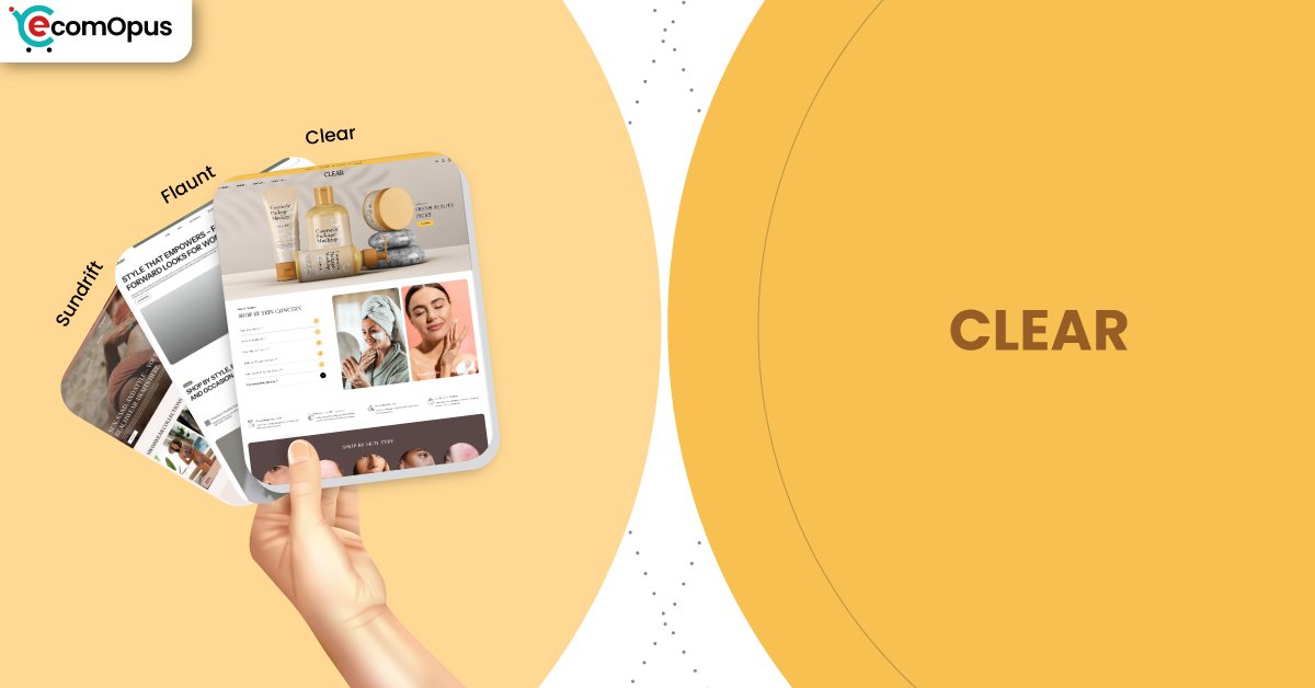
Presets
Clear is part of a preset family, and that matters because presets change the store’s default rhythm without forcing you to rebuild your entire structure. In our experience, merchants benefit most when they choose a preset that matches their photography style and merchandising intensity from day one. The table below frames each preset direction as a practical starting point, not a cosmetic skin. Even if you start with Clear, you can borrow layout ideas from the other presets when your catalog grows.
| Preset | Aesthetic Vibe | Where It Shines | Noteable Tweaks |
|---|---|---|---|
| Clear | Minimal, bright, quietly premium | Baby, beauty, essentials, boutique brands | Airier spacing and a calmer browsing pace |
| Flaunt | High-contrast, campaign-forward | Drops, promos, seasonal launches | Stronger headings and sharper promo hierarchy |
| Sundrift | Soft, lifestyle-led and cozy | Home goods, wellness, gifting | Warmer tone support and gentler visual weight |
Key Features And Highlights
Features only matter if they save you work or remove buyer friction, and Clear performs best when you treat it like a system, not a scrapbook. We focused on the pieces that shape day-to-day merchant workflow: merchandising edits, product-page consistency, navigation clarity, and reducing the temptation to install five cosmetic apps. The table below explains the features we kept coming back to and how they influence real shopping behavior. If you want Clear Shopify Theme to convert, these are the levers that do the heavy lifting.
| Features | What It Is And Why It Matters? |
|---|---|
| Section-first homepage building | Clear encourages modular homepage composition so you can swap campaigns without rebuilding everything. This reduces “homepage fatigue” because updates stay clean instead of turning into layered clutter. |
| Collection grid control | Grid density and spacing determine whether shoppers scan calmly or bail fast. Clear’s layout style rewards consistent product imagery, making comparison feel easier across categories and devices. |
| Product information structure | Product pages work best when benefits, sizing, and policies are easy to find. Clear supports a tidy information flow that reduces second-guessing right before add-to-cart moments. |
| Mobile-friendly header behavior | Navigation is where many Shopify stores lose money on phones. Clear keeps key actions reachable, which helps shoppers move from browsing to checkout without menu frustration. |
| Promotional placement discipline | Promotions can help or harm depending on how they’re placed. Clear’s approach favors restrained messaging so discounts stay visible without turning the storefront into a banner wall. |
| Media handling for premium visuals | Strong photography should elevate a store, not slow it down. Clear performs best when you keep aspect ratios consistent so the experience stays stable while shoppers scroll and compare. |
| Trust signal integration | Shoppers look for shipping clarity, returns, and reassurance in predictable spots. Clear supports trust cues in a way that feels native, which can reduce reliance on popups. |
| Variant and option clarity | Multi-size or multi-color catalogs need clean option selection. Clear Shopify Theme works best when variant labels are short and consistent, keeping decision-making fast on mobile. |
| App restraint compatibility | Themes don’t fail alone, they fail with app overload. Clear stays stable when merchants add only what earns its place, especially around cart, reviews, and tracking scripts. |
| Long-term maintainability | A theme should still look good after 50 edits, not just on launch day. Clear’s design language helps prevent “drift,” where pages slowly stop matching because layouts were patched together. |
Theme Experience!
Theme experience is what shoppers feel during real browsing, not what a demo screenshot promises. In our testing, Clear felt steady and composed, which helps buyers trust the store faster, especially when they’re shopping quickly on a phone. The table below breaks the experience into specific moments that affect conversion rate: first impression, collection scanning, product confidence, and cart momentum. If your store sells through clarity and reassurance, this is where Clear tends to shine.
| Experience Area | What Shoppers Feel In Practice? |
|---|---|
| First impression | The storefront feels calm and intentional, which makes the brand seem more credible. Shoppers get oriented quickly because the page doesn’t compete with itself for attention. |
| Collection browsing | Product grids stay readable during long scroll sessions, especially when images follow consistent framing. This reduces comparison fatigue, so shoppers are more likely to open multiple products. |
| Product page comfort | Details feel organized instead of scattered, which helps shoppers find sizing, materials, or care notes faster. That structure matters most for first-time buyers who need reassurance before they commit. |
| Cart momentum | Add-to-cart moments feel more direct when the page isn’t crowded with competing widgets. Clear Shopify Theme benefits from a lean cart setup so intent keeps moving instead of stalling. |
| Mobile navigation | Menus and key actions feel thumb-friendly when you keep labels concise and avoid overly complex menu trees. This reduces mis-taps, which quietly improves the overall shopping experience. |
| Brand storytelling | Story sections support context without hijacking the shopping journey. Shoppers can absorb your brand tone, then return to products without feeling lost or “sold at.” |
Performance, Explained!
Clear shows a split that’s common for modern Shopify storefronts: desktop feels reliably smooth, while mobile is more sensitive to interaction load. The real-user snapshot suggests visual stability is a strength, but responsiveness can slip when too many scripts compete during taps, swipes, and menu actions. In practical terms, Clear rewards restraint above the fold, consistent image sizing, and a trimmed font setup so mobile shoppers don’t feel micro-delays.
This is also where merchant discipline matters more than theme drama. Use modern image formats, lazy load below-the-fold media, and prune unused app code so the storefront stays responsive on a mid-range Android. When you treat third-party scripts like a budget instead of a buffet, Clear Shopify Theme holds onto its best “feels fast” behavior.
| Performance Parameters | Mobile | Desktop | Remarks |
|---|---|---|---|
| Performance Score | 74/100 | 97/100 | Desktop feels crisp during browsing and menu actions. Mobile is solid, but has less headroom for heavy app stacks. |
| First Contentful Paint | 1.7 s | 1.4 s | Content appears quickly enough to reduce early bounces. Desktop delivers a slightly faster sense of readiness during first scroll. |
| Largest Contentful Paint | 2.4 s | 2.0 s | Main content lands in a healthy window for most shoppers. Strong hero imagery still needs compression to keep perceived speed high. |
| Cumulative Layout Shift (CLS) | 0 | 0.08 | Mobile stability is excellent, so pages don’t “jump” during load. Desktop remains acceptable, and improves with locked media dimensions. |
| Interaction to Next Paint (INP) | 210 ms | 66 ms | Desktop interactions feel immediate and confidence-building. Mobile can feel slightly delayed when scripts and widgets compete. |
| Time to First Byte (TTFB) | 0.3 s | 0.8 s | Server response is decent, but mobile networks amplify delays. Faster hosting and fewer blocking scripts improve the first moments most. |
Pricing
Clear is priced at $290 as a one-time purchase per storefront license, and the smart move is to treat that cost like infrastructure, not decoration. Test it with your real catalog before you publish, because the true workload is not installing the theme, it’s building a homepage, two collections, and a product template that you can maintain weekly without chaos. The ROI improves when Clear replaces a few cosmetic apps, since fewer apps usually means fewer scripts competing with performance on mobile.
Where merchants get value fastest is in reduced rework. If your current storefront needs constant patching to look consistent, a cleaner theme system often pays back through saved hours, fewer layout mistakes, and a steadier conversion experience. Clear Shopify Theme is most worth it when your brand sells through calm presentation, not aggressive gimmicks.
Stores Build with Clear Shopify Theme
Live examples are useful because they reveal the boring details that matter, like menu clarity on phones, collection structure, and how merchants handle real product photography at scale. Team eComOpus also looks for restraint: fewer popups, fewer competing banners, and a homepage that guides rather than overwhelms. At the moment, verified public examples tied specifically to Clear are limited, so we’re avoiding guesswork and keeping this section credibility-first. As more merchants publish and share storefronts, we’ll update this section with confirmed store names.
Themes Similar to Clear
Choosing a Shopify theme is rarely about one option in isolation, because small differences in structure can change how easy the store is to maintain. We picked alternatives that share Clear’s core intent: calm browsing, strong product framing, and a layout that rewards good photography and disciplined merchandising. The goal here is not to “name five themes,” it’s to show you nearby options if you need more flexibility, more promo intensity, or a different storytelling rhythm. Use these comparisons to match your catalog behavior to the theme’s default personality.
| Shopify Theme | FREE or Paid? | Why is it Similar? |
|---|---|---|
| Dawn | FREE | Dawn is a clean baseline that rewards discipline and strong content. It’s similar when you want minimal structure, but it may need more polishing to feel premium. |
| Craft | FREE | Craft leans into calm storytelling and airy presentation. It overlaps when brands want warmth and credibility, especially for lifestyle-focused catalogs. |
| Sense | FREE | Sense supports clean product clarity and a friendly browsing rhythm. It’s similar when you want reassurance-led shopping, with slightly different visual energy. |
| Prestige | Paid | Prestige targets premium presentation with stronger editorial polish. It’s comparable if you want more luxury styling and deeper merchandising control. |
| Symmetry | Paid | Symmetry balances clean design with scalable catalog tools. It’s similar when your collections grow and you still want consistent, readable browsing patterns. |
Pros and Cons
Pros and cons should clarify fit, not create drama. Team eComOpus pulled these from hands-on setup behavior, the performance profile, and the single merchant sentiment we were given. The strengths are about calm conversion and easy maintenance, while the considerations mostly come down to protecting mobile responsiveness. Use this table as a fast decision filter before you commit.
| Pros | Cons |
|---|---|
| The layout feels clean and professional. It builds shopper trust fast. | Mobile interactions can slow slightly. Too many scripts usually cause it. |
| Customization stays simple in the editor. Sections don’t feel fragile. | A cluttered homepage hurts the preset. It performs best with restraint. |
| Product pages read calmly on phones. Details feel easy to find. | Some merchants may want more visual drama. Clear prioritizes quiet confidence. |
| It supports premium presentation without gimmicks. Photography stays the hero. | |
| The structure stays consistent after edits. Your store avoids “layout drift.” |
Our Rating
Ratings are only useful when they reflect what happens after the theme meets real content and real editing habits. Team eComOpus scored Clear based on merchant workflow, shopper comfort, and how stable the experience stays once apps, tracking, and promotions enter the picture. We also weigh long-term maintainability, because a theme that looks good today but drifts after 30 edits is a hidden cost. The table below breaks down the categories that most directly impact Shopify success.
| Parameters | Our Ratings | Summary |
|---|---|---|
| Feature Depth | 4.4/5.0 | The feature set focuses on practical storefront needs, not novelty. Clear supports merchandising, product clarity, and trust cues without forcing heavy app dependence. |
| Design and Customization | 4.6/5.0 | Customization feels structured, which keeps pages consistent across updates. The design language stays calm, making it easier to maintain a premium brand impression. |
| Performance | 4.2/5.0 | Desktop experience is strong and steady during browsing and navigation. Mobile responsiveness depends on script restraint, especially around cart features and extra widgets. |
| Value for Money | 4.3/5.0 | $290 makes sense when the theme reduces rework and replaces a few cosmetic tools. Stores that update weekly tend to feel the payoff sooner than static catalogs. |
| Support and Updates | 4.3/5.0 | Clear benefits most when merchants get guidance on best-practice setup choices. Ongoing updates matter because they protect stability as Shopify features evolve. |
| Overall | 4.4/5.0 | Clear is a strong fit for brands selling through calm clarity. It rewards disciplined content and gives shoppers a smooth path from browsing to checkout. |
User Reviews: What Merchants Say
Merchant feedback for Clear is currently limited, but the signal we do have lines up with what we experienced during setup. One store owner running a baby clothing business described the theme as “clean, easy to use and professional,” which matches Clear’s calm design philosophy and straightforward customization flow. They also called out that mobile speed mattered for their shoppers, and Clear’s stable layout supports that goal when the build stays disciplined.
The early takeaway is simple: merchants seem happiest when they keep the storefront focused, avoid stacking cosmetic apps, and treat the homepage like a curated welcome rather than a crowded billboard. If more reviews arrive over time, we’ll have a clearer picture of support patterns, edge-case issues, and how the theme behaves across different catalog sizes.
Our Verdict
Clear is a strong recommendation for Shopify merchants who want a storefront that feels composed, modern, and easy to trust, especially on mobile where clutter kills conversion. It’s best for brands that sell through clarity: babywear, beauty, essentials, and boutique catalogs where product presentation matters more than flashy effects. Clear Shopify Theme also fits teams who plan to iterate, because the structure stays consistent when you keep edits intentional.
If you buy it, build one “real” collection and one “real” product template before you get fancy. Then audit apps like a bouncer at the door: only let in tools that create measurable value, because mobile responsiveness is the first thing to suffer. Do that well, and Clear becomes a quiet advantage that shoppers feel, even if they can’t name it.
Who Should Not Buy Clear
Clear is not the right pick if your brand relies on high-energy motion, experimental layouts, or an intentionally chaotic collage aesthetic. The preset’s strength is restraint, and forcing it into constant animation or aggressive visual gimmicks usually makes the store feel less premium, not more. If your marketing strategy depends on heavy overlays and multiple popups competing at once, you’re likely to fight the theme’s natural rhythm.
It’s also a weaker fit for merchants who won’t maintain content discipline. If photography varies wildly, collections are unstructured, and product pages are inconsistent, Clear will expose those gaps instead of hiding them. In that situation, you may prefer a theme that leans harder into bold design tricks to compensate, or you may need to fix your content pipeline first.
GET THE BEST APPS IN YOUR INBOX
Don't worry we don't spam


