Caffeine Shopify Theme Review: Cozy Commerce For Local Brands
Caffeine is a warm, product-forward preset in the Local theme family, built to sell food and drink with clarity. It pairs in-person friendly tools with modern conversion sections, so your store feels calm, useful, and ready to grow.
- Cozy editorial preset for coffee-first brands and subscriptions
- Local pickup tools suit in-person selling smoothly
- Ingredient and nutrition blocks keep details clear
- Quick buy plus sticky cart speed checkout
- Lookbooks and hotspots turn stories shoppable fast
- Krown support praised for rapid human fixes

Introduction
Caffeine is the kind of Shopify preset that makes your storefront feel like a well-loved neighborhood spot, even if you ship worldwide. It leans into a cozy, editorial mood, but it still keeps the shopping path practical and obvious, which is exactly what food, drink, and repeat-purchase brands need. Under the hood, it is part of the Local theme by Krown Themes, so the vibe may feel relaxed, but the feature set is very “retail awake.” That balance is what makes Caffeine feel like more than a pretty skin.
Where this preset shines is in how it helps you sell products that require trust, detail, and habit. Coffee and tea brands often need room for origin notes, brew guidance, subscriptions, and add-ons, and Caffeine’s section system supports that without forcing a complicated build. The navigation and discovery tooling also feels built for real shopping, meaning shoppers can browse, filter, and compare without getting lost in a maze of menus. If your catalog is mid-sized and growing, that stability matters.
Merchant feedback for the Local theme family leans heavily positive and unusually consistent in what it praises. Store owners repeatedly mention fast, human support, flexibility, and a theme that looks refined while staying usable in everyday updates. There is also a realistic note that very specific customization can require some coding, but the overall sentiment suggests merchants feel supported rather than stranded. Taken together, Caffeine reads like a preset designed for brands that want warmth and polish, with operational tools that keep selling smooth.
Ideal For Niches With Supporting Features
Caffeine is not a one-note preset, but it does have a clear “home turf.” It works best when your products benefit from education, visual storytelling, and repeat buying, all without turning pages into endless scroll essays. The supporting features are especially helpful when you need to show details like ingredients, usage, and delivery expectations in a tidy, predictable way. The table below highlights niches where the fit feels natural, not forced.
| Niches | Supporting Features | Why They Matter? |
|---|---|---|
| Coffee roasters and specialty tea | Subscriptions, product tabs, product videos | These shoppers buy with curiosity and routine at the same time. Clear tabs and rich media help them decide quickly, then come back for repeats. |
| Specialty food and drink | Ingredients or nutritional information, age verifier, trust badges | Food buyers want certainty before they commit, especially with dietary constraints. Built-in detail blocks keep that certainty visible without cluttering the page. |
| Multi-location retailers | In-store pickups, sticky header, enhanced search | Location-aware shopping reduces hesitation when customers want the fastest fulfillment option. Pickup tooling and strong navigation make the store feel “nearby,” not abstract. |
| Subscription-led consumables | Quick buy, slide-out cart, cross-selling | Repeat purchase flows win when friction is low and add-ons feel natural. A slide-out cart and cross-sells keep momentum without breaking browsing. |
| Wellness and functional products | Usage information, FAQ page, product badges | These categories require reassurance and instructions in the same breath. Usage blocks and FAQs make the store feel guided rather than salesy. |
| Boutique gifting and curated goods | Lookbooks, image hotspots, promo banners | Gift shoppers respond to curated scenes and easy discovery paths. Shoppable visuals help them buy the “moment,” not just the item. |
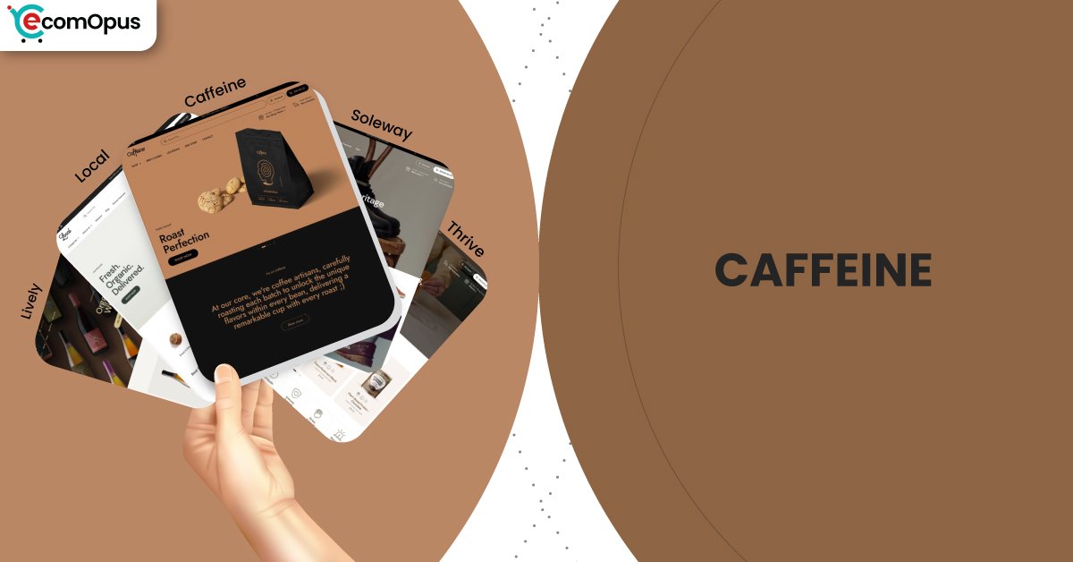
Presets
Presets matter because they set the store’s default pacing, density, and emotional tone before you touch a single setting. With Local, presets share the same engine, so you can change the vibe without rebuilding your store architecture. This is useful if your brand evolves seasonally or you want different moods for campaigns. The table below shows how each preset tends to behave once real products and real photos replace the demo content.
| Preset | Aesthetic Vibe | Where It Shines | Noteable Tweaks |
|---|---|---|---|
| Caffeine | Cozy, editorial, product-forward | Coffee, tea, small-batch consumables | Encourages storytelling sections and warm merchandising rhythm |
| Local | Clean retail clarity with warmth | General retail and local-first selling | Balanced homepage pacing and utility blocks |
| Soleway | Minimal, airy, boutique-sleek | Premium goods and curated catalogs | More whitespace and calmer visual density |
| Thrive | Energetic, promo-aware, campaign-ready | Seasonal launches and campaign pushes | Stronger callouts and bolder merchandising |
| Lively | Bright, friendly, approachable | Community-driven shops and boutiques | Lighter mood with softer browsing cues |
Key Features And Highlights
Caffeine benefits from a feature set that is designed to reduce app dependency, not increase it. Many storefronts start clean and then slowly become a patchwork of overlapping popups, carts, and widgets that fight each other. Local’s built-in toolkit helps you avoid that “plugin collage” outcome if you use it intentionally. The table below focuses on features that directly affect conversion confidence, trust, and day-to-day editing comfort.
| Features | What It Is And Why It Matters? |
|---|---|
| In-store pickups | Pickup options create a fast-fulfillment pathway that feels practical and reassuring for local customers. It also helps in-person retailers connect online browsing with real-world inventory intent. |
| Slide-out cart | A slide-out cart keeps shoppers in the flow while adjusting quantities or removing items. This reduces “checkout anxiety” because the cart never feels like a dead-end page. |
| Sticky cart | Sticky cart behavior keeps purchase intent visible during long reads and media scrolling. It is especially useful for coffee and wellness products where details matter before buying. |
| Quick buy | Quick buy supports repeat purchases by reducing clicks from collection to checkout. It works best when your customers already know what they want and just want speed. |
| Cross-selling and recommended products | Built-in recommendations can lift order value without a heavyweight upsell app. When curated thoughtfully, it feels like helpful pairing, not pushy selling. |
| Ingredients or nutritional information | Structured ingredient and nutrition blocks keep sensitive product details consistent across the catalog. That consistency builds trust, especially when shoppers compare multiple products quickly. |
| Age verifier | Age gating is handled as a native step rather than a clunky third-party popup. It protects compliance while keeping the store experience coherent and on-brand. |
| Product tabs and usage information | Tabs prevent product pages from turning into long, tiring walls of text. Usage sections reduce post-purchase confusion, which can lower returns and support tickets. |
| Lookbooks and image hotspots | Lookbooks and hotspots turn lifestyle content into direct shopping paths. This is ideal when you sell bundles, rituals, or “sets” that are easier to buy visually. |
| Mega menu and enhanced search | Strong navigation keeps discovery comfortable as your catalog grows. Enhanced search reduces bounce risk because shoppers find what they meant, not what the menu happened to show. |
Theme Experience!
Theme experience is the lived reality of browsing, not the feature list. Caffeine’s best work happens in subtle moments, like how easy it is to scan a collection, how predictable product pages feel, and whether the cart experience stays calm. This preset also benefits from Local’s strong discovery and in-person selling tools, so shoppers feel guided rather than pressured. The table below breaks down the experience areas that tend to decide conversion and repeat visits.
| Experience Area | What Shoppers Feel In Practice? |
|---|---|
| First impression | The storefront feels warm, tidy, and trustworthy from the first screen. Shoppers understand what you sell quickly without feeling overwhelmed. |
| Collection browsing | Grids stay readable and scanning feels calm over long scrolls. Filters and sorting help shoppers narrow choices without getting lost. |
| Product page clarity | Product details appear in a predictable order that reduces hesitation. Tabs and structured blocks keep reading light while answers stay easy to find. |
| Subscription comfort | Subscription prompts can feel natural when they appear as an option, not a trap. Shoppers feel invited into a routine rather than pushed into commitment. |
| Local fulfillment confidence | Pickup and delivery messaging can be made clear without breaking the aesthetic. Shoppers feel in control when fulfillment choices are obvious and consistent. |
| Cart and checkout flow | The cart feels present and editable without derailing browsing. Sticky and slide-out patterns reduce the “where did my cart go?” moment on mobile. |
| Mobile navigation | The header stays usable and thumb-friendly when kept organized. Shoppers are less likely to mis-tap or lose context during quick browsing sessions. |
Performance, Explained!
Caffeine’s performance profile suggests a store that feels visually stable and generally quick to “show up,” while being more sensitive to interaction responsiveness on mobile. In real shopping terms, this means customers will likely see the page content fast, but taps can feel slightly delayed when multiple scripts compete for attention. That delay matters most on product pages and carts, where shoppers are deciding quickly and patience is short.
Desktop performance looks more confident, with interactions feeling snappy and browsing staying smooth during longer sessions. The practical takeaway is simple: Caffeine performs best when you treat the theme as the core system and avoid stacking overlapping apps that duplicate cart, popups, and heavy animations. Keep media optimized and your app stack disciplined, and the experience stays closer to “premium calm” than “pretty but laggy.”
| Performance Parameters | Mobile | Desktop | Remarks |
|---|---|---|---|
| Core Web Vitals Assessment | Failed | Passed | Mobile sensitivity is mostly interaction-driven. Desktop stays comfortable for browsing and cart actions. |
| Largest Contentful Paint (LCP) | 2.4 s | 2.0 s | Main content appears quickly on both devices. This helps first impressions feel confident and immediate. |
| Interaction to Next Paint (INP) | 210 ms | 66 ms | Mobile taps can feel slightly delayed in heavier builds. Desktop interactions feel immediate and clean. |
| Cumulative Layout Shift (CLS) | 0.00 | 0.08 | Mobile layout stability is excellent and reduces mis-clicks. Desktop remains stable with minor movement that rarely disrupts shopping. |
| First Contentful Paint (FCP) | 1.7 s | 1.4 s | Shoppers see content early, reducing bounce risk. The store feels “alive” quickly, even before everything finishes loading. |
| Time to First Byte (TTFB) | 1.1 s | 0.8 s | Server response is decent, but not the main bottleneck. Most improvements will come from scripts and media discipline. |
Mobile stability is a strength here, so the experience rarely feels jumpy or chaotic. The main performance lever is reducing competing scripts so taps feel more instant, especially around cart and navigation.
Pricing
Caffeine is priced at $360, placing it firmly in the premium tier where the real question is ROI, not aesthetics. The value comes from how much the theme reduces dependence on paid apps, especially for cart behavior, quick buying, trust signals, and merchandising tools that many merchants otherwise bolt on. If you sell in person or across locations, pickup functionality can also replace custom development costs that quickly exceed the theme price. The key to making the pricing feel justified is using what is built in, then adding apps only when they fill a real gap. If you treat Caffeine as a complete selling system, the one-time price can feel cheaper than a year of stacked subscription apps.
Stores Build with Caffeine Shopify Theme
Live examples are useful because they show how a theme behaves once real product photos, real promos, and real catalog structure replace the demo. Since Caffeine is a preset within the Local theme family, many storefronts may use the same underlying system even if the exact preset styling is customized. Examples currently using this theme family include Craft a Brew, Brentos, Sweet Greek, and Field Tacoma, each reflecting different merchandising choices and catalog complexity. What these stores collectively demonstrate is that the Local framework can flex across product types while keeping navigation and checkout patterns consistent. For Caffeine specifically, the strongest real-world fit tends to appear in consumable brands where repeat buying and product education matter.
Themes Similar to Caffeine
Caffeine sits in a very specific lane: warm, product-forward presentation with serious commerce tooling underneath. Themes that feel similar typically overlap in either food and drink readiness, clean structure, or conversion helpers that reduce app dependency. Some alternatives lean simpler and lighter, while others lean more editorial and premium. The table below highlights close comparisons and explains where the overlap truly matters.
| Shopify Theme | FREE or Paid? | Why is it Similar? |
|---|---|---|
| Taste | FREE | Taste supports food brands with clean, appetizing presentation. It is lighter on built-in retail tooling, so advanced workflows may require more apps. |
| Crave | FREE | Crave offers bold food merchandising and quick browsing patterns. It overlaps in category fit, but Caffeine’s Local framework is stronger for pickup and deeper feature needs. |
| Craft | FREE | Craft emphasizes calm, trust-forward layout rhythm with strong readability. Caffeine tends to feel more operationally equipped for repeat buying and local fulfillment. |
| Prestige | Paid | Prestige delivers premium, editorial polish with strong brand storytelling. It is comparable when presentation is paramount, though Caffeine is more grounded in local retail workflows. |
| Broadcast | Paid | Broadcast is strong for promotions and merchandising control in consumer brands. It can be a close match if you run frequent campaigns and need flexible homepage storytelling. |
| Symmetry | Paid | Symmetry balances clean design with scalable catalog browsing. It is often cross-shopped when merchants want structure, speed, and predictable navigation patterns. |
Pros and Cons
Every theme has a personality, and Caffeine’s personality is “cozy clarity with retail muscle.” The strengths show up when you want a calm storefront that still sells efficiently through modern cart and discovery patterns. The limitations are less about missing features and more about how the theme responds to chaotic builds and heavy script stacking. The table below balances the advantages against the most common friction points merchants run into.
| Pros | Cons |
|---|---|
| Built-in pickup supports real local selling. It keeps fulfillment choices clear without extra plugins. | Too many apps can slow mobile taps. Interaction delays often appear around cart and header. |
| Product detail blocks keep facts scannable. This builds trust faster for ingredient-led goods. | Highly specific customization may need coding. Edge cases can exceed settings-only control. |
| Sticky and slide-out cart protect intent. Shoppers can adjust carts without losing momentum. | Aggressive promos can clutter the calm feel. Overused banners dilute the preset’s warmth. |
| Quick buy suits repeat-purchase catalogs. It reduces clicks when shoppers know their favorites. | Weak photography shows more in minimalist layouts. The design cannot disguise inconsistent visuals. |
| Lookbooks and hotspots sell sets visually. This helps bundles feel natural, not forced. | Heavy media can increase load strain. Large images need compression to stay snappy. |
| Support reputation lowers launch-week stress. Faster fixes keep builds moving under deadlines. |
Our Rating
Ratings are only useful when they reflect long-term store behavior, not demo-page charm. We scored Caffeine based on the Local framework’s breadth, how comfortable it feels to edit over time, and how well it supports real buying decisions. Merchant sentiment also influences the rating, especially around support responsiveness and ongoing improvements. The table below breaks down performance in the areas that most often decide whether a paid theme feels like a smart investment.
| Parameters | Our Ratings | Summary |
|---|---|---|
| Design Quality | 4.6/5.0 | Caffeine feels warm, tidy, and product-forward without looking dated. The preset supports storytelling while keeping shopping structure obvious. |
| Ease Of Setup | 4.5/5.0 | The section library is approachable once you commit to a homepage plan. More complex builds may take time, but the system stays consistent as you edit. |
| Feature Depth | 4.7/5.0 | Local’s built-in tools cover many workflows that typically require extra apps. Food-ready details and in-person selling features make it feel unusually complete. |
| Conversion Support | 4.6/5.0 | Sticky and slide-out cart patterns protect buying intent during scrolling. Cross-sells and quick buy improve cart building when used with restraint. |
| Mobile Experience | 4.2/5.0 | Layout stability is excellent, so pages rarely feel jumpy or chaotic. Responsiveness depends on keeping scripts lean, especially around cart and navigation. |
| Support And Updates | 4.8/5.0 | Merchant feedback repeatedly highlights fast, helpful human responses. Regular updates reduce the risk of the theme feeling stale over time. |
User Reviews: What Merchants Say
Merchant feedback for the Local theme family is overwhelmingly positive, and the most repeated compliment is the support experience. Multiple store owners describe responses as fast, human, and genuinely helpful, which matters because theme value often shows up during the first stressful weeks of setup. One review put it plainly: “Very fast and competent human support team.” That sentiment appears again and again, even when merchants are asking for fixes and custom guidance.
A second pattern is category fit, especially for food and drink. Merchants frequently call the theme clean, refined, and well-suited to product presentation where details matter, with several mentioning how effectively it supports food ecommerce. Another recurring theme is flexibility: store owners like that it can be customized deeply, but they also acknowledge that highly specific demands may require some coding. The overall tone suggests a theme that feels premium and usable, backed by a team that stays responsive after purchase.
Even the rare negative or neutral feedback reads more like a solvable bump than a deal-breaker, such as content presentation quirks that support later addressed. When reviews praise both the design and the ongoing workflow, that is usually the strongest signal that the theme holds up beyond the demo phase. If you value a smooth build experience as much as the final look, merchant sentiment here is a meaningful advantage.
Our Verdict
Caffeine is a strong pick for merchants who want a warm, editorial storefront that still behaves like a serious selling system. It delivers the “cozy premium” mood many food and drink brands want, while keeping the mechanics modern through quick buying, strong discovery, and cart patterns that reduce friction. The preset works especially well when your product story includes details, rituals, or repeat routines, because the structure helps you present those without overwhelming the page. It feels like a theme that respects shopper attention rather than trying to shout louder than it.
Performance signals suggest a stable experience with a clear warning label for mobile interaction sensitivity. The store can look fast and polished, yet feel slightly less responsive if you overload it with overlapping scripts and app widgets. The smart approach is to lean on the built-in tools first, then add apps only when they provide unique value. If you keep media optimized and avoid duplicating cart or popup functionality, the experience stays closer to the premium intent.
For coffee, tea, specialty food, and local-first retail, Caffeine is a confident recommendation at its price. You are paying for design and features, but also for a support reputation that merchants consistently praise. In practical terms, that can mean fewer build delays, fewer “theme regret” moments, and a storefront that stays easy to evolve as your catalog grows.
Who Should Buy Caffeine
Caffeine is best for merchants who want warmth and clarity, with conversion features that feel built-in rather than bolted on. It fits brands that educate shoppers while selling, especially where ingredients, rituals, and repeat buying matter. It also suits stores that sell in person or offer pickup, since the Local framework supports those workflows cleanly. If you value reliable support during customization, this preset family is especially appealing.
| Best-Fit Buyer Profile | Why Caffeine Fits | What They Will Love Most | Smart Setup Move |
|---|---|---|---|
| Coffee roasters and tea brands | Supports storytelling plus repeat purchase paths | Cozy editorial vibe with quick buying | Standardize tasting notes with product tabs |
| Specialty food and drink stores | Detail blocks keep trust information organized | Ingredients and nutrition clarity | Build a consistent “facts” section template |
| Subscription-first consumables | Smooth cart and quick buy reduce friction | Easy add-ons and repeat-friendly flow | Place subscription choice near key benefits |
| Local retailers with pickup | In-person tools reduce fulfillment confusion | Pickup options that feel native | Configure locations and pickup messaging early |
| Boutique gifting and curated sets | Shoppable visuals help sell collections | Lookbooks and hotspots for bundles | Build one “gift guide” landing page template |
| Small teams launching fast | Strong system reduces need for extra apps | Section flexibility plus support reliability | Keep app stack lean for mobile responsiveness |
Who Should Not Buy Caffeine
Caffeine is not ideal for merchants who want a maximalist, high-motion storefront where constant animation and unconventional layout are the main brand identity. It can also be a poor fit if your growth strategy relies on stacking many overlapping conversion apps, since mobile responsiveness is the first place friction shows up. Brands with weak product photography may struggle because clean, cozy layouts amplify content quality rather than hiding it. If you need extreme custom logic beyond what theme settings can offer, you may be better served by a more developer-first approach.
| Not-Ideal Buyer Profile | Why It Can Be A Poor Fit | What They Will Likely Struggle With | Better Approach |
|---|---|---|---|
| Maximalist, collage-style brands | The preset favors calm structure and clarity | Making chaos feel intentional | Choose a theme built for bold experimental layouts |
| App-heavy overlay users | Competing scripts can degrade interaction feel | Tap delays and cart conflicts | Reduce apps or pick an overlay-friendly build style |
| Stores with inconsistent photography | Minimal layouts expose asset quality quickly | Making products look premium | Invest in visuals first, then keep sections minimal |
| Merchants needing extreme custom logic | Some workflows exceed settings-only control | Developer dependency and delays | Use a framework theme or custom build route |
| Brands that change layouts constantly | Too many section experiments can dilute rhythm | Losing consistency across pages | Commit to a repeatable page system and iterate slowly |
GET THE BEST APPS IN YOUR INBOX
Don't worry we don't spam


