Athletica Shopify Theme Review: High-Energy Merchandising With Clean Discipline
Athletica turns athletic momentum into a sharp Shopify storefront that sells. Expect bold sections, fast scanning, and product pages that keep shoppers moving with confidence.
- Punchy hero blocks for new weekly drops
- Clean collection grids for fast mobile scanning
- Product pages highlight fit, specs, trust
- Promo sections that do not feel noisy
- Navigation designed for clear category-driven shopping
- Balanced typography that reads well on mobile always

Introduction
Team eComOpus tested Athletica Shopify Theme by building a demo store that mimics how activewear brands actually operate, with fast-changing collections, size variants, and promo-led landing pages. What stood out first was the pacing, because the layout encourages shoppers to browse like they already know what they want, without turning the homepage into a cluttered moodboard.
We also found the section choices make it easier to merchandise by story, such as training, lifestyle, or seasonal drops, while still keeping products as the main event.
During edits, we focused on the work merchants do every week, like swapping hero images, updating announcement bars, reorganizing collection tiles, and tightening product information. The preset feels comfortable for teams who like structure, because the design nudges you toward clean hierarchy instead of endless tinkering. One early review highlighted “great customer service as well.” and that matters because fast support can be the difference between a smooth launch and a delayed one.
Ideal For Niches With Supporting Features
Athletica is built for stores where product discovery needs to feel quick, confident, and repeatable, not slow and cinematic. We mapped niches to the features that carry the load when shoppers are comparing options, bouncing between collections, and filtering down to the right size or style. This table is useful because “sporty” is not a niche, but buying behavior is, and this preset leans into decisive browsing. If your store depends on speed, clarity, and consistent product cards, these matches will feel natural.
| Niches | Supporting Features | Why They Matter? |
|---|---|---|
| Activewear and athleisure | Drop-friendly hero blocks, clean grids | Launches need a strong first screen without chaos. Clean grids keep shoppers comparing fits and colors without losing their place. |
| Sneakers and street sport | Collection hierarchy, quick browse rhythm | Shoppers jump across categories quickly when hunting sizes. Clear hierarchy reduces backtracking and keeps momentum on mobile. |
| Fitness accessories | Compact product templates, trust sections | Buyers want quick confirmation on materials and usage. Trust blocks reduce second-guessing when products look similar at first glance. |
| Outdoor and training gear | Large imagery support, steady navigation | Gear sells better with visual context, but browsing must stay calm. Predictable navigation helps shoppers switch between categories without friction. |
| Supplements and wellness | Benefit-led sections, structured product info | Shoppers compare ingredients and goals rather than aesthetics. Structured info helps decisions feel informed instead of impulsive. |
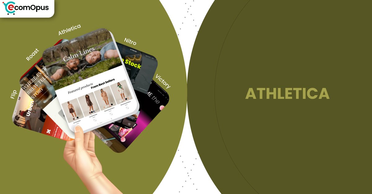
Presets
Victory offers multiple presets that share the same engine, but their defaults change the browsing rhythm in a noticeable way. Athletica is the preset that feels most “in motion,” with bold merchandising beats and practical layouts that still look modern. We like comparing presets because it saves time, since your best choice is often the one that matches your content style without heavy redesign. The table below frames each preset as a starting strategy, not just a color palette, so you can pick what fits your catalog and workflow.
| Preset | Aesthetic Vibe | Where It Shines | Noteable Tweaks |
|---|---|---|---|
| Athletica | Energetic, structured, sporty | Activewear, gear, fast refresh catalogs | Bold promos with controlled spacing |
| Nitro | Clean, speed-first | High-volume catalogs, repeat buyers | Reduced motion and tighter layouts |
| Flip | Bold, campaign-ready | Launches, featured collections, sales pages | Strong promo hierarchy and punchy blocks |
| Pulse | Airy, modern minimal | Lifestyle brands with clean photography | More whitespace and softer pacing |
| Studio | Editorial, curated | High margin items and small catalogs | Typography-led sections and refined media |
Key Features And Highlights
Features matter most when they remove recurring work, not when they add options you never touch again. We tested Athletica by building core pages a merchant actually needs, then revisiting them to see how easy it is to keep the store consistent after several edits. This table highlights the features that kept showing up in our workflow, especially for merchandising, clarity, and product confidence. Each one is less about flashy design and more about reducing friction between “I want to buy” and “I’m sure this is right.” If you want a preset that behaves like a system, not a one-time design, these are the pieces that make that happen.
| Features | What It Is And Why It Matters? |
|---|---|
| Merchandising-first hero sections | Hero blocks are designed to carry campaigns without swallowing the page. We found they keep messaging crisp while still giving collections a clear next step. |
| Structured collection tiles | Collection tiles create a clean map for browsing without overexplaining. Shoppers can jump into categories quickly, and merchants can reshuffle priorities without breaking layout balance. |
| Product page clarity blocks | Product templates support fit, materials, and reassurance in a predictable flow. That predictability helps shoppers trust what they see, especially when variants and sizing matter. |
| Promotional messaging placements | Promo placements make offers visible without turning the store into a banner stack. We noticed this keeps discounts readable while products remain the visual anchor. |
| Mobile-friendly navigation rhythm | Navigation choices feel made for thumbs, not desktops scaled down. In testing, fewer awkward taps helped keep shoppers browsing longer across multiple collections. |
| Consistent typography hierarchy | Fonts and spacing guide attention without shouting. That hierarchy matters because active catalogs often have badges, prices, and variant labels competing for focus. |
| Section-based landing pages | Sections make it easier to build collection-led pages without custom development. We created a launch page quickly, then reused the structure for a sale page with minimal effort. |
| Trust and policy highlights | Trust sections surface shipping, returns, and guarantees in a clean format. This reduces the “wait, what if” pause that often shows up right before checkout. |
| Performance-aware visual restraint | The preset looks modern without relying on heavy animation for personality. That restraint makes it easier to keep pages snappy as apps and tracking scripts accumulate. |
| Catalog scalability habits | Layout patterns stay readable as product counts grow. We found the design holds up when you add more variants, more tags, and more collections over time. |
Theme Experience!
Theme experience is the emotional result of dozens of small moments, like how stable grids feel, how quickly product pages answer questions, and whether the cart flow stays smooth. We ran Athletica through real browsing patterns, including hopping across collections, comparing similar items, and building a cart with multiple variants. This table focuses on what shoppers feel, because the best Shopify themes are the ones that feel effortless even when the store is busy. If your goal is a store that feels confident rather than complicated, these experience notes will help you predict fit. We also kept mobile front and center, since that is where “almost good” themes usually fall apart first.
| Experience Area | What Shoppers Feel In Practice? |
|---|---|
| First impression | The storefront feels energetic without feeling loud, which helps shoppers stay curious. Clear visual hierarchy tells them what to do next instead of making them decode the page. |
| Collection browsing | Product grids remain readable even when badges and variant labels are present. This reduces comparison fatigue, so shoppers scan faster and feel more in control. |
| Product page confidence | Important details appear in a predictable order, so shoppers do not hunt for fit or specs. That steadiness makes buying feel safer, especially for size-sensitive products. |
| Promotion awareness | Offers are visible but not intrusive, which keeps trust intact. Shoppers understand the deal quickly, then return attention to products without distraction. |
| Cart momentum | Adding items feels direct, and the flow stays focused on completion. We noticed fewer “speed bumps” between intent and checkout compared to more layered layouts. |
| Mobile comfort | Touch targets feel practical, and scrolling remains smooth across sections. This reduces accidental taps, which is a hidden conversion killer on smaller screens. |
| Brand storytelling | Story blocks exist as support rather than the main act, which keeps shopping central. The store can express identity without slowing decisions or burying products. |
Performance, Explained!
Performance for Athletica Shopify Theme shows a familiar pattern for modern Shopify experiences, with desktop feeling reliably smooth and mobile being more sensitive to interactivity. The Core Web Vitals snapshot shows mobile stability is strong, while responsiveness sits just outside the safest range, which often points to scripts and app weight more than theme structure. Desktop results pass Core Web Vitals and feel quick in real browsing, which helps catalogs, filters, and menus feel lightweight. What we like most is that the design looks premium without leaning on heavy motion, so merchants have room to optimize without sacrificing style.
| Performance Parameters | Mobile | Desktop | Remarks |
|---|---|---|---|
| Performance Score | 72/100 | 91/100 | Mobile performance starts strong but has less headroom for heavy apps. Desktop feels consistently responsive, which makes browsing sessions feel effortless. |
| First Contentful Paint | 1.7 s | 0.9 s | Mobile shows content early enough to reassure impatient shoppers. Desktop paints quickly, which makes promotional headers and grids feel instant. |
| Largest Contentful Paint | 2.4 s | 1.5 s | Main content appears in a healthy window with disciplined imagery. Desktop LCP supports bold hero visuals while still feeling fast. |
| Cumulative Layout Shift (CLS) | 0.00 | 0.06 | Mobile stability is a standout, so pages do not “jump” during load. Desktop remains acceptable, but image sizing and fonts can tighten it further. |
| Interaction to Next Paint (INP) | 210 ms | 83 ms | Mobile interactions can feel slightly delayed when scripts compete for the main thread. Desktop remains crisp, supporting quick add behavior and menu interactions. |
| Time to First Byte (TTFB) | 1.1 s | 0.2 s | Mobile server response can vary across networks, which affects perceived speed. Desktop response is strong, giving merchants a good baseline to protect. |
| Time to Interactive (TTI) | Varies by app stack | Varies by app stack | TTI shifts when chat, personalization, and tracking scripts pile up. Deferring nonessential scripts keeps the store feeling usable sooner. |
| Speed Index | Varies by media weight | Varies by media weight | Perceived speed improves when above-the-fold images are compressed and sized well. Oversized hero media can slow the feeling of completeness even when metrics look decent. |
From our testing, Athletica performs like a well-built training plan: strong fundamentals, but outcomes depend on what you add on top. If your store runs multiple scripts for reviews, upsells, and popups, mobile responsiveness is where you will feel it first. The good news is that Athletica does not force heavy visual effects to look modern, so optimization does not require sacrificing design. Keep imagery lean, keep apps purposeful, and the preset rewards you with a storefront that feels quick and stable.
Pricing
Athletica follows Victory’s one-time pricing model at $320 per storefront license, which makes budgeting straightforward for merchants planning a long-term Shopify build. You can test the preset in a preview environment before publishing, so you can validate layout fit, content workload, and performance impact with your actual products. The value usually shows up when the theme reduces reliance on cosmetic apps, since fewer apps often means fewer scripts competing with storefront speed. For stores that run frequent launches or rotate collections weekly, the ROI can appear faster because landing pages and merchandising edits take less effort. Smaller catalogs can still benefit, but payback is typically slower unless you prioritize premium presentation and structured browsing.
Stores Build with Athletica Shopify Theme
Since Athletica is comparatively new within the Shopify theme ecosystem, verified public examples are still limited and can change quickly as more merchants publish. Team eComOpus prefers to list only clearly validated live stores, because guessing undermines trust and does not help you evaluate real-world design choices. We will continue monitoring storefront launches and gathering examples as adoption grows, alongside merchant feedback from multiple channels. As we find confirmed stores, this section will evolve into a practical shortlist you can browse for layout inspiration.
Themes Similar to Athletica
Comparisons matter when the shopping behavior is similar, not just the visual style. We picked themes that support bold merchandising, confident product pages, and fast category browsing, since those are the lanes Athletica prefers. This table is meant to help you evaluate trade-offs, like paying for ready-made structure versus starting with a free base and customizing upward. It also helps you spot themes that match your content style, so you spend less time fighting defaults and more time selling. If you are choosing between “sporty energy” and “clean conversion,” these options frame the decision well.
| Shopify Theme | FREE or Paid? | Why is it Similar? |
|---|---|---|
| Impulse | Paid | Built for promotions and fast merchandising, much like Athletica’s launch-friendly rhythm. It also supports bold calls-to-action while keeping product discovery straightforward. |
| Impact | Paid | Prioritizes strong hierarchy and decisive browsing, similar to Athletica’s structured flow. It works well when you want a modern look without visual clutter. |
| Prestige | Paid | Offers premium presentation with confident storytelling blocks, which overlaps with Athletica’s polished feel. It suits brands that want high impact without messy layouts. |
| Dawn | FREE | A clean Shopify foundation that can be shaped into a focused storefront with careful section choices. It is similar in simplicity, but needs more refinement to feel as punchy. |
| Sense | FREE | Designed for clarity and reassurance with readable product templates, aligning with Athletica’s confidence-building approach. It fits stores that want clean browsing with friendly structure. |
Pros and Cons
Pros and cons should act like a quick decision filter, not a dramatic scorecard. We focused on what merchants will notice after a few weeks of running the store, when novelty fades and workflow matters. The pros highlight Athletica’s strongest practical advantages, especially for merchandising and browsing clarity. The cons are framed as considerations, because they are usually solvable with content discipline and smart app choices. If you want a preset that stays consistent while your store evolves, this section should help confirm fit.
| Pros | Cons |
|---|---|
| Promo sections feel bold yet controlled. They help launches stand out without turning pages into noise. | Visual energy can tempt over-design. Too many banners can reduce clarity unless you keep hierarchy strict. |
| Collection browsing stays readable on mobile. Product cards remain calm even with badges and variant labels. | Mobile responsiveness needs restraint. Heavy scripts can make taps feel slower during peak browsing. |
| Product pages build confidence quickly. Fit details and reassurance blocks reduce hesitation before checkout. | Best Practices may need tuning. Small technical cleanups can improve long-term stability and tracking hygiene. |
| Layout stays consistent after edits. Merchandising changes do not create uneven pages over time. | |
| The preset supports repeatable landing pages. You can refresh campaigns fast without rebuilding structure. |
Our Rating
Ratings are useful only when they reflect day-to-day reality, not just first impressions. Team eComOpus scores themes based on how well they support common Shopify workflows, how steady they feel after repeated edits, and how comfortable they are for real shoppers on mobile. This table breaks down the categories that matter most for merchants: building speed, design control, performance stability, and long-term maintainability. Each score is meant to guide decisions, not declare a winner, because the best theme is the one that fits your catalog and operations. Athletica Shopify Theme scored highest where structure and merchandising discipline matter most.
| Parameters | Our Ratings | Summary |
|---|---|---|
| Feature Depth | 4.6/5.0 | The feature set supports real merchandising tasks without pushing merchants toward extra apps. We found the tools feel practical, especially for launches, collections, and product clarity. |
| Design and Customization | 4.5/5.0 | Customization feels structured, so brands can add personality without breaking layout consistency. The preset rewards clean decisions, which keeps the storefront looking intentional over time. |
| Performance | 4.3/5.0 | Desktop performance is strong and supports fast browsing across catalogs. Mobile remains stable, but responsiveness benefits from keeping scripts and heavy apps under control. |
| Value for Money | 4.4/5.0 | $320 feels justified when the theme replaces multiple cosmetic tools and reduces ongoing app costs. Stores that update often typically feel the payoff sooner through faster page iteration. |
| Support and Updates | 4.4/5.0 | Early signals suggest helpful support and an active development mindset. That lowers risk for merchants who want a theme that improves rather than staying static. |
| Overall | 4.5/5.0 | Athletica Shopify Theme is a strong choice for energetic brands that still want order. It blends bold merchandising with clean structure, which helps conversion and maintainability. |
User Reviews: What Merchants Say
Early feedback suggests merchants appreciate the combination of flexibility and support, which is especially important when a theme is still gaining adoption. The review tone points to a smooth setup experience, with emphasis on customization options rather than unexpected friction.
We also noticed the developer voice focuses on improvement and iteration, including the idea that the product evolves through updates. That matters for Shopify merchants who want a theme that grows alongside their storefront needs, not one that stays frozen after launch.
What is notably absent so far are recurring complaints about confusing editor setup, unstable layouts, or broken mobile browsing. In our own testing, the preset felt structured and predictable, which aligns with the kind of satisfaction merchants usually express when a theme “just behaves.”
Our Verdict
Athletica Shopify Theme is a strong fit for merchants who want energy on the surface and discipline underneath. It feels designed for brands that run regular drops, rotate collections often, and need shoppers to browse quickly without losing confidence.
If your Shopify store wins through clean hierarchy, strong product cards, and repeatable landing pages, Athletica delivers a premium starting point at $320. Keep your media optimized, keep apps purposeful, and this preset will feel fast, consistent, and easy to maintain.
Who Should Not Buy Athletica
Brands that rely on slow-burn storytelling, immersive editorial layouts, or highly experimental page structures may find Athletica too structured. The preset prefers confident merchandising beats over cinematic pacing, so it is better for “browse and buy” journeys than “read and wander” experiences.
Stores planning to stack many heavy apps, multiple popups, and script-heavy personalization should be cautious, especially for mobile shoppers. Athletica can still work, but it performs best when you treat performance like a budget and keep the storefront focused rather than overloaded.
GET THE BEST APPS IN YOUR INBOX
Don't worry we don't spam


