Atelier Shopify Theme Review: Editorial Styling That Makes Products Feel Pricier
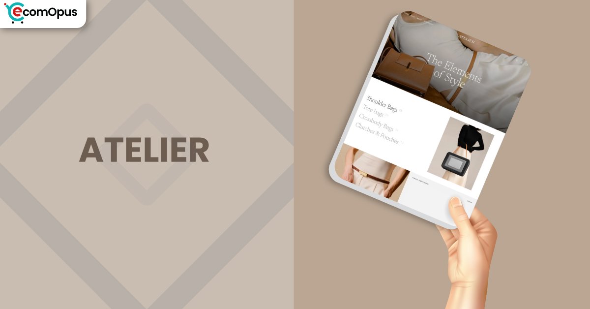
Atelier Shopify Theme is a FREE Shopify theme for visual-first brands. Team eComOpus found it creates a gallery-like storefront while keeping checkout flow obvious.
- Editorial layout that flatters premium photography
- Calm navigation for deliberate, guided browsing
- Product pages built for detailed storytelling
- Clean swatches that make variants intuitive
- Cart drawer flow that keeps momentum
- Frequent refinements that improve polish
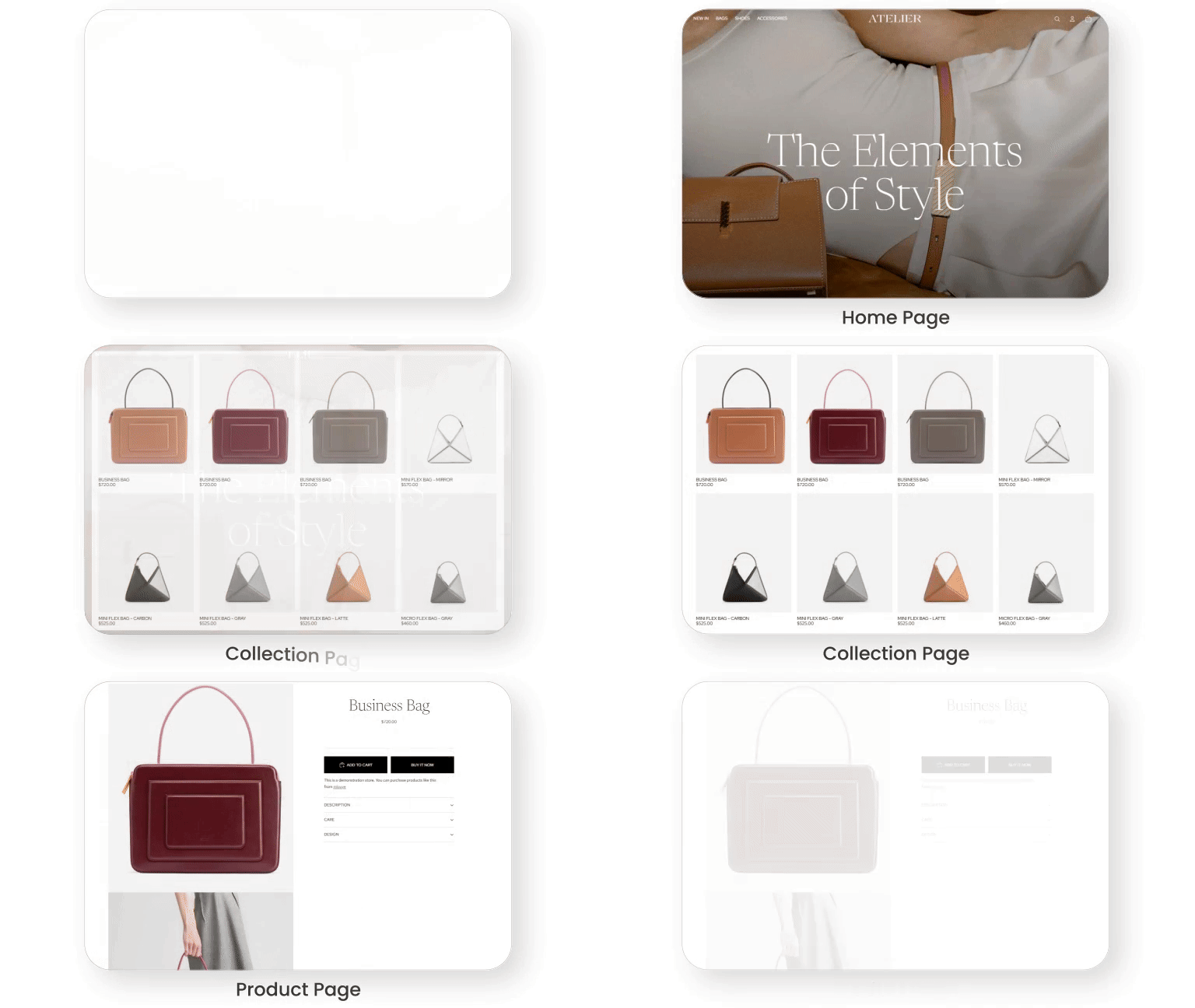
Introduction
We built a test store, loaded real product photos, and ran the theme through everyday stress that exposes weak design: long menus, variant-heavy items, and content-rich pages. Everything feels thoughtfully designed and well balanced. The mood stays quiet and confident, so the catalog looks curated instead of crowded. One merchant nailed the first impression: “It’s stunning.”
Atelier Shopify Theme also rewards good setup habits. When imagery is consistent and product content is structured, the storefront looks premium fast, even without custom code. The main complaints tend to show up after change, like an update or an added app, when a small bug or a missing control becomes noticeable. If you’re willing to test before publishing, this theme can be a strong long-term foundation.
Ideal For Niches With Supporting Features
Atelier shines for stores that sell with detail, texture, and presentation rather than loud promotion. We saw the best fit for catalogs where shoppers browse slowly, compare variants, and read context before committing. Use the table below to confirm the theme matches how your customers actually shop.
| Niches | Supporting Features | Why They Matter? |
|---|---|---|
| Jewelry and Accessories | Minimal grids, refined type controls, and clear swatch mapping. | Shoppers judge shine and finish quickly, so clean spacing keeps focus on detail. Visual swatches reduce second-guessing when color and metal choices decide the purchase. |
| Ceramics and Home Decor | Image-forward sections and curated collection spotlights. | Home buyers compare texture and scale, so large visuals build trust early. Spotlight collections help them shop by room, style, or gifting intent without getting lost. |
| Art and Handmade Goods | Storytelling sections plus readable product accordions. | Handmade buyers want the story, and accordions keep detail accessible without clutter. An editorial rhythm makes the checkout feel intentional rather than rushed. |
| Boutique Apparel | Variant-friendly layouts and smooth collection browsing. | Apparel browsing needs speed, and clear grids keep scanning effortless on mobile. Clean variants reduce mistakes in size and color selection, which helps protect returns. |
| Premium DTC Brands | Calm UI, consistent branding tools, and modern cart flow. | Premium positioning needs restraint, and the interface avoids noisy tricks. A focused cart experience keeps momentum high once shoppers are ready. |
Presets
Atelier is a standalone Shopify theme with no preset variations. As a FREE Shopify theme, it gives you one editorial foundation to shape through sections, colors, and typography. That simplicity keeps branding consistent as you scale.
Key Features And Highlights
We judge features by one question: will this make a shopper’s decision easier. Atelier leans into modern Shopify building blocks, so you can assemble pages quickly without stacking cosmetic apps. The table below highlights what matters most to set up first.
| Features | What It Is And Why It Matters? |
|---|---|
| Central typography settings | Fonts are managed in one place, so your brand voice stays consistent across pages. It’s efficient, but you’ll want to decide your type scale early. |
| Swatch mapping for variants | Swatches map to variant names so choices feel visual, not technical. This speeds selection and can reduce wrong-variant orders. |
| Collection spotlight navigation | Spotlight collections guide shoppers into the catalog without endless scrolling. It’s ideal when you sell by category and want curated entry points. |
| Featured collection grid sections | Grids make merchandising repeatable across pages with minimal effort. Test desktop layouts with long titles because a few merchants reported overlap edge cases. |
| Product information accordions | Accordions keep long details readable and prevent product pages from feeling heavy. They’re perfect for materials, care notes, sizing, and shipping reassurance. |
| Cart drawer purchase flow | The cart drawer helps shoppers adjust items without losing context. If you customize cart code, retest after updates because file structure can change. |
| Hover image previews | Hover or tap previews show alternate angles quickly and lift confidence for visual products. Keep animations light so mobile interaction stays smooth. |
| Mobile menu layout controls | Mobile menus can stay tidy even with deep category trees and many links. That reduces bounce because navigation feels like exploration, not work. |
| Templates for pages and products | Templates help pages feel purposeful instead of cloned as content grows. Assign distinct templates to avoid content appearing across multiple pages. |
| App section compatibility | Many apps work, but some widgets need responsive tuning to match spacing. Validate app blocks on mobile before you design your product page around them. |
Theme Experience!
A theme is more than how it looks, it’s how it feels when someone is deciding whether to trust you. In our testing, Atelier kept attention on products and reduced “where do I click” confusion. Here’s what shoppers typically feel across the journey.
| Experience Area | What Shoppers Feel In Practice? |
|---|---|
| First impression | The page opens with gallery-like quiet that feels curated and premium. Shoppers see hierarchy quickly, so the first scroll feels guided. |
| Collection browsing | Grids stay readable even when shoppers scan fast and jump categories. Spacing reduces fatigue, which keeps browsing sessions longer. |
| Product detail reading | Product pages handle long descriptions gracefully, so detail feels like reassurance. Accordions keep key information easy to find near purchase time. |
| Variant selection | Variants feel visual and clear, which lowers hesitation for color choices. If you need multi-image variant galleries, you may need an app or custom approach. |
| Cart readiness | The cart drawer keeps intent warm because shoppers can adjust items quickly. After updates, it’s smart to recheck cart behavior on mobile and desktop. |
| Mobile navigation | Menus can stay organized with many links, protecting browsing mood on small screens. Merchants have flagged occasional mobile display quirks, so preview your exact setup carefully. |
Performance, Explained!
Atelier performs stronger on desktop than mobile, with the main pressure point being how quickly the largest above-the-fold element renders. In our tests, desktop felt ready for shoppers, while mobile needed tighter media discipline to keep the first view snappy. Layout stability is a bright spot, so pages feel steady instead of jumpy.
| Performance Parameters | Mobile | Desktop | Remarks |
|---|---|---|---|
| Performance Score | 79/100 | 92/100 | Desktop feels quick and steady, which supports smooth browsing. Mobile is workable, but it rewards strict image optimization and fewer scripts. |
| First Contentful Paint | 2.4 s | 1.9 s | Shoppers see content early, reducing the “blank screen” moment. Trim render-blocking code and font weight to improve perceived speed. |
| Largest Contentful Paint | 3.4 s | 2.6 s | Mobile LCP is the limiter and usually tracks hero imagery size. Compress above-the-fold media and avoid oversized sliders to improve it. |
| Interaction to Next Paint (INP) | 287 ms | 72 ms | Desktop interaction is snappy and supports fast clicking. Mobile stays acceptable, but heavy animations and apps can introduce lag. |
| Cumulative Layout Shift (CLS) | 0 | 0.01 | Stability is excellent, so shoppers aren’t chasing moving buttons. Keep image dimensions set and avoid late banners above CTAs. |
| Time to First Byte (TTFB) | 1.5 s | 1.0 s | Response time is reasonable here, with desktop arriving faster. Too many apps can raise TTFB, so keep scripts purposeful. |
| Time to Interactive (TTI) | Not shown | Not shown | TTI isn’t shown, but it often worsens with extra scripts after load. If mobile feels slow, audit apps first and reduce effects. |
| Speed Index | Not shown | Not shown | Speed Index isn’t listed, yet it tracks perceived loading smoothness. Prioritize above-the-fold compression and delay non-critical sections. |
Atelier Shopify Theme can feel fast when you treat performance like ongoing grooming, not a one-time task. Merchants who complain about speed often point to heavy loading after changes, like added apps or oversized media. Compress hero images, keep the homepage focused, and mobile LCP becomes much less intimidating.
We also saw merchants praise overall responsiveness while still flagging bugs in specific sections on certain devices. That usually means the core is solid, but edge cases appear when layouts are pushed. Build lean, test on real phones, and you’ll get the best balance of speed and polish.
Pricing
Atelier is priced at $0, so your investment is time, not money. You can test it inside your Shopify admin, refine sections, and publish only when it matches your brand. Because the theme covers core merchandising cleanly, you can often skip a few “make it prettier” apps that add monthly costs and extra scripts. The ROI shows up as a calmer site, fewer dependencies, and simpler maintenance, especially if you keep the homepage light.
Stores Build with Atelier Shopify Theme
Live storefronts show what a theme becomes after real products and real photography are layered in. Editorial themes can look empty with weak imagery or stunning with consistent visuals, so examples matter. Below are store names shared in positive merchant experiences with this theme.
- Di Conza
- Islasereia
- Southern Gothic Art
- Grevano
- Puralma
- Premium Handcrafted Leather Bags For Professionals – Gallery de Neyuh
Themes Similar to Atelier
It helps to compare themes by merchandising style, not just visual vibe. We picked alternatives that overlap with Atelier in clean presentation, section flexibility, and modern navigation. Use the table below as a shortlist starter, then test your own photos in each option.
| Shopify Theme | FREE or Paid? | Why is it Similar? |
|---|---|---|
| Dawn | FREE | Dawn shares a clean foundation and predictable sections, making it a strong baseline comparison. It’s similar when you want simplicity first with neutral defaults. |
| Craft | FREE | Craft supports storytelling and spacious layouts for handmade and lifestyle catalogs. It’s similar when you want calm browsing with a warmer, tactile mood. |
| Sense | FREE | Sense is built for bold visuals and strong product emphasis across collections and pages. It aligns when you want clarity and confidence without heavy decoration. |
| Prestige | Paid | Prestige offers premium presentation plus deeper merchandising for growing catalogs. It’s comparable if you want polish plus more native upsell structure. |
| Impulse | Paid | Impulse is promo-ready and designed for energetic merchandising across campaigns. It’s similar if you want structure but a more sales-forward tempo. |
Pros and Cons
A fast decision needs honest trade-offs, not dramatic criticism. These points reflect what we repeatedly observed and what merchants often mention. Read the pros as weekly wins and the cons as items to validate before launch.
| Pros | Cons |
|---|---|
| Products look curated instantly. The layout stays calm as collections grow. | SKU workflows may feel limited. Some stores need custom display and search to match inventory habits. |
| Branding changes are quick. Typography and spacing upgrade the mood without redesign. | Updates can shift code. Retesting is smart if you edited cart or section files. |
| Variants feel shopper-friendly. Swatches reduce hesitation and wrong-choice returns. | Edge-case section bugs appear. Test grids and carousels on desktop before publishing. |
| Cart flow keeps momentum. Drawer checkout avoids extra page jumps. | |
| Storytelling stays readable. Accordions keep details accessible without clutter. |
Our Rating
These ratings reflect hands-on setup, storefront testing, and repeated patterns from merchant feedback. We focus on what stays true after launch: editor workflow, predictability after updates, and how the theme behaves as content grows. Use the scores as a filter, then validate with your catalog.
| Parameters | Our Ratings | Summary |
|---|---|---|
| Feature Depth | 4.1/5.0 | Core sections cover most storefront needs, from collections to product storytelling. Advanced workflows like SKU-first shopping may need customization to feel complete. |
| Design and Customization | 4.6/5.0 | The design language is premium, and small edits create big gains quickly. Central typography and spacing keep branding consistent without constant tweaking. |
| Performance | 4.0/5.0 | Desktop performance is strong and stable, supporting smooth discovery and fast decisions. Mobile improves significantly when you compress hero media and keep apps lean. |
| Value for Money | 5.0/5.0 | At $0, the value is obvious for merchants who want a high-end look without cost. The theme can also reduce app spend by handling presentation cleanly. |
| Support and Updates | 4.1/5.0 | Updates bring fixes and refinements, which is a net positive over time. If you customize code heavily, you’ll need consistent testing after each update. |
| Overall | 4.4/5.0 | Atelier Shopify Theme suits image-led brands that want calm, editorial merchandising. With performance discipline and testing habits, it scales confidently. |
User Reviews: What Merchants Say
Merchants love the look and the “premium without paying” feeling, especially for visual catalogs like jewelry and art. The most common praise is that it looks expensive and feels intuitive once set up, even for smaller stores. One merchant wrote: “The best free theme available on Shopify in my opinion.”
Constructive feedback repeats around SKU visibility, variant image handling, and occasional device-specific quirks after updates. Some merchants also mention that features can feel rigid in places, like menu behavior or typography defaults. The pattern is consistent: people like living in the theme, they just want sharper controls and fewer surprises.
Our Verdict
Atelier Shopify Theme is a strong choice for brands that sell through photography, typography, and restrained presentation. Team eComOpus sees it as one of the best FREE options for merchants who want a premium feel without paying for a design upgrade. It’s built for calm merchandising, not noisy gimmicks.
Treat performance as ownership: compress hero images and limit script-heavy apps. Retest key sections after updates, especially if you touched cart or section code. Those habits keep mobile smooth and protect conversions.
If your catalog is curated and your imagery is consistent, this theme makes products look more valuable than they are. If you want a Shopify storefront that feels polished without paying for design, it’s an easy yes. Commit to it, and iterate with discipline.
Who Should Not Buy Atelier
Skip this theme if your customers shop primarily by SKUs or product codes and expect code-first search behavior. You can add what you need, but you’ll be doing extra work to match an inventory-first workflow. A more utility-first theme will feel simpler for that scenario.
Also avoid Atelier if you plan frequent radical redesigns or rely on deep code edits that must survive untouched. The theme improves through updates, and that’s good, but heavy customizations require maintenance. If you prefer a stable sandbox for experiments, choose a theme with a slower update cadence.
GET THE BEST APPS IN YOUR INBOX
Don't worry we don't spam


