Supreme Shopify Theme Review: Smart Conversion Design, Dependable Support
Supreme is a premium Shopify theme built for merchants who want a modern storefront that feels clean, capable, and conversion-aware. It blends a broad feature set with a surprisingly “hands-on” support reputation, making it appealing for both builders and busy operators.
- Modern layout built for broad catalogs
- Thirty-five plus sections for flexible pages
- Quick buy and sticky cart built-in
- Mega menu and smart filters for scale
- Mobile vitals look stable and smooth
- Desktop layout shifts need careful tuning

Introduction
Supreme feels like a theme designed for merchants who want options without chaos. The layout in the preview leans modern and confident, with spacing that keeps pages readable instead of crowded. It’s not trying to be a minimalist art gallery, but it also avoids the loud “promo wall” vibe that can make stores feel messy.
The homepage flow is built to guide shoppers from brand context to product discovery without making them think too hard. Navigation stays clear, collections feel organized, and product blocks are arranged in a way that encourages browsing rather than forcing urgency. That structure matters for stores with growing catalogs, because confusion scales faster than traffic does.
What makes Supreme especially interesting is how merchant feedback consistently shifts attention from “nice design” to “this support team actually helps.” Multiple reviewers describe quick replies, patient troubleshooting, and fixes that go beyond the immediate issue. When a theme is this feature-packed, supportive developers can be the difference between a smooth launch and a week of tiny fires.
Ideal For Niches With Supporting Features
Supreme is built to be versatile, but it still has a personality: modern, structured, and built for stores that want both storytelling and strong shopping mechanics. It supports browsing-heavy journeys, where customers compare, filter, and return to products repeatedly before buying. That’s why features like quick view, strong discovery tools, and clean product detail layouts matter more than flashy effects. The table below highlights niches where Supreme’s structure and feature set feel naturally aligned.
| Niches | Supporting Features | Why They Matter? |
|---|---|---|
| Fashion and apparel | Lookbooks, swatches, clean collection grids | Apparel shoppers compare visually and fast. A tidy grid reduces fatigue while keeping choice momentum alive. |
| Beauty and skincare | Usage info, FAQs, badges, media tools | These buyers want clarity before committing. Structured education builds trust without turning pages into clutter. |
| Jewelry and accessories | Zoom, size chart, high-resolution media | Small products create big hesitation around detail. Clear media and specs reduce uncertainty and returns. |
| Food and drink | Bundles, promos, quick buy flow | Shoppers often add multiple items quickly. Fast add-to-cart mechanics protect impulse intent and basket size. |
| Home décor and lifestyle | Image galleries, curated collections, mega menu | Décor browsing is comparative and slow. Clean discovery tools keep shoppers oriented across many options. |
| Large multi-collection catalogs | Filtering, sorting, enhanced search, navigation | Scale punishes messy information architecture. Strong discovery keeps customers moving instead of bouncing. |
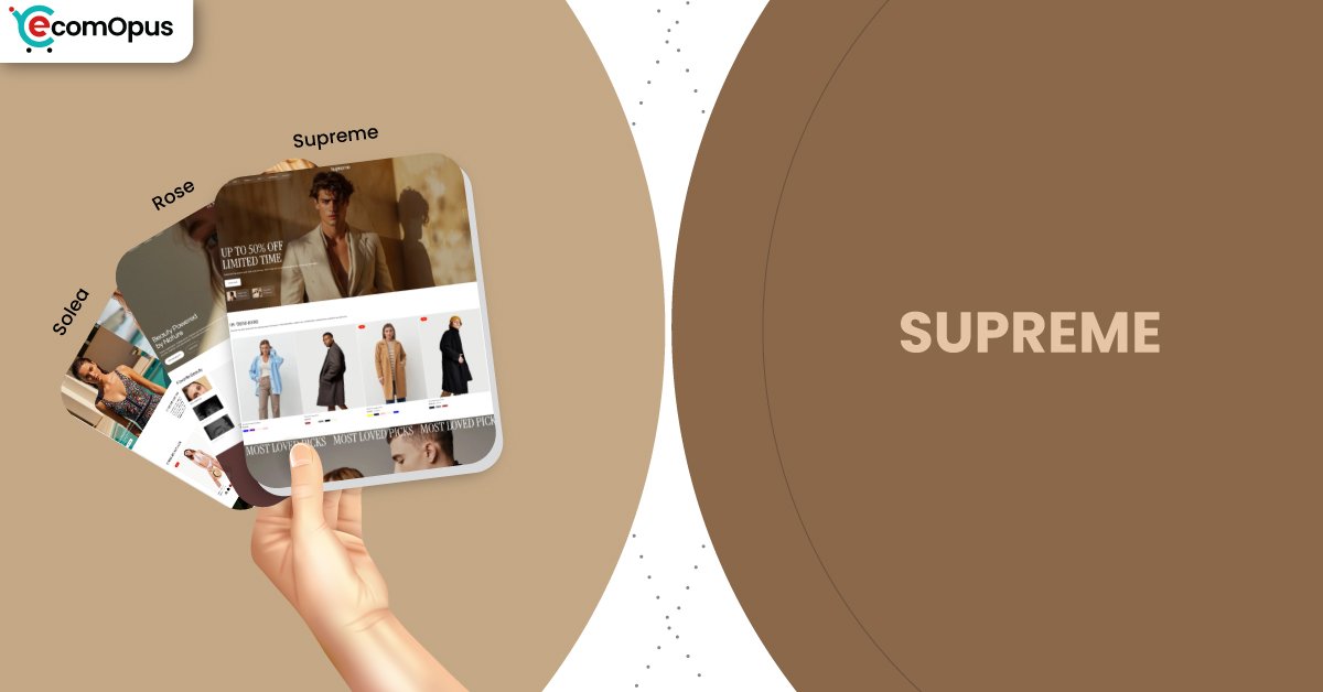
Presets
Presets matter because they set the store’s “tempo” before you customize anything. Supreme includes three presets that share the same underlying feature foundation, which means you can shift styling direction without rebuilding your store structure. The differences show up in mood, spacing decisions, and how bold the design feels at first glance. Use the table below to choose the preset that best fits your brand’s natural energy.
| Preset | Aesthetic Vibe | Where It Shines | Noteable Tweaks |
|---|---|---|---|
| Supreme | Modern flagship storefront with flexible balance | Multi-category lifestyle, broad catalogs | More neutral rhythm for varied merchandising |
| Rose | Warm, romantic premium styling | Fashion, gifting, accessories | Slightly richer mood for storytelling |
| Solea | Chic minimalism with luxe calm | Beauty, wellness, boutique brands | Cleaner density and product-first framing |
Key Features And Highlights
Supreme’s feature list is not just long, it’s strategically practical. It focuses on the mechanics that reduce friction during browsing, improve product confidence, and keep shoppers moving toward purchase without feeling pushed. Many themes look premium in the demo and then need a stack of apps to become functional for real catalogs. Supreme aims to reduce that dependency by building key conversion and discovery tools directly into the theme experience. The table below highlights the features that most directly influence shopper behavior.
| Features | What It Is And Why It Matters? |
|---|---|
| Quick buy and quick view | Shoppers can act without leaving the collection flow. This reduces drop-off caused by too many page jumps. |
| Slide-out cart and sticky cart | Cart access stays close during long browsing sessions. It supports faster checkout decisions without interrupting discovery. |
| Mega menu with in-menu promos | Navigation can scale while still feeling curated. Subtle promo placement stays visible without turning noisy. |
| Product filtering and swatch filters | Shoppers narrow choices faster and with less frustration. Better filtering increases time-on-site and comparison comfort. |
| Lookbooks and image hotspots | Products become contextual and shoppable within stories. This increases perceived value for lifestyle-led brands. |
| High-resolution media with zoom | Detail-led categories benefit from crisp visuals. Better media reduces hesitation and improves purchase confidence. |
| Before/after image slider | Transformation is communicated visually, not verbally. This helps beauty and wellness brands sell outcomes clearly. |
| Product badges and stock counter | Helpful cues guide decisions without aggressive pressure. Used sparingly, they support urgency while staying brand-safe. |
| Blogs, FAQs, press coverage sections | Trust content can live inside the shopping flow. It reduces doubt without requiring separate landing pages. |
Theme Experience!
A theme’s real test is how it behaves after the first scroll, when shoppers start comparing, switching collections, and searching for reassurance. Supreme is designed to keep those moments smooth and predictable, especially for stores that want both storytelling and high-intent merchandising. The experience feels best when merchants keep their content structured and avoid stacking redundant apps that duplicate theme features. If you let the theme do its job, the store stays calm while still being conversion-ready. The table below breaks down what shoppers typically feel in practice.
| Experience Area | What Shoppers Feel In Practice? |
|---|---|
| First impression | The store looks modern and purposeful. The layout signals competence without trying too hard. |
| Navigation and discovery | Menus feel organized and easy to trust. Shoppers find categories quickly without getting lost. |
| Collection browsing | Grids feel scannable and not exhausting. The page encourages comparison instead of overwhelm. |
| Product pages | Details feel structured and reassuring. Answers show up where shoppers expect them to live. |
| Brand storytelling | Story blocks feel part of shopping, not a detour. The store explains itself while still selling. |
| Mobile browsing flow | Scrolling stays readable and stable. Fewer surprises means fewer accidental taps. |
| Conversion moment | Buying feels clean and close-by. Cart behavior supports momentum rather than breaking it. |
Performance, Explained!
Supreme’s performance profile is a tale of two screens. On mobile, Core Web Vitals pass with strong stability, which usually means fewer frustrating jumps while shoppers scroll and tap. That matters because most browsing happens quickly and impatiently on phones, and stability protects intent.
| Performance Parameters | Mobile | Desktop | Remarks |
|---|---|---|---|
| Core Web Vitals Assessment | Passed | Failed | Mobile should feel steady for most shoppers. Desktop needs stability tuning to protect trust. |
| Largest Contentful Paint (LCP) | 1.9 s | 1.6 s | The main visual appears quickly on both devices. Fast hero rendering reduces early bounce and impatience. |
| Interaction to Next Paint (INP) | N/A | 98 ms | Desktop interactions should feel crisp and immediate. Mobile reporting gaps mean real-device testing is essential. |
| Cumulative Layout Shift (CLS) | 0.02 | 0.22 | Mobile stability is excellent in this run. Desktop movement can distract and cause accidental clicks. |
| First Contentful Paint (FCP) | 1.1 s | 1.9 s | Shoppers see content early, which builds confidence. Early visibility makes the store feel “ready” faster. |
| Time to First Byte (TTFB) | 0.3 s | 0.2 s | Server response looks healthy and consistent. Strong TTFB supports snappy navigation and repeat browsing. |
On desktop, the experience loads fast and interactions are responsive, but layout shift is the main watch-out. When elements move during load, shoppers can misclick or feel a subtle “unfinished” vibe, which undermines premium perception. The table below summarizes the metrics in a way that translates into real user experience.
Pricing
Supreme is priced at $250, placing it in a premium tier that’s easier to justify when you actually use its built-in capabilities. The theme includes a wide range of conversion, discovery, and merchandising features that can reduce the need for multiple paid apps. When fewer tools are bolted on, stores often feel faster, cleaner, and easier to maintain.
The best value shows up over time, not just at launch. If Supreme saves you repeated design rework, prevents app conflicts, and reduces troubleshooting during promotions or seasonal refreshes, the price becomes less of a “theme fee” and more of an operational shortcut. For early-stage stores still changing branding weekly, the investment may feel premature until content and photography stabilize.
Stores Build with Supreme Shopify Theme
Live store examples help validate whether a theme still feels cohesive once real products, real imagery, and real navigation decisions enter the picture. Supreme currently shows several active stores using the theme, and they reflect the same pattern seen in the preview: modern layouts, product-forward merchandising, and a clean browsing rhythm. This consistency suggests the theme holds its structure well when merchants move from demo content to real catalog complexity.
The store names that appear publicly alongside Supreme include Elite Couture, Oana Nutu, Lamerae, ONIMUU, and Dorian & Sage. Even across different brand aesthetics, the common thread is a composed layout that doesn’t feel overloaded. That’s usually a sign that the theme’s foundation is doing real work instead of relying on perfect demo styling.
Themes Similar to Supreme
Supreme sits in the modern premium lane: clean typography, strong media presentation, and built-in mechanics that support browsing at scale. Its closest alternatives tend to balance storytelling with merchandising tools, especially for catalogs that need navigation discipline. Similarity here is less about identical styling and more about the job each theme is trying to solve. The table below highlights comparable options and why they belong in the same neighborhood.
| Shopify Theme | FREE or Paid? | Why is it Similar? |
|---|---|---|
| Prestige | Paid | Prestige also emphasizes premium spacing and editorial composition. It supports trust-first product pages while keeping conversion tools close. |
| Impact | Paid | Impact blends modern visuals with strong merchandising support. It rewards clean content structure and confident media presentation. |
| Broadcast | Paid | Broadcast balances storytelling with promotion-friendly layouts. It keeps navigation structured while supporting brand-led presentation. |
| Impulse | Paid | Impulse is built for fast browsing and conversion mechanics. With disciplined styling, it can feel similarly premium and clean. |
| Dawn | FREE | Dawn offers a modern baseline with flexibility. It can approximate Supreme’s cleanliness, but needs more setup work to match depth. |
Pros and Cons
Supreme has clear strengths, but it also has expectations that the wrong buyer can ignore at their own cost. The pros below highlight what merchants tend to love once the store is live, especially when they lean into theme-native features. The cons focus on the common friction points that appear when stores overload scripts, expect unlimited layout freedom, or neglect content discipline. Use the table as a practical fit check before committing.
| Pros | Cons |
|---|---|
| Built-in features reduce app clutter. Stores stay easier to maintain. | Desktop layout can shift during load. Stability tuning becomes important. |
| Quick buy keeps browsing uninterrupted. Shoppers compare products faster. | Heavy apps can worsen responsiveness. Script conflicts show up early. |
| Discovery tools help big catalogs. Navigation feels less maze-like. | Extreme layout changes may need code. Guardrails protect consistency. |
| Media presentation feels premium. Products look sharper and more valuable. | Inconsistent photography looks more obvious. Clean layouts expose asset gaps. |
| Merchant support feedback is standout. Launch issues resolve with less stress. | |
| Presets offer easy mood shifts. You can refresh without rebuilding structure. |
Our Rating
Ratings are most useful when they reflect real ownership factors like setup friction, day-to-day editing, and how the theme behaves as a catalog grows. Supreme scores highest in feature completeness and support sentiment, which reduces the “what now?” feeling during launch week. The main caution is desktop layout stability, because high CLS can chip away at perceived polish even when everything loads quickly. The table below scores Supreme across key dimensions that affect long-term satisfaction.
| Parameters | Our Ratings | Summary |
|---|---|---|
| Design Quality | 4.7/5.0 | Modern hierarchy and spacing feel premium. The layout stays composed even with varied content. |
| Ease Of Setup | 4.6/5.0 | Settings are approachable for most merchants. Support feedback suggests help arrives quickly when needed. |
| Feature Depth | 4.7/5.0 | Conversion and discovery tools feel complete. Many stores can reduce app dependence substantially. |
| Conversion Support | 4.6/5.0 | Quick buy and cart tools protect momentum. The structure encourages confidence without aggressive pressure. |
| Mobile Experience | 4.5/5.0 | Mobile stability looks strong in this run. Smooth browsing supports thumb-led shopping behavior well. |
| Support And Updates | 4.8/5.0 | Merchants consistently praise responsiveness and care. Strong support reduces operational stress during changes. |
Supreme feels like a theme designed for real operations, not just screenshots. If you address desktop stability, the experience reads polished and dependable end-to-end.
User Reviews: What Merchants Say
Merchant feedback for Supreme is unusually consistent in where it places the spotlight. Reviewers repeatedly describe the theme as clean, modern, and fast, but they spend even more energy praising the developers. That’s meaningful because merchants typically only mention support when it either saves them or fails them, and here it’s described as proactive, patient, and quick to respond.
Several reviews emphasize that Supreme feels feature-complete, especially compared to themes that promise capability but require code tweaks or extra tools to deliver it. Merchants mention customization depth and practical options that cover what they need without feeling buried. The “beginner-friendly” angle appears too, suggesting the theme doesn’t punish users who are new to Shopify editing workflows.
A standout detail is the support style described by at least one store owner: issues were resolved, and the team also improved the storefront while they were in the process of helping. That’s the kind of experience that builds long-term trust, because it signals the developers care about outcomes, not just closing tickets. Overall, sentiment positions Supreme as a theme that looks premium and behaves like a partner when the build gets real.
Our Verdict
Supreme is a strong recommendation for merchants who want a modern premium storefront that can handle both storytelling and serious merchandising. It delivers breadth without feeling bloated, which is rare for feature-heavy themes. If your catalog is growing or your shoppers browse deeply, the navigation and discovery tools alone can justify the choice.
The biggest practical caution is desktop layout shift. It’s not a reason to avoid the theme, but it is a reason to be disciplined with media, fonts, and third-party scripts, especially above the fold. When stability is managed, the theme’s speed and structure support the “this brand has it together” feeling that premium stores need.
Supreme also earns points where many themes quietly lose them: support. Based on merchant commentary, the developer experience reduces the stress of launch tweaks and ongoing improvements. If you want a theme that feels capable on day one and still feels manageable on day one hundred, Supreme fits the brief.
Who Should Buy Supreme
Supreme is best for merchants who want a premium look paired with practical selling mechanics, not just a pretty frame. It suits brands that expect customers to browse, compare, and read before buying, because the theme supports discovery and reassurance without clutter. It also fits teams that want to rely on theme-native features instead of stacking multiple apps for basic functionality. The table below outlines the buyer profiles most likely to get strong value from Supreme.
| Best-Fit Buyer Profile | Why Supreme Fits | What They Will Love Most | Smart Setup Move |
|---|---|---|---|
| Multi-collection lifestyle stores | Built for navigation and scale | Organized browsing without chaos | Build a clean mega menu structure |
| Beauty and wellness brands | Strong education plus conversion tools | Calm layout with trust cues | Create reusable benefits and FAQ blocks |
| Fashion and apparel catalogs | Visual browsing is supported well | Swatches, lookbooks, quick view | Standardize product imagery and grids |
| Jewelry and accessories | Detail-first selling is easier | Zoom, sizing, tidy product pages | Add consistent materials and care sections |
| Stores migrating off app-heavy builds | Theme can replace multiple tools | Cleaner stack and smoother UX | Remove redundant apps before launch |
Who Should Not Buy Supreme
Supreme is not ideal for merchants who want a promotion-saturated storefront where banners dominate every scroll. It can also be a poor fit for stores that depend on heavy third-party app layering for core experiences, because script competition can amplify stability issues and dilute the theme’s clean rhythm. Another mismatch is buyers who expect unlimited layout experimentation through toggles alone, because premium polish usually comes with structural guardrails. The table below highlights profiles that should consider alternatives.
| Not-Ideal Buyer Profile | Why It Can Be A Poor Fit | What They Will Likely Struggle With | Better Approach |
|---|---|---|---|
| Discount-first retailers | The theme favors calm premium pacing | Promo overload can feel messy | Use a merchandising-first promo theme |
| App-stacked storefronts | Scripts can compete during load | Responsiveness and stability issues | Reduce apps and lean on native features |
| Extreme layout customizers | Guardrails preserve consistency | Needing code for deep reshaping | Choose a framework-like theme approach |
| Stores with weak photography | Clean design exposes asset gaps | Products look less premium | Upgrade imagery before switching themes |
| Buyers who want zero optimization | Desktop CLS needs discipline | First-load polish may suffer | Reserve image space and simplify scripts |
GET THE BEST APPS IN YOUR INBOX
Don't worry we don't spam


