Prestige Shopify Theme Review: Luxury Design, Strong Merchandising
Prestige is built for high-end brands that sell with texture, typography, and confidence. This review breaks down its layout strengths, performance signals, and real merchant sentiment so you can decide fast.
- Premium visual hierarchy for editorial brand storytelling
- Mega menu navigation made for larger catalogs
- Product pages support detail-rich, trust-first selling
- Built-in promos and badges without clutter
- Sections feel polished, animated, and brand-safe
- Mobile layout stays stable during long scrolls

Introduction
Prestige is a premium Shopify theme designed to make a store feel established from the first screen, even if your brand is still growing behind the curtain. In the preview, the layout leans into cinematic imagery, confident whitespace, and sections that look “composed” rather than simply assembled. The overall effect is luxury without stiffness, where products are allowed to breathe and headlines carry real weight.
What stood out most is how Prestige balances storytelling with navigation discipline. You can build a homepage that reads like an editorial spread, then guide shoppers into collections using structured menus, curated tiles, and product discovery features that do not feel bolted on. It is a theme that expects good photography and rewards it, but it also gives you enough merchandising tools to support real sales workflows.
Merchant sentiment aligns with that positioning: many reviews praise the elevated look, the depth of features, and support that responds quickly when something goes sideways. The critical notes tend to cluster around expectations, especially refunds, deeper customization comfort, and a few feature requests like more flexible collection loading behavior. In other words, Prestige delights when you buy into its design system, and it frustrates when you want unlimited freedom without touching code.
Ideal For Niches With Supporting Features
Prestige is not trying to be everything to everyone, and that is part of its charm. The theme’s strengths show up most clearly in niches where presentation is part of the product, not just a wrapper around it. It also performs best when shoppers want reassurance and detail before committing, because the layout supports long-form browsing without feeling heavy. The table below maps niche fit to the specific features that do the work.
| Niches | Supporting Features | Why They Matter? |
|---|---|---|
| Luxury fashion and apparel | Lookbooks, image galleries, refined typography | Apparel buyers judge fit and identity quickly. Prestige keeps browsing elegant while still making selection steps feel obvious. |
| Jewelry and accessories | High-resolution images, zoom, structured details | Jewelry shoppers hesitate on materials and scale. Prestige makes the “proof” feel tidy, which reduces uncertainty at checkout. |
| Beauty and skincare | Usage blocks, ingredient sections, FAQs | Beauty customers need clarity without a clinical vibe. Prestige supports education while keeping the page visually premium. |
| Home décor and lifestyle | Curated collection tiles, spacious grids | Décor shoppers compare finishes and sets across collections. Prestige keeps scanning calm so decision fatigue hits later, not sooner. |
| Premium food and drink | Story sections, badges, merchandising promos | Food brands sell origin and craft, not just items. Prestige helps you stage credibility without turning the page into a banner festival. |
Presets
Presets matter because they set the theme’s personality before you customize a single block. Prestige’s presets share the same underlying engine, but their pacing and styling can change how “quiet” or “bold” your storefront feels. This is useful if your catalog stays the same but your brand direction evolves, because you can refresh the mood without rebuilding everything. The table below summarizes how each preset typically behaves once real products replace the demo content.
| Preset | Aesthetic Vibe | Where It Shines | Noteable Tweaks |
|---|---|---|---|
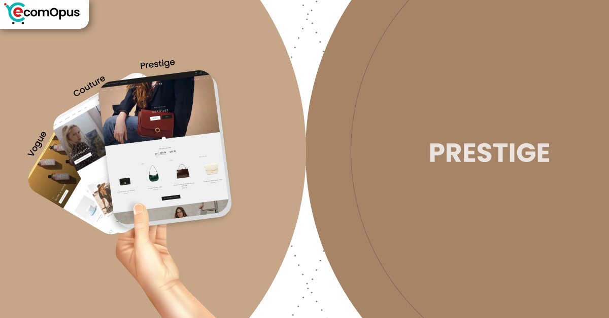
| Prestige | Classic luxury with balanced restraint | Broad premium catalogs across industries | Clean spacing and neutral, brand-safe rhythm |
| Couture | Airy editorial with softer presence | Fashion, bridal, boutique lifestyle | Lighter feel that flatters minimalist photography |
| Vogue | Bolder luxury with warmer energy | Beauty, wellness, statement lifestyle | Stronger visual punch and campaign-friendly contrast |
| Allure | Legacy luxe with traditional structure | Older installs and classic storefront styles | Familiar e-commerce cadence with premium polish |
Key Features And Highlights
Prestige’s feature set is built to support both brand storytelling and conversion structure, which is harder than it sounds. Many “pretty” themes look great on day one and fall apart once you add filters, promos, and real product data. Prestige avoids that trap by offering merchandising tools that still feel designed, not tacked on. The table below highlights the features that most directly influence how shoppers browse, compare, and commit.
| Features | What It Is And Why It Matters? |
|---|---|
| Mega menu navigation | The menu system supports large catalogs without feeling like a maze. It helps shoppers self-direct quickly, which reduces bounce on stores with many collections. |
| Sticky cart behavior | A persistent cart action keeps purchase momentum during long product reads. It helps high-AOV products because shoppers can commit without scrolling back to the top. |
| Quick buy and quick view | Shoppers can sample products faster without losing their place. This is especially helpful when customers want to compare variants across a collection. |
| Lookbooks and image hotspots | Visual storytelling sections connect products to lifestyle context in a clean way. They raise perceived value because the store feels curated, not warehouse-like. |
| Product media and zoom | High-resolution imagery, galleries, and zoom support detail-first purchasing. It builds confidence for materials, texture, and finish, especially on mobile. |
| Promo tiles and in-menu promos | Merchandising can be woven into navigation and layout without shouting. This keeps promotions present while preserving the premium mood. |
Theme Experience!
Prestige is designed to feel calm even when the store is doing a lot behind the scenes. The scrolling rhythm is intentional, with enough whitespace to keep the page breathable and enough structure to keep shoppers oriented. When a theme is truly premium, it should reduce mental load rather than add it, and Prestige generally succeeds there. The table below breaks down how the experience tends to feel across the key parts of a shopping session.
| Experience Area | What Shoppers Feel In Practice? |
|---|---|
| First impression | The storefront reads as premium within seconds. The layout feels deliberate, which increases trust early. |
| Navigation and discovery | Menus feel structured instead of overwhelming. Shoppers can move from browsing to filtering without confusion. |
| Collection browsing | Product grids feel curated rather than crowded. Scrolling stays comfortable because spacing reduces visual noise. |
| Product page clarity | Details land where shoppers expect them. The page supports long reads without feeling like a wall of text. |
| Promotional presence | Promotions feel integrated, not aggressive. Shoppers notice offers without feeling chased around the page. |
| Mobile browsing flow | Layout stability stays strong during scrolling. That reduces mis-taps and keeps the experience controlled. |
Performance, Explained!
On desktop, Prestige shows a very responsive interaction profile, which usually translates into crisp menu opens, quick variant changes, and smoother browsing across heavier pages. The server response also looks healthy, helping the theme feel “ready” quickly even when a store uses large imagery. Desktop field data may show as not applicable for some metrics, but the overall responsiveness signals a strong day-to-day experience.
On mobile, the report flags a failed Core Web Vitals assessment despite excellent layout stability. The biggest practical watch-outs here are interaction responsiveness and a slower server response, which can make taps feel slightly delayed if too many scripts compete early. In a luxury storefront, that matters because “slightly delayed” often reads as “slightly less premium.”
| Performance Parameters | Mobile | Desktop | Remarks |
|---|---|---|---|
| Core Web Vitals Assessment | Failed | Not Applicable | Mobile UX is the main focus here. Desktop needs more field coverage to classify consistently. |
| Largest Contentful Paint (LCP) | 2.4 s | N/A | Mobile hero content appears fairly quickly. Desktop LCP is unavailable in this capture. |
| Interaction to Next Paint (INP) | 210 ms | 78 ms | Mobile taps can feel less immediate under load. Desktop interactions feel sharp and controlled. |
| Cumulative Layout Shift (CLS) | 0 | 0.01 | Stability is excellent across devices. That protects conversion by reducing accidental clicks. |
| First Contentful Paint (FCP) | 1.7 s | 1.1 s | Shoppers see content early on both devices. Desktop reaches “browse-ready” faster and more reliably. |
| Time to First Byte (TTFB) | 1.1 s | 0.3 s | Mobile server response is slower, especially on weaker networks. Desktop response time supports a snappy first impression. |
Prestige rewards discipline: compress media, limit heavy apps, and keep early-loading scripts lean. Do that, and the luxury look will not come with a luxury-weight delay.
Pricing
Prestige is priced at $400, which places it firmly in the premium tier where value depends on longevity, not novelty. The theme makes the most sense when it replaces a stack of design-heavy apps, because its built-in merchandising and storytelling tools can reduce dependency on add-ons. If you are selling high-AOV products, the polished presentation can pay for itself by increasing trust and reducing hesitation. If your store strategy is mostly discounts and rapid promo cycling, you may not fully benefit from Prestige’s calmer luxury rhythm. The best ROI comes when you treat it as a long-term brand foundation, not a short-term makeover.
Stores Build with Prestige Shopify Theme
Prestige is used by a range of brands that lean into premium storytelling and clean merchandising. Notable examples include Mission Workshop, Charles Simon, Aglaia & Co, and Element Matcha. What these stores tend to share is a focus on product presentation, strong imagery, and a browsing experience that feels curated rather than cluttered. This aligns well with Prestige’s strengths, especially its ability to combine editorial sections with structured navigation. If your brand wants that same “considered” storefront tone, these examples show the theme can hold up in real retail environments.
Themes Similar to Prestige
Prestige sits in the “premium editorial” lane, where design quality and merchandising structure are both non-negotiable. The closest alternatives tend to offer strong media presentation, upscale typography, and features that support larger catalogs without feeling messy. Choosing between them usually comes down to how opinionated you want the design to be and how much built-in merchandising you need. The table below lists themes that compete in a similar territory and why the overlap is real.
| Shopify Theme | FREE or Paid? | Why is it Similar? |
|---|---|---|
| Broascast | Paid | Broadcast supports premium storytelling with strong merchandising surfaces. It also balances design polish with tools for promotions and collections. |
| Impulse | Paid | Impulse is built for high-performing merchandising and campaign moments. It can deliver a similarly premium feel when paired with strong imagery and typography. |
| Symmetry | Paid | Symmetry handles large catalogs with structured navigation and flexible layouts. It shares Prestige’s ability to stay clean even as product counts grow. |
| Pipeline | Paid | Pipeline leans modern and editorial with a minimal product-first approach. Like Prestige, it rewards restraint and makes photography do the heavy lifting. |
| Impact | Paid | Impact is designed for bold visuals and premium product presentation. It overlaps with Prestige on conversion features and polished browsing flow. |
Pros and Cons
Prestige has clear strengths, but it also has expectations, and those expectations should be respected before purchase. The pros below focus on how it elevates presentation while supporting real merchandising needs. The cons reflect the most common friction points merchants mention, especially around customization comfort and purchase regret. Use this table as a reality check before you commit.
| Pros | Cons |
|---|---|
| Premium spacing makes products feel expensive. Browsing stays calm across long pages. | Refund expectations can cause frustration. You need certainty before purchasing. |
| Mega menus keep large catalogs organized. Shoppers find collections faster with less guessing. | Deep customization may require coding. Some changes feel harder than expected. |
| Media tools support detail-first selling. Zoom and galleries build confidence quickly. | Collection loading options feel limited to some. Shoppers may want “load more” experiences. |
| Merchandising promos feel integrated and clean. Offers show up without cheapening the design. | Editor language limitations annoy some teams. International workflows can require extra tooling. |
| Quick buy speeds up product comparison. It reduces friction for repeat buyers. | |
| Support is often described as responsive. That lowers stress during launch fixes. |
Our Rating
Prestige performs best when you judge it like a retail system, not just a beautiful template. It is strong in design quality and feature depth, and it tends to feel “complete” compared to themes that require many add-ons. Setup is generally smooth if you follow the theme’s intended structure, but deeper customization can demand more confidence. The table below scores Prestige across six categories that affect real-world ownership.
| Parameters | Our Ratings | Summary |
|---|---|---|
| Design Quality | 4.8/5.0 | The layout feels premium and intentionally paced. Typography and spacing make products look curated, not mass-listed. |
| Ease Of Setup | 4.4/5.0 | Most sections are configurable without friction. Advanced changes can require experimentation or light developer support. |
| Feature Depth | 4.7/5.0 | Merchandising tools are robust and thoughtfully integrated. You can often replace multiple apps with native theme features. |
| Conversion Support | 4.6/5.0 | Quick buy, sticky cart, and structured pages support smoother decisions. The theme encourages confidence instead of pressure-based selling. |
| Mobile Experience | 4.2/5.0 | Layout stability is excellent during scrolling. Responsiveness can dip if you overload the store with scripts and heavy apps. |
| Support And Updates | 4.7/5.0 | Merchants frequently praise fast, helpful support interactions. Updates appear to be actively maintained, which protects long-term value. |
Prestige is a high scorer when brand perception matters as much as mechanics. The theme’s real advantage is how it keeps premium presentation and practical selling tools in the same room.
User Reviews: What Merchants Say
Merchant feedback paints Prestige as a theme that looks premium and behaves like a mature product. Multiple reviewers describe it as “gorgeous” and elevated, often pointing to the spacing, typography, and animations as the reason the storefront feels high-end rather than generic. Support comes up repeatedly as a bright spot, with named team members praised for fast replies, clear guidance, and practical troubleshooting even when the issue is not strictly theme-related.
The negative experiences are less about visual quality and more about expectation mismatch. Some merchants strongly warn about purchase regret and refund limitations, especially when they felt the purchase was accidental or premature. Others highlight that deeper customization can feel restrictive unless you are comfortable with code, and a few point to missing or underpowered features, such as more flexible collection loading or a more advanced cart drawer.
There are also smaller, recurring frustrations that matter in real operations. One merchant dislikes that the editor language options are limited, while another expected a feature like sticky add to cart to be easier to activate without confusion. Overall, the sentiment suggests Prestige delights merchants who want an opinionated luxury system, and it tests the patience of those who want unlimited flexibility through settings alone.
Our Verdict
Prestige is a premium theme that earns its price when your brand is ready to look the part and operate like it, too. It delivers a luxury storefront feel through disciplined spacing, strong typography, and sections that make storytelling and merchandising feel like one cohesive experience. If your products benefit from detail, context, and trust-building content, Prestige gives you a structure that supports longer consideration journeys without making the store feel heavy.
Performance signals show a strong desktop experience and a mobile experience that depends on restraint. The design is stable, which is excellent, but mobile responsiveness can slip if you stack too many apps or run heavy scripts early. In practice, the theme works best when you let it do the job it was built to do instead of fighting it with overlapping tools.
Buy Prestige if you want a storefront that feels curated, composed, and conversion-ready without looking aggressive. Skip it if you need endless layout freedom without code, or if your store strategy leans on constant promo noise rather than premium clarity. In the right hands, Prestige feels like a long-term brand asset, not a temporary coat of paint.
Who Should Buy Prestige
Prestige is best for brands that compete on perception, detail, and a clean shopping journey. It suits stores that want premium storytelling but still need practical merchandising tools to move volume. It also works well for teams that prefer a strong design system instead of infinite settings. If you can keep your build disciplined, Prestige will make your store feel more expensive than the sum of its parts.
| Best-Fit Buyer Profile | Why Prestige Fits | What They Will Love Most | Smart Setup Move |
|---|---|---|---|
| Luxury fashion and apparel | Built for editorial presentation and collections | Typography, spacing, and lookbook rhythm | Standardize imagery across product lines |
| Jewelry and accessories | Supports detail-heavy product decisions | High-res media and clean product layouts | Build a consistent materials and sizing block |
| Beauty and skincare | Handles education without visual clutter | Usage, FAQs, and premium page flow | Turn FAQs into reusable templates |
| Luxury décor and lifestyle | Keeps catalogs curated and navigable | Clean grids and structured discovery | Use mega menu to group collections logically |
| Premium multi-category brands | Balances storytelling with merchandising | Promo tiles that stay brand-safe | Keep promos selective and season-driven |
Who Should Not Buy Prestige
Prestige is not a great fit for stores that rely on constant discount messaging and loud promotional stacking. It can also disappoint teams who want deep layout freedom without touching code or hiring help. If your store is heavily app-dependent, mobile responsiveness may become a recurring pain point. And if you are unsure about committing to a premium theme purchase, this is not the kind of decision you want to make impulsively.
| Not-Ideal Buyer Profile | Why It Can Be A Poor Fit | What They Will Likely Struggle With | Better Approach |
|---|---|---|---|
| Discount-first stores | The theme’s luxury tone clashes with noise | Promo overload can cheapen the experience | Choose a promotion-forward theme style |
| App-stacked storefronts | Scripts can compete and slow interactions | Tap delay and heavier mobile feel | Reduce apps and use theme-native features |
| Extreme layout customizers | Design guardrails limit pure freedom | Needing code for deeper changes | Pick a framework-like, developer-first theme |
| Early-stage brands with weak media | Premium layouts expose asset gaps quickly | Inconsistent photos look more obvious | Upgrade photography before switching themes |
| Refund-sensitive buyers | Purchase regret becomes costly | Frustration after committing | Trial carefully and validate requirements first |
GET THE BEST APPS IN YOUR INBOX
Don't worry we don't spam


