Thrive Shopify Theme Review: Promo-Ready Local Selling Design That Stays Clean
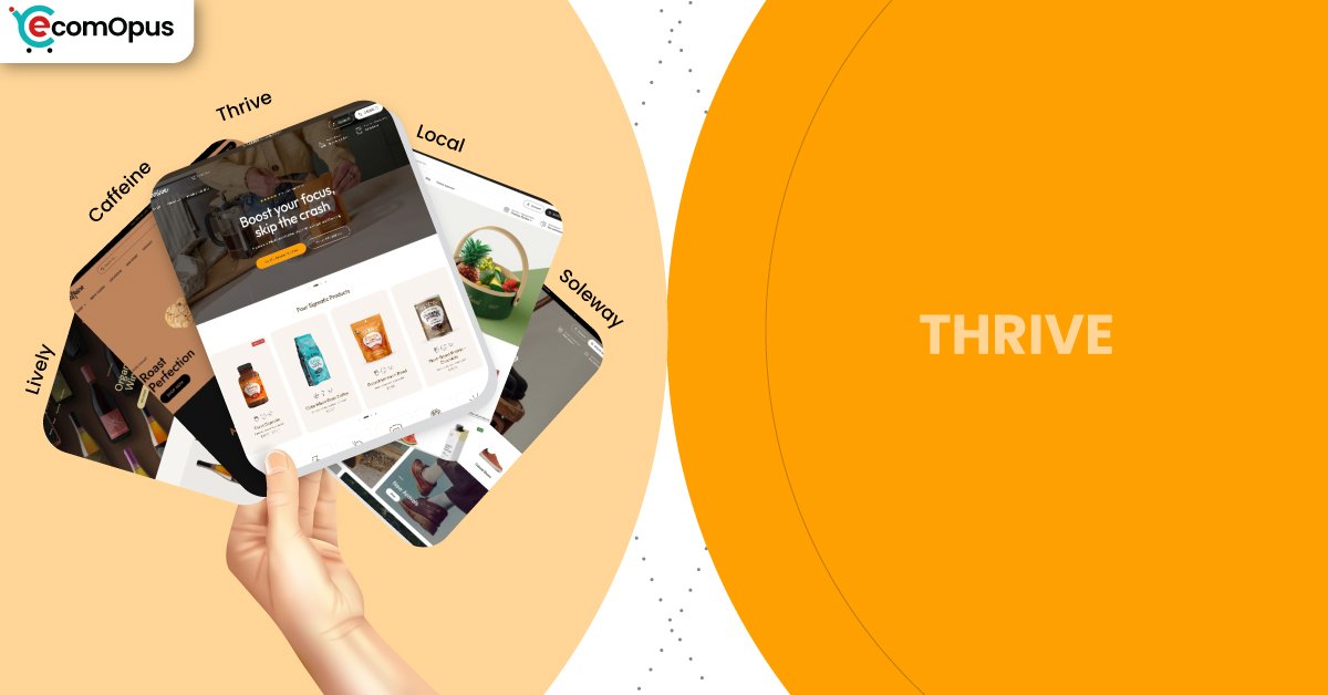
Thrive is the most campaign-minded preset in the Local theme family, built to spotlight offers without turning your storefront into a noisy banner farm. It keeps the layout crisp while giving you plenty of room for launches, seasonal drops, and conversion-focused storytelling.
- Promo-first preset with bold homepage rhythm
- Strong navigation keeps collections easy to scan
- Quick buy and sticky cart help conversion
- Pickup-friendly options support local retail flows
- Flexible sections suit seasonal content swaps
- Support reputation reduces launch-week panic cycles

Introduction
Thrive is the “lights on, doors open” preset inside Shopify’s Local theme family, designed for merchants who run frequent promotions but still want the site to feel composed. Instead of leaning on heavy animations or gimmicks, it uses confident spacing, punchy sections, and clear call-to-action rhythm to guide shoppers from curiosity to cart. The overall impression is energetic, but not chaotic, which is harder to pull off than it sounds when you are juggling sales, bundles, and limited-time messaging. If your brand does weekly specials or seasonal pushes, Thrive feels like it was made for your calendar.
What’s especially interesting about Thrive is that it borrows the practical backbone of Local and dresses it in a more “ready to convert” outfit. Features that matter to everyday operations like pickup, strong navigation, product clarity blocks, and cart-friendly patterns remain part of the experience. That means you can run a promo-heavy homepage while still keeping product pages calm and legible. In real usage, this balance helps you avoid the common trap where the homepage screams “SALE” and the product pages whisper “good luck.”
Merchant sentiment around the Local theme family reinforces the same story: stores love the clean structure, the flexible toolkit, and the support team’s speed. Reviews repeatedly mention fast, human replies and help that arrives with solutions rather than vague instructions. A few merchants note that very specific customization can benefit from coding knowledge, but the tone stays positive because support is described as responsive and committed. For Thrive, that matters because campaign-heavy stores change more often, and fast support can be the difference between a smooth launch and a stressful one.
Ideal For Niches With Supporting Features
Thrive works best when your business needs both promotion and precision, meaning you want to market loudly without confusing shoppers. The preset supports campaigns, but it still depends on clear product organization and consistent merchandising choices. If you regularly rotate collections, run bundles, or highlight limited drops, Thrive gives you the structure to do that without rebuilding layouts every month. The table below shows niches where Thrive’s strengths map neatly to real storefront needs.
| Niches | Supporting Features | Why They Matter? |
|---|---|---|
| Food and beverage brands | Ingredients blocks, product tabs, quick buy | Shoppers want detail and speed in the same visit. Thrive lets you explain choices clearly, then convert without extra friction. |
| Seasonal retail and gifting | Promo banners, lookbooks, recommended products | Gift shoppers respond to guided curation and clear offers. Thrive supports fast discovery while keeping the store feeling organized. |
| Subscription-led consumables | Sticky cart, slide-out cart, cross-selling | Repeat buyers value convenience and familiar flows. A cart that stays present helps shoppers build orders without interrupting browsing. |
| Multi-location stores | In-store pickups, enhanced search, mega menu | Local intent is fragile and disappears when options are unclear. Strong pickup and navigation tools keep the store feeling practical and nearby. |
| Wellness and functional products | Usage information, FAQ structure, trust signals | These purchases often require reassurance before commitment. Thrive keeps education readable while still nudging action at the right moments. |
| Launch-driven product drops | Quick buy, promo sections, visual storytelling blocks | Drops rely on momentum, not long decision loops. Thrive supports a clean hype-to-checkout path without drowning pages in clutter. |
Presets
Presets in Local are more than color changes, because they set the default pacing of your homepage and the style of how sections “stack” together. Thrive leans into a more promotional cadence, while other presets feel calmer or more boutique. If you sell across multiple categories, you can treat presets like different “store moods” without changing your underlying toolkit. This table outlines how each preset tends to behave once you replace demo content with real photography and real collection logic.
| Preset | Aesthetic Vibe | Where It Shines | Noteable Tweaks |
|---|---|---|---|
| Thrive | Energetic, offer-forward, campaign-ready | Launches, seasonal sales, promo rotations | Strong callouts with clean structure and urgency-friendly layout |
| Caffeine | Cozy, editorial, product-forward | Coffee, tea, small-batch consumables | Encourages storytelling sections and warm merchandising rhythm |
| Local | Clean retail clarity with warmth | General retail and local-first selling | Balanced homepage pacing and utility blocks |
| Soleway | Minimal, airy, boutique-sleek | Premium goods and curated catalogs | More whitespace and calmer visual density |
| Lively | Bright, friendly, approachable | Community-driven shops and boutiques | Lighter mood with softer browsing cues |
Key Features And Highlights
Thrive succeeds when it reduces your reliance on a tower of apps that all want to “own” the shopper experience. The Local theme family includes conversion patterns and merchandising tools that many stores typically bolt on later, which can create conflicts and slowdowns. Thrive’s job is to make those tools feel natural inside a promo-aware design, not like separate add-ons. The features below are the ones that most directly affect day-to-day selling, especially when you run campaigns and need fast content changes.
| Features | What It Is And Why It Matters? |
|---|---|
| In-store pickups | The cart stays within the browsing flow, which helps shoppers adjust quantities without losing context. It is especially helpful during promotions when customers add and remove items quickly. |
| Sticky cart | Sticky cart behavior keeps purchase intent visible while shoppers scroll long product details or campaign sections. It reduces “scroll fatigue” because the next step always feels close. |
| Quick buy | Quick buy supports fast purchasing from collection pages and featured grids. It is valuable for bestsellers, bundles, and repeat-buy items where shoppers already trust the product. |
| Cross-selling and recommended products | Recommendations help raise average order value when they feel like smart pairing rather than aggressive upsell. Thrive’s promo-friendly layout makes it easy to position these suggestions as part of the shopping journey. |
| Ingredients or nutritional information | Structured details prevent product pages from turning into messy paragraphs. This keeps trust high for food, beverage, and wellness categories where clarity drives conversion. |
| Age verifier | Age gates help maintain compliance for restricted products without using intrusive third-party popups. When implemented cleanly, it protects both the shopper experience and the business. |
| Product tabs and usage information | Tabs create a predictable layout for specs, shipping, and instructions. This improves scanning and reduces support questions because shoppers can find answers fast. |
| Lookbooks and image hotspots | Shoppable visuals help sell sets, routines, and bundles through context rather than long explanations. For promo campaigns, this turns curated content into direct purchase paths. |
| Mega menu and enhanced search | Strong navigation scales as your catalog grows and as you run seasonal collection rotations. Shoppers find what they meant faster, which protects conversion during busy campaigns. |
Theme Experience!
The real test of Thrive is whether it can keep shoppers calm while you keep marketing active. Campaign-heavy storefronts often feel cluttered because every section tries to be the hero, which creates decision fatigue. Thrive avoids that by keeping the layout structured and the browsing experience predictable, even when you stack multiple promotional blocks. The table below breaks down what shoppers typically feel across key moments, from first impression to checkout flow.
| Experience Area | What Shoppers Feel In Practice? |
|---|---|
| First impression | The store feels active and current without feeling messy. Shoppers quickly understand the offer and the product category. |
| Collection browsing | Scanning stays easy because grids feel consistent and readable. Shoppers can compare items without losing their place. |
| Product page clarity | Details feel organized rather than buried in long text. Shoppers can find answers fast, which supports confident buying. |
| Promotion visibility | Offers feel present but not suffocating across the page. Shoppers notice deals without feeling pushed into mistakes. |
| Local fulfillment confidence | Pickup and delivery choices feel practical and easy to understand. Shoppers feel reassured when fulfillment options are clear early. |
| Cart and checkout flow | The cart feels editable without breaking momentum. Shoppers can adjust quickly and continue shopping without frustration. |
| Mobile navigation | Navigation feels thumb-friendly when menus are kept tidy. Shoppers are less likely to mis-tap or lose context mid-browse. |
Performance, Explained!
Thrive’s performance data shows a familiar pattern: desktop users get a smooth, responsive experience, while mobile results are more sensitive to interaction delays. In practical terms, shoppers will see content load quickly, but mobile taps can feel slightly less immediate when the store is heavy with scripts or layered app features. This matters most during campaigns, because shoppers are clicking faster and patience is thinner.
Desktop performance looks more “ready for busy traffic,” with quick server response and strong interaction responsiveness. The lesson is simple: Thrive rewards discipline, meaning optimized media, fewer overlapping popups, and a lean app stack. If you keep your promo tools intentional rather than excessive, the storefront stays both energetic and comfortable.
| Performance Parameters | Mobile | Desktop | Remarks |
|---|---|---|---|
| Core Web Vitals Assessment | Failed | Passed | Mobile interaction sensitivity can impact perceived speed during rapid browsing. Desktop behavior remains consistently responsive for most shoppers. |
| Largest Contentful Paint (LCP) | 2.4 s | 1.5 s | Main content appears quickly, supporting strong first impressions. Desktop feels notably faster, which helps browsing-heavy sessions. |
| Interaction to Next Paint (INP) | 210 ms | 78 ms | Mobile interactions can feel slightly delayed with heavier builds. Desktop taps and clicks feel much more immediate and stable. |
| Cumulative Layout Shift (CLS) | 0.00 | 0.09 | Mobile layout stability is excellent and reduces mis-click risk. Desktop has minor movement that usually does not disrupt shopping. |
| First Contentful Paint (FCP) | 1.7 s | 1.0 s | Shoppers see content early, which reduces bounce risk. Desktop becomes usable very quickly, even on deeper pages. |
| Time to First Byte (TTFB) | 1.1 s | 0.2 s | Mobile response time is decent but not exceptional under real-world variation. Desktop server response is very fast, which supports snappy navigation. |
Mobile stability is a clear strength, so pages tend to feel visually reliable even during promotions. The biggest improvement lever is reducing script conflicts so taps and cart actions feel more instant.
Pricing
Thrive is priced at $360, which places it in the premium bracket where the real question is whether it replaces other costs. The strongest value comes from how much the Local theme family can reduce app dependency for cart patterns, merchandising, and product detail structure. If you run campaigns often, you may also save time because Thrive’s sections support frequent swaps without rebuilding layouts or hiring a developer for every new promo page. The price makes the most sense when you use the built-in toolkit deliberately and keep your storefront clean. If you plan to stack multiple conversion apps that duplicate the same functions, the ROI becomes harder to justify.
Stores Build with Thrive Shopify Theme
Live store examples matter because they reveal how a preset behaves once real products, real promotions, and real category structure replace the demo. For Thrive specifically, verified storefront examples are harder to isolate because many merchants customize the Local theme family heavily, blending preset styling into their own brand systems. At eComOpus, we avoid listing unverified examples since it can mislead readers who are trying to evaluate real-world usage patterns. This section is best updated when storefront identification is confirmed with reliable evidence tied to the preset.
In practice, Thrive is most commonly seen in stores that run frequent seasonal promotions and rotate homepage merchandising often, because its layout rhythm supports that workflow. When verified store examples are available, this section will focus on how Thrive handles promo density, product discovery, and cart behavior under real catalog complexity. Until then, the safest takeaway is to evaluate the preset directly through its structure and performance profile rather than relying on guesswork.
Themes Similar to Thrive
Thrive lives in a specific category of themes that balance polished design with promotional control. The closest alternatives tend to offer strong merchandising tools, flexible homepage blocks, and conversion-focused patterns like quick buy and robust navigation. Some competitors lean more editorial and premium, while others lean more campaign-driven and bold. The table below highlights similar options and explains where the overlap is meaningful rather than superficial.
| Shopify Theme | FREE or Paid? | Why is it Similar? |
|---|---|---|
| Dawn | FREE | Dawn offers clean structure and Shopify-native flexibility for modern storefronts. It can support campaigns, but often needs more apps or custom work to match Thrive’s built-in merchandising depth. |
| Crave | FREE | Craft emphasizes calm spacing and strong product storytelling similar to Thrive’s clean readability. It is typically less promo-forward, so campaign-heavy stores may need extra layout effort. |
| Taste | FREE | Taste is a natural match for food and beverage with clear product presentation. Thrive adds more conversion-friendly structure for ongoing promotions and rotating merchandising. |
| Prestige | Paid | Prestige focuses on premium storytelling and high-end visual polish. Thrive is similar in refinement, but it is more practical for fast promo rotations and operational retail workflows. |
| Broadcast | Paid | Broadcast is built for strong merchandising control and frequent promotional content. Thrive feels cleaner and more restrained, which can suit brands that want urgency without visual overload. |
| Symmetry | Paid | Symmetry provides scalable navigation and solid conversion patterns for growing catalogs. Thrive competes well when you want a more campaign-ready homepage rhythm with a tidy layout. |
Pros and Cons
Thrive’s strengths show up when you are running real campaigns and need the storefront to keep up without looking frantic. It gives you a promo-ready rhythm while preserving clean navigation and product clarity, which protects conversion when traffic spikes. The trade-offs are mostly about discipline, because heavy app stacking can reduce the mobile responsiveness advantage you want during sales. The table below highlights what Thrive does best and where it can frustrate the wrong store setup.
| Pros | Cons |
|---|---|
| Promo sections feel structured, not cluttered. It keeps urgency readable for shoppers. | App stacking can dull mobile responsiveness. Interaction delays often show up near cart actions. |
| Quick buy supports fast campaign conversions. It reduces clicks for bestsellers and bundles. | Highly specific tweaks may need code. Some edge layouts exceed settings-only control. |
| Sticky and slide-out cart protect momentum. Shoppers can edit carts without losing flow. | Overusing banners can cheapen the look. Thrive works best with selective promo placement. |
| Navigation scales well for rotating collections. Menus stay predictable during seasonal changes. | Weak photography becomes more obvious. Clean layouts do not hide inconsistent imagery. |
| Product detail blocks improve buying confidence. Shoppers find ingredients and usage quickly. | |
| Support reputation lowers launch stress. Fast fixes help keep timelines intact. |
Our Rating
Ratings should reflect how a theme performs when you are actually running a store, not just admiring a demo page. Thrive was evaluated through the Local theme family’s feature depth, the preset’s promo readiness, merchant sentiment around support, and the real-world implications of its performance data. The goal is to score both the look and the operating comfort over time. The table below breaks down where Thrive feels strongest and where it requires more discipline.
| Parameters | Our Ratings | Summary |
|---|---|---|
| Design Quality | 4.6/5.0 | Thrive feels energetic without being messy, which is rare for promo-friendly presets. The layout stays polished even when you stack multiple campaign sections. |
| Ease Of Setup | 4.5/5.0 | Sections are flexible and intuitive once your merchandising plan is clear. Frequent changers will appreciate how quickly content can be swapped without rework. |
| Feature Depth | 4.7/5.0 | Local’s built-in tools cover many workflows that otherwise need paid apps. Thrive benefits by making those tools feel natural inside a campaign-first presentation. |
| Conversion Support | 4.6/5.0 | Quick buy and cart patterns support faster checkout momentum. Recommendations and structure help promotions translate into higher-value carts when curated well. |
| Mobile Experience | 4.1/5.0 | Mobile layout stability is strong, which protects usability during busy promo periods. Interaction responsiveness depends on keeping scripts and apps under control. |
| Support And Updates | 4.8/5.0 | Merchant feedback repeatedly highlights fast, human support responses. Ongoing updates reduce long-term risk for stores that evolve frequently. |
User Reviews: What Merchants Say
Merchant reviews for the Local theme family are strikingly consistent in what they celebrate: support speed, usability, and a design system that feels premium without being fragile. Multiple store owners describe the support team as fast and human, and some explicitly mention preferring real support over automated answers. That matters because themes become “real” when you hit a problem at the worst time, like a launch weekend or a catalog update. The recurring tone suggests merchants feel helped, not handled.
Another strong theme is flexibility without confusion. Merchants repeatedly call the theme versatile, easy to customize, and rich in features, with several noting that it looks clean while still offering depth. There is also an honest note that very specific demands can require some coding knowledge, but the sentiment stays positive because support is described as committed and effective. Even when a merchant reported an issue, the response narrative often included a prompt fix once support was available.
Overall, reviews point to a theme family that merchants stick with rather than abandon after a few months. That kind of retention usually signals operational comfort, meaning updates do not break everything and editing stays manageable. For Thrive, this is especially relevant because promo-driven stores change often, and a reliable support experience can quietly protect revenue during busy seasons.
Our Verdict
Thrive is the Local theme preset for merchants who run promotions often and want the storefront to keep pace without losing its composure. It delivers a campaign-ready layout rhythm while preserving the practical foundations that matter day-to-day, like strong navigation, product clarity tools, and cart patterns that keep checkout momentum alive. The result is a store that can highlight urgency without turning every page into a blinking billboard. If your marketing calendar is busy, Thrive feels like a steady stage rather than a fragile set.
Performance data suggests the experience is comfortable on desktop and generally stable on mobile, with the main caution being interaction responsiveness when scripts pile up. In a promo environment, shoppers tap quickly and abandon faster, so the most important discipline is keeping the app stack lean and avoiding duplicate cart or popup tools. Optimize images, be selective with widgets, and the store will feel both energetic and efficient. Ignore those guardrails, and the mobile experience can feel less crisp than the design deserves.
At $360, Thrive makes sense when you want built-in conversion structure and a support reputation that merchants repeatedly praise. It is not just about how the preset looks on day one, but how confidently you can keep updating it during sales, launches, and seasonal transitions. For brands that need frequent change without frequent chaos, Thrive is a strong investment.
Who Should Buy Thrive
Thrive is best for merchants who want a clean storefront that can still carry promotional weight. It fits businesses that rotate collections, run seasonal campaigns, and need sections that can be swapped quickly without redesigning the whole site. It also suits stores that require product clarity, such as food, beverage, and wellness, because details can remain readable even when marketing is active. The table below shows the buyer profiles that tend to get the most value from Thrive.
| Best-Fit Buyer Profile | Why Thrive Fits | What They Will Love Most | Smart Setup Move |
|---|---|---|---|
| Promo-heavy brands and seasonal sellers | Built for rotating offers without clutter | Campaign rhythm that stays clean | Create a reusable promo section stack |
| Food and beverage merchants | Detail blocks keep product trust strong | Ingredients and usage clarity | Standardize product page tabs site-wide |
| Subscription-first consumables | Cart patterns support repeat buying | Sticky cart and quick buy speed | Place subscription options near benefits |
| Multi-location or pickup-driven stores | Local workflows stay practical and visible | Pickup tools that feel native | Configure locations and pickup messaging early |
| Catalogs that change often | Sections make updates fast and consistent | Easy swapping without redesign | Build a content calendar for homepage blocks |
| Small teams with tight timelines | Support reputation reduces launch friction | Faster fixes and clearer guidance | Keep apps minimal to protect mobile taps |
Who Should Not Buy Thrive
Thrive is not the best choice for stores that want extreme, experimental layouts where structure changes constantly and rules are meant to be broken. It can also be a poor fit for merchants who plan to stack multiple overlapping conversion apps, because mobile responsiveness is where clutter shows up first. If your brand relies on heavy animation or a maximalist collage aesthetic, Thrive’s clean framework may feel restrictive rather than empowering. The table below outlines profiles that should consider a different approach.
| Not-Ideal Buyer Profile | Why It Can Be A Poor Fit | What They Will Likely Struggle With | Better Approach |
|---|---|---|---|
| Experimental, non-standard layout brands | Thrive favors structure and predictability | Forcing chaos into a clean system | Choose a theme built for unconventional grids |
| App-heavy overlay users | Script conflicts can affect mobile taps | Cart friction and delayed interactions | Reduce apps or use a simpler baseline theme |
| Brands with weak photography | Clean layouts highlight asset quality | Making products feel premium visually | Improve imagery, then keep sections minimal |
| Stores needing complex custom logic | Some workflows exceed theme settings | Developer dependence for edge cases | Consider a custom build or developer-first theme |
| Brands chasing constant motion | Thrive is energetic but not animation-led | Achieving a kinetic brand feel | Pick a theme designed for motion-heavy storytelling |
GET THE BEST APPS IN YOUR INBOX
Don't worry we don't spam


