Lively Shopify Theme Review: Friendly Retail Design With Serious Selling Tools
Lively is a bright, community-first Shopify theme preset built for food, local retail, and repeat-purchase brands that value clarity, trust, and smooth buying flows.
- Friendly preset styling with practical selling tools
- Built for local pickup and in-store selling
- Food-ready blocks for ingredients and nutrition
- Strong navigation supports growing product catalogs
- Quick buy and sticky cart reduce friction
- Flexible sections simplify seasonal homepage updates

Introduction
Lively is a preset within the Local theme family, and it leans into a bright, welcoming storefront mood without losing the operational muscle that makes Local popular for real-world retail. In the theme preview, Lively feels approachable and airy, with a layout rhythm that favors clear browsing and gentle merchandising instead of aggressive promotional noise. It is the kind of design that can make a small brand feel instantly established, especially when the catalog is curated and the photography is consistent. The overall impression is friendly, but not flimsy, which matters when you want charm without sacrificing structure.
What makes Lively more than a “pretty preset” is the underlying Local framework that supports in-person selling behaviors, practical cart tools, and detail-friendly product storytelling. It includes modern commerce patterns such as quick buy, slide-out cart behavior, sticky cart moments, and discovery tools that help shoppers find what they want with fewer wrong turns. It also brings category-specific elements that are especially helpful for food and consumables, like nutritional information blocks and age verification. Those features help brands explain products clearly while keeping thes.
Merchant sentiment for the Local theme family is overwhelmingly positive, and it consistently points to two things: strong usability and a support experience that feels genuinely human. Reviewers repeatedly describe fast responses, helpful fixes, and a theme that stays usable even when a merchant is not deeply technical. There is also a realistic note that very specific, edge-case customization can require some coding, which is fair for a theme with deeper options than a basic template. Overall, Lively reads as a preset built for merchants who want a welcoming storefront that still behaves like a serious sales system.
Ideal For Niches With Supporting Features
Lively fits best when your store needs to feel approachable while still supporting serious buying behavior. The preset works well for brands that rely on trust-building details, repeat purchasing, and clear browsing patterns. It is also a strong match for merchants who sell in person and want their online store to reflect real-world availability and pickup flows. The table below maps common niches to the supporting features that make Lively feel naturally suited, not forced.
| Niches | Supporting Features | Why They Matter? |
|---|---|---|
| Food and drink | Nutritional information, ingredients blocks, age verifier | Food shoppers decide using facts, not only visuals. Structured details reduce hesitation and support repeat purchases. |
| Multi-location retail | In-store pickups, sticky header, enhanced search | Shoppers want convenience and clarity across locations. Pickup options make fulfillment feel immediate and practical. |
| Specialty consumables | Quick buy, stock counter, recommended products | Repeat buying improves when checkout friction stays low. Stock signals and recommendations increase confidence and order size. |
| Wellness and supplements | Usage information, trust badges, FAQ page | Buyers need reassurance and instructions before committing. Guided information builds trust without cluttering the page. |
| Beauty with ingredient focus | High-resolution images, before/after slider, product badges | Proof and clarity are central to conversion in this category. Media tools help demonstrate value without extra apps. |
| Local gift and boutique brands | Lookbooks, promo banners, cross-selling | Gift shopping benefits from curated discovery and gentle nudges. Lookbooks and cross-sells make browsing feel guided, not pushy. |
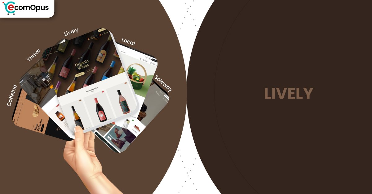
Presets
Presets matter because they set the store’s default tempo, spacing, and how quickly a shopper’s eye finds products versus story content. With Local, presets share the same foundation, so you can change the vibe without rebuilding the entire store structure. This is useful for merchants who want to test different brand moods while keeping the same operational tools and section system. The table below shows how each preset tends to feel in real builds and what it is best used for.
| Preset | Aesthetic Vibe | Where It Shines | Noteable Tweaks |
|---|---|---|---|
| Lively | Bright, friendly, approachable | Community-driven shops and boutiques | Softer mood with airy browsing rhythm |
| Local | Clean retail clarity with warmth | General retail and local-first selling | Balanced homepage pacing and utility blocks |
| Soleway | Minimal and boutique-sleek | Premium goods and curated catalogs | More whitespace and calmer visual density |
| Thrive | Energetic and promo-aware | Seasonal launches and campaign pushes | Stronger callouts and bolder merchandising |
| Caffeine | Cozy editorial and product-forward | Coffee, tea, subscriptions, specialty goods | Content-friendly sections with tactile tone |
Key Features And Highlights
Lively benefits from a feature set that is designed to reduce app dependency rather than encourage it. Many Shopify themes can look polished in a demo, yet become messy after months of edits and add-ons. The Local framework behind Lively keeps tools organized into a coherent system, which helps merchants maintain consistency as catalogs grow. The table below focuses on the features that most directly affect conversion confidence, store maintenance, and real shopper comfort.
| Features | What It Is And Why It Matters? |
|---|---|
| In-store pickups | Pickup options add a fast-fulfillment pathway that feels practical and reassuring. It also helps local customers feel the brand is genuinely nearby. |
| Slide-out cart | A slide-out cart keeps shoppers in the browsing flow while editing items. It reduces checkout friction because cart changes do not require page hopping. |
| Sticky cart | Sticky cart behavior keeps purchase intent visible on long product pages. This matters most on mobile, where scrolling can separate intent from action. |
| Quick buy and quick view | Quick buy helps repeat shoppers add items directly from collection pages. Quick view improves comparison shopping without opening multiple tabs. |
| Ingredients and nutritional information | Structured product facts create trust for food, drink, and functional categories. It also standardizes detail presentation across the catalog. |
| Age verifier | Age restriction can be handled without clunky third-party popups. It keeps compliance in place while preserving a clean shopping journey. |
| Cross-selling and recommended products | Built-in recommendations support higher order value at natural decision moments. It works best when you keep suggestions curated and relevant. |
| Enhanced search and mega menu | Strong discovery tools prevent larger catalogs from feeling chaotic. Shoppers find categories faster, which reduces bounce risk on mobile. |
Theme Experience!
A theme’s real quality is felt during long browsing sessions, not during the first ten seconds of a homepage visit. Lively is designed to feel calm and readable, while still supporting serious shopping behavior through structured discovery and cart patterns. The experience tends to reward merchants who keep content intentional rather than stacking every section available. The table below breaks down how shoppers typically experience the storefront in practice.
| Experience Area | What Shoppers Feel In Practice? |
|---|---|
| First impression | The storefront feels cheerful and trustworthy at first glance. The layout guides attention without feeling salesy or loud. |
| Collection browsing | Grids stay readable and consistent across long scrolls. Shoppers can compare products without visual fatigue building up. |
| Product page clarity | Information can be presented in a predictable, confidence-building order. Shoppers get answers without losing the buying path. |
| Navigation and discovery | Menus feel structured instead of maze-like. Shoppers reach the right collection with fewer taps and fewer backtracks. |
| Cart and checkout flow | Cart interactions feel close to the shopper’s thumb and attention. The path to checkout stays smooth and interruption-light. |
| Local pickup confidence | Pickup options create a practical “get it soon” feeling. Shoppers feel reassured when fulfillment choices are clear and transparent. |
| Promotional guidance | Offers can be visible without turning pages into banner stacks. Shoppers notice deals while keeping focus on products. |
Performance, Explained!
On mobile, Lively shows strong visual stability and solid paint timing, yet still lands a failed Core Web Vitals assessment. The numbers suggest the issue is not layout chaos, but interaction responsiveness, meaning taps can feel slightly delayed when multiple scripts compete. This typically becomes more noticeable when merchants stack popups, heavy tracking, or multiple cart-related apps. The practical takeaway is that Lively can feel smooth on phones, but only if you treat scripts like a budget.
On desktop, Core Web Vitals passes and interaction timing looks clean, which supports browsing-heavy sessions like collection hopping and quick product comparisons. LCP and FCP are comfortably fast, and CLS remains within an acceptable range, so the experience feels stable and confident. If you keep media optimized and avoid overlapping app behaviors, the mobile experience can move closer to the desktop feel.
| Performance Parameters | Mobile | Desktop | Remarks |
|---|---|---|---|
| Core Web Vitals Assessment | Failed | Passed | Mobile sensitivity is driven by interaction timing. Desktop stays stable and responsive across typical shopping flows. |
| Performance Score | 57/100 | 65/100 | Mobile feels usable but less efficient under load. Desktop improves browsing confidence during longer sessions. |
| Largest Contentful Paint (LCP) | 2.4 s | 1.7 s | Main content appears within a healthy window. Faster desktop LCP supports image-led merchandising. |
| Interaction to Next Paint (INP) | 210 ms | 86 ms | Mobile taps can feel slightly delayed with heavier scripts. Desktop interactions feel immediate and clean. |
| Cumulative Layout Shift (CLS) | 0.00 | 0.09 | Mobile is extremely stable during load. Desktop is acceptable, but can tighten with better media sizing. |
| First Contentful Paint (FCP) | 1.7 s | 1.0 s | Content appears quickly enough to reduce early bounces. Desktop feels “ready” sooner during first scroll. |
| Time to First Byte (TTFB) | 1.1 s | 0.3 s | Mobile server response is slower and more variable. Desktop suggests a healthier baseline worth protecting. |
Mobile performance here is a discipline story, not a theme failure. If you keep third-party scripts lean, interaction can feel significantly snappier.
Pricing
Lively is priced at $360, placing it firmly in the premium theme tier where value is measured by long-term usability, not just initial visual polish. The best ROI shows up when you use the built-in cart tools, discovery features, and product storytelling blocks instead of replacing them with multiple apps. That matters because app stacking can increase monthly costs and also worsen mobile interaction responsiveness. If your store sells in person, in-store pickup and local-friendly behaviors can also reduce custom development needs. For many merchants, the value is not only design, but fewer workarounds over time.
Stores Build with Lively Shopify Theme
Seeing real stores matters because it shows how a theme behaves under real product photography, real catalog sizes, and real merchandising pressure. The Local theme family is used by storefronts that reflect its strengths, especially food, drink, and local-first retail. Examples include Craft a Brew, Brentos, Sweet Greek, and Field Tacoma, each applying the same foundation in a different way. The variety suggests the theme system is flexible, but it rewards merchants who keep the build intentional and avoid stacking too many competing add-ons.
Themes Similar to Lively
Themes are rarely identical, but they can be grouped by intent and shopping rhythm. Lively sits in a “friendly clarity” lane, where clean browsing meets practical selling mechanics and detail-forward product pages. Some alternatives match the same category fit, while others overlap through structure and conversion tools. The table below helps you compare options based on how similar they feel in day-to-day operations.
| Shopify Theme | FREE or Paid? | Why is it Similar? |
|---|---|---|
| Taste | FREE | Taste also suits food and drink with detail-friendly presentation. It is simpler, so you may need more apps for advanced conversion tools. |
| Crave | FREE | Crave supports bold food merchandising and quick browsing patterns. Lively feels more structured and operational for local selling workflows. |
| Craft | FREE | Craft leans calm and trust-forward with readable sections. Lively provides deeper selling mechanics and stronger discovery tools by default. |
| Prestige | Paid | Prestige targets premium presentation with strong storytelling structure. Lively is more grounded in practical retail moments like pickup and product facts. |
| Broadcast | Paid | Broadcast overlaps on merchandising flexibility and promotional layouts. Lively leans more into disciplined browsing and product clarity systems. |
Pros and Cons
Lively’s strengths show up when you want a storefront that feels friendly while still behaving like a structured sales machine. It gives merchants strong product clarity tools, local-friendly fulfillment behavior, and modern cart patterns that keep checkout intent visible. The main watch-out is performance sensitivity on mobile when merchants stack heavy scripts or duplicate theme features with apps. The table below balances the practical wins against the most common friction points.
| Pros | Cons |
|---|---|
| Friendly layout feels credible and calm. Browsing stays easy. | Mobile taps can lag with scripts. Heavy apps amplify delay. |
| Pickup features support local-first selling. Customers feel reassured. | Very specific demands may need coding. Edge cases require help. |
| Product facts sections build trust fast. Details stay scannable. | Overlapping cart apps cause conflicts. Behavior can feel inconsistent. |
| Quick buy reduces repeat purchase friction. Fewer steps convert. | Heavy imagery can slow first impressions. Compression becomes mandatory. |
| Sections stay consistent during updates. Seasonal edits feel manageable. | |
| Discovery tools scale for catalogs. Navigation stays tidy. |
Our Rating
Ratings matter only when they reflect daily merchant workflow and long-term maintainability. Lively scores strongest when merchants rely on the theme’s native tools rather than layering multiple overlapping apps. It also benefits from a mature framework that supports both online and in-person selling behaviors. The table below summarizes how Lively performs across the categories that typically decide satisfaction after launch.
| Parameters | Our Ratings | Summary |
|---|---|---|
| Design Quality | 4.6/5.0 | Lively feels welcoming while still looking premium and composed. The spacing and hierarchy keep pages readable and calm. |
| Ease Of Setup | 4.5/5.0 | The section system is approachable once you commit to a simple homepage plan. Advanced builds may require light technical confidence. |
| Feature Depth | 4.7/5.0 | Tools cover real selling needs like pickup, discovery, and product education. Many stores can reduce app dependency using native features. |
| Conversion Support | 4.6/5.0 | Sticky cart and quick buy help shoppers commit with fewer steps. Cross-sells work best when offers stay restrained and relevant. |
| Mobile Experience | 4.2/5.0 | Layout stability is excellent and reduces mis-taps. Interaction responsiveness depends heavily on scripts and app choices. |
| Support And Updates | 4.8/5.0 | Merchant feedback repeatedly highlights fast and helpful support. Ongoing updates reduce the risk of the theme feeling stale. |
User Reviews: What Merchants Say
Merchant reviews for the Local theme family strongly reinforce a pattern of usability plus genuinely responsive support. Several merchants highlight fast, competent help that resolves issues quickly, and the tone repeatedly suggests real humans solving real problems. One review describes the support as “very fast and competent human support team,” which is exactly the kind of detail that reduces launch-week stress. Another common thread is flexibility, with merchants describing the theme as versatile and easy to customize once you understand the options.
Industry fit also shows up clearly in feedback, especially for food and drink brands. Multiple store owners explicitly mention that the theme works beautifully for food ecommerce, and that it makes products feel clean and refined without clutter. The overall sentiment suggests the theme becomes more rewarding over time as updates and improvements continue to land. Even the rare negative feedback reads like a solvable bump rather than a deal-breaker, especially when support responds with a fix.
There is also a realistic caution that ultra-specific customization demands may require coding knowledge, which is typical for themes that offer deeper control. That said, the same reviewers often add that issues get resolved quickly due to support responsiveness. The most useful takeaway is that merchants are not only praising the demo look, they are praising the lived experience of building, maintaining, and improving the store.
Our Verdict
Lively is a strong recommendation for merchants who want a storefront that feels welcoming, modern, and community-friendly, yet still runs on a serious selling framework. Its biggest advantage is that it combines calm design cues with practical commerce tools like sticky cart behavior, quick buy, structured product facts, and strong discovery features. If your brand needs trust and clarity more than theatrical design, Lively’s rhythm will feel like a natural fit. It is especially well suited for merchants who sell both online and in person and want that bridge to feel seamless.
Performance is the main area where ownership behavior matters. Desktop passes Core Web Vitals and feels confident, while mobile is stable but sensitive to interaction timing when scripts pile up. The best approach is to rely on native theme tools first, then add only essential apps that do not overlap with cart or popup behavior. If you build with restraint and optimized media, Lively can deliver a storefront that feels friendly, fast enough, and easy to maintain as you grow.
Who Should Buy Lively
Lively is best for merchants who want a friendly storefront mood without losing structure, clarity, and conversion discipline. It suits brands that need product education, repeat purchasing comfort, and strong navigation as catalogs expand. It is also a practical fit for merchants who sell in person and want pickup flows to feel native rather than bolted on. The table below outlines the buyer profiles most likely to get strong value from Lively.
| Best-Fit Buyer Profile | Why Lively Fits | What They Will Love Most | Smart Setup Move |
|---|---|---|---|
| Food and drink brands | Supports product facts and compliance needs | Ingredients and nutrition blocks that feel native | Standardize product info blocks across SKUs |
| Multi-location retailers | Built for pickup and local shopping moments | In-store pickup flow that reduces friction | Configure locations early and test pickup logic |
| Subscription consumables | Encourages repeat buying and add-ons | Quick buy and recommendations for AOV | Use bundles sparingly and keep pages uncluttered |
| Wellness and functional products | Helps explain usage and reassurance clearly | Usage info plus trust cues near purchase | Create a reusable product template structure |
| Boutique and giftable catalogs | Works well with curated discovery | Lookbooks and gentle merchandising rhythm | Keep homepage sections focused, not stacked |
Who Should Not Buy Lively
Lively is not ideal for merchants who want highly experimental layouts, maximalist collage energy, or constant animation-led experiences. It also becomes a weaker choice if your strategy relies on stacking many overlapping apps that compete with the theme’s native cart and popup behaviors. Brands with weak photography or inconsistent product content may find that the clean structure exposes gaps rather than hiding them. The table below shows the profiles that should consider a different approach.
| Not-Ideal Buyer Profile | Why It Can Be A Poor Fit | What They Will Likely Struggle With | Better Approach |
|---|---|---|---|
| Maximalist, collage-style brands | The system favors clarity and restraint | Making the store feel intentionally “messy” | Choose a theme built for high-motion creativity |
| App-heavy conversion stack users | Mobile interaction timing is sensitive | Tap delays and competing cart behavior | Use fewer apps or pick an overlay-friendly theme |
| Stores with weak product photography | Clean layouts amplify content quality gaps | Making products look premium without assets | Invest in imagery or use a more forgiving style |
| Custom-coded interaction requirements | Deep customization may exceed preset intent | Building unique behaviors without compromises | Use a developer-first theme strategy |
| Ultra-large catalogs without discipline | Structure needs taxonomy consistency | Messy navigation and filter confusion | Plan collections and filters before scaling |
GET THE BEST APPS IN YOUR INBOX
Don't worry we don't spam


