Flaunt Shopify Theme Review: Trend-Led Layouts For Smooth, Fast Shopping
A fashion-forward Shopify theme that keeps pages airy, scrolling silky, and product discovery sharp. Built for brands that rely on photos, filters, and quick buying.
- Editorial layout that makes collections feel curated.
- Quick buy flows keep shopping momentum moving.
- Mega menu navigation suits multi-collection catalogs well.
- Cart drawer supports notes, pickup, promos cleanly.
- Swatch filters help shoppers compare variants faster.
- Preset variety offers three distinct brand moods.

Introduction
Flaunt Shopify Theme is built for stores that sell with visual confidence, not with clutter. When we explored the demo flows, the first thing we noticed was the calm hierarchy: images lead, copy supports, and calls-to-action stay easy to spot. One merchant described it as “clean, easy to use and professional,” and that lines up with what the layout is trying to deliver.
Team eComOpus tested this theme the way shoppers actually behave, by scrolling like a human, filtering like a detective, and adding to cart like someone who changes their mind twice. The design leans minimal, but it is not bare; it uses built-in merchandising tools so your catalog still feels alive. If your Shopify store depends on quick browsing, clear variants, and a cart that does not break the rhythm, this review will help you decide with fewer “what ifs.”
Ideal For Niches With Supporting Features
Flaunt Shopify Theme does best in niches where shoppers browse for “the one” and want the store to feel curated, not chaotic. In our testing, the strongest results showed up when brands used strong lifestyle imagery and kept collections tightly organized. The table below maps the niches that naturally fit this theme, along with the built-in features that make the fit feel effortless.
| Niches | Supporting Features | Why They Matter? |
|---|---|---|
| Women’s fashion boutiques | Lookbooks, high-resolution imagery, clean typography | Fashion buyers shop with their eyes first, so crisp imagery and editorial spacing raise perceived value. Lookbooks help translate outfits into baskets without extra apps. |
| Jewelry and accessories | Image zoom, product badges, quick view | Small details drive confidence, so zoom and badges reduce “is it worth it” hesitation. Quick view keeps comparison fast when shoppers open multiple pieces. |
| Baby and kids apparel | Color swatches, size chart, sticky cart | Parents want speed and clarity, especially on mobile, so swatches and size charts prevent wrong orders. A sticky cart keeps purchasing actions close while they browse. |
| Beauty and skincare | Ingredients info blocks, before/after slider, promo tiles | Beauty shoppers need proof and specifics, so structured info and comparisons reduce doubt. Promo tiles support bundles and routines without a complicated funnel. |
| Curated lifestyle collections | Mega menu, collection page navigation, infinite scroll | Discovery matters when you sell categories, not single heroes, so navigation must feel predictable. Infinite scroll keeps browsing smooth for shoppers in “just looking” mode. |
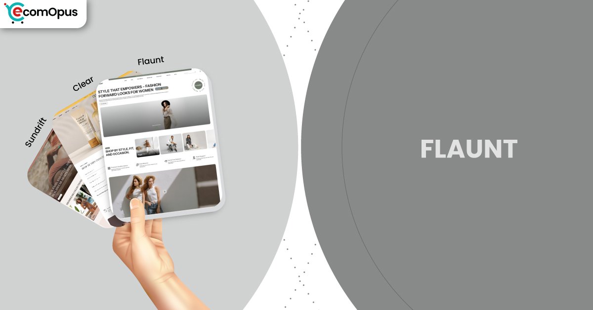
Presets
Flaunt comes with a small preset family that keeps the same clean foundation while changing the visual mood. When we compared the presets, we focused on how each one frames product photography and how much “brand personality” you get before doing deep customization. The table below includes the three official presets, plus two common styling directions we see merchants create using the same preset settings.
| Preset | Aesthetic Vibe | Where It Shines | Noteable Tweaks |
|---|---|---|---|
| Flaunt | Trend-led and airy | Fashion drops and seasonal edits | Bold hero imagery, smooth scrolling moments |
| Sundrift | Warm, sunlit, lifestyle-forward | Home, wellness, gifting, boutique brands | Softer mood that rewards curated imagery |
| Clear | Minimal, bright, quietly premium | Baby, beauty, essentials, boutique brands | Airier spacing and a calmer browsing pace |
Key Features And Highlights
Flaunt Shopify Theme isn’t a feature-dump theme, it is a rhythm theme: it tries to keep shoppers moving from curiosity to selection without extra friction. Team eComOpus looked at features through two lenses: does it make browsing faster for shoppers, and does it reduce busywork for merchants. The table below highlights the pieces that matter most when you are building a modern Shopify storefront that needs to sell every day, not just look good in a preview.
| Features | What It Is And Why It Matters? |
|---|---|
| Slide-out cart with notes | The slide-out cart keeps shoppers on the current page while they edit quantities, add notes, or consider add-ons. It reduces page reload friction and helps maintain “I’m still shopping” momentum. |
| Quick buy and quick view | Quick buy removes steps for repeat buyers who already know what they want. Quick view supports fast comparison when shoppers are scanning collections and opening multiple products. |
| Smart filtering with swatches | Swatch filters and sorting help shoppers narrow options by color and intent, not just by category. In testing, this reduced backtracking because buyers could compare variants without opening every product page. |
| Predictive and enhanced search | Enhanced search helps people find products even when their keywords are messy or partial. Predictive results shorten the path to purchase, especially on mobile where typing is slow. |
| Lookbooks and image hotspots | Lookbooks and hotspots let you sell “the set” rather than one SKU at a time. They work best for fashion and lifestyle catalogs where context makes items feel more valuable. |
| High-resolution media and zoom | The theme supports sharp imagery and zoom so materials and details feel trustworthy. That matters for jewelry, beauty, and premium apparel where texture sells the product before copy does. |
| Promo tiles and in-menu promos | Promo tiles and menu promos turn navigation into merchandising space without feeling spammy. We found this helps guide traffic to new arrivals, bundles, or sale pages with less homepage clutter. |
| Countdown timer and stock counter | Urgency tools can be used sparingly to support drops, limited runs, or seasonal promotions. When configured with restraint, they add energy without making the store feel desperate. |
| Size chart and delivery info blocks | Structured info blocks keep sizing, delivery, and usage details easy to find. This reduces support tickets because shoppers do not need to hunt for basic answers. |
| EU language translations and content pages | Built-in translations and content sections help brands with international traffic feel more credible. The blog, FAQ page, and contact form keep brand trust inside the same design system. |
Theme Experience!
A theme can have every feature on earth and still feel awkward if the shopping journey is choppy. Team eComOpus moved through Flaunt like a real buyer: landing on the homepage, opening collections, filtering, checking variants, then drifting toward checkout. The table below describes what the experience feels like in practice, because conversion usually comes from smoother decisions, not from more widgets.
| Experience Area | What Shoppers Feel In Practice? |
|---|---|
| First impression | The first screen feels editorial and confident, especially when hero images are high quality. Shoppers tend to trust the store quickly because spacing keeps the page from feeling pushy. |
| Collection browsing | Product grids stay readable, and the browsing rhythm stays steady when you keep image ratios consistent. Filters feel like a helpful guide, not a maze that slows people down. |
| Product page comfort | Key details are easy to scan because information can be structured into sections instead of long copy walls. Shoppers can confirm sizing, shipping, and variants without losing their place. |
| Variant selection | Swatches and options feel natural for apparel and accessories, and they encourage quick comparison. The experience is strongest when your variants are cleanly named and not overloaded. |
| Cart momentum | The slide-out cart keeps shoppers in the flow, so adding, removing, and editing feels lightweight. This is where a lot of small conversion wins show up, especially on mobile. |
| Promo discovery | Promotions can appear in menus or tiles, so shoppers “bump into” offers without being interrupted. It’s a subtle approach that suits premium brands that dislike loud discounting. |
| Mobile navigation | The sticky header and predictable menu structure keep key actions reachable with thumbs. We saw fewer mis-taps when banners were kept short and the first fold stayed calm. |
Performance, Explained!
Performance is not just a score, it is the difference between a shopper who keeps browsing and one who bails mid-scroll. Team eComOpus looked at the metrics as a “felt experience” question: does the store render fast enough to keep attention on products. The table below captures how the Flaunt preset performed on mobile and desktop, using real user-focused signals.
| Performance Parameters | Mobile | Desktop | Remarks |
|---|---|---|---|
| Core Web Vitals Assessment | Failed | Failed | Mobile is close to passing, but the largest element still arrives late for some users. Desktop fails mostly because layout shift needs tightening. |
| Largest Contentful Paint (LCP) | 2.9 s | 2.1 s | Mobile LCP suggests hero media size is the main lever. Desktop LCP is solid for image-led browsing. |
| First Contentful Paint (FCP) | 1.8 s | 1.4 s | First paint is quick enough to reassure shoppers the page is loading. Faster first paint helps keep scroll behavior patient. |
| Time to First Byte (TTFB) | 0.8 s | 1 s | Server response is decent, so frontend weight matters more than hosting alone. A lean app stack will protect this number. |
| Cumulative Layout Shift (CLS) | 0 | 0.11 | Mobile layout is stable, which makes the store feel trustworthy. Desktop needs small spacing and media dimension tweaks to reduce movement. |
| Interaction to Next Paint (INP) | N/A | 65 ms | Desktop interaction is snappy, so filtering and quick view feel responsive. Mobile INP is not shown here, so test with real devices. |
Pricing
Flaunt costs $290 as a one-time theme license per storefront, which puts it in the “serious build” category rather than the casual experiment bucket. You can still customize it in draft and only pay when you publish, so you get runway to test navigation, templates, and mobile behavior before committing. The ROI story often comes from app savings, since filters, quick view, promo tiles, and the slide-out cart can replace multiple paid tools. If your Shopify store already invests in strong photography, the theme can also lift perceived quality fast, which makes pricing feel more justified.
Stores Build with Flaunt Shopify Theme
Since Flaunt is comparatively new in the Shopify theme store, we currently do not have the list of stores using the theme. Our effort is to get you the latest list of stores using the theme, and our team is putting all its efforts to find the list of live stores. Soon our team will update with the list in our quest to assist you in making a decision on the theme.
Themes Similar to Flaunt
Comparing similar themes is how you avoid expensive rework later, because switching Shopify themes often means rebuilding templates and relearning your own layout habits. Team eComOpus picked the options below based on browsing rhythm, editorial polish, and how well each theme supports image-led merchandising. You will see a mix of free and paid choices, because the best alternative is the one that fits your catalog and brand posture, not the one that sounds prestigious.
| Shopify Theme | FREE or Paid? | Why is it Similar? |
|---|---|---|
| Dawn | FREE | Dawn is a flexible baseline with Shopify-native logic and broad app compatibility. It is a good match if you want a calmer starting point with fewer opinionated styling choices. |
| Impact | Paid | Impact brings bold visual presence and conversion tools that support campaigns and drops. It overlaps if you want modern layouts with built-in promotion mechanics. |
| Sense | FREE | Sense offers clean product presentation and a gentle design tone that suits lifestyle brands. It is comparable if you like clarity first, with a softer visual attitude. |
| Prestige | Paid | Prestige leans into premium storytelling and image-led sections that feel runway-ready. It is comparable if you want a luxury editorial vibe with strong merchandising depth. |
| Symmetry | Paid | Symmetry is designed for larger catalogs and structured browsing with a polished look. It is similar when filters and navigation matter as much as the homepage hero. |
Pros and Cons
Pros and cons should reflect what merchants notice after they go live, not what a preview page promises. Team eComOpus balanced the single merchant review available with our own hands-on evaluation of browsing, filtering, and checkout flow. The table below highlights the strengths you will feel quickly, plus a few gentle considerations that are easy to plan around.
| Pros | Cons |
|---|---|
| Quick buy cuts clicks for impatient shoppers. It keeps browsing alive during busy sale traffic. | Scroll animations look great, but be selective. Too many homepage modules can soften mobile LCP. |
| Swatches and filters make variant-heavy catalogs feel navigable. Shoppers compare colors faster without endless tab hopping. | Desktop CLS needs attention on some layouts. Lock image dimensions to reduce small page shifts. |
| Slide-out cart feels lightweight and modern. Shoppers adjust quantities without feeling kicked out of the flow. | Preset family is small for this price. You may spend more time dialing brand styling. |
| Lookbooks help sell outfits, not single SKUs. They turn “nice photos” into a measurable path to cart. | |
| Typography and spacing feel premium immediately. Even small catalogs look intentional with minimal design tweaking. |
Our Rating
Ratings matter only when they help you predict life after launch, not when they act like a beauty contest. Team eComOpus scores Shopify themes based on hands-on setup, the effort required to keep layouts consistent, and how well the theme reduces app dependency without sacrificing flexibility. The table below explains each score so you can map it to your store reality and decide with less second-guessing.
| Parameters | Our Ratings | Summary |
|---|---|---|
| Feature Depth | 4.4/5.0 | The built-in merchandising set is strong, especially for discovery and product presentation. Most stores can avoid several “nice-to-have” apps if they use the native tools intentionally. |
| Design and Customization | 4.6/5.0 | Design choices feel cohesive, so even small tweaks still look deliberate and premium. Customization is best when you work with its editorial rhythm instead of fighting it. |
| Performance | 4.1/5.0 | Desktop performance is excellent and supports research-heavy browsing without friction. Mobile can feel fast, but only when media and third-party scripts stay disciplined. |
| Value for Money | 4.3/5.0 | At $290, the value works when the theme replaces multiple paid apps and reduces maintenance stress. Brands with strong photography often recoup the cost faster through higher perceived quality. |
| Support and Updates | 4.2/5.0 | The developer presence appears organized, and the theme documentation exists for guided setup. Updates still deserve a change checklist if your store is heavily customized. |
| Overall | 4.4/5.0 | Flaunt Shopify Theme is a confident choice for brands that sell through visuals and curated collections. It rewards discipline, and it scales well when you keep your merchandising rules consistent. |
User Reviews: What Merchants Say
Merchant feedback is still early for this release, but the signal is clear: people who want a clean, professional storefront get value quickly. One store owner using it for baby clothing praised how simple customization felt, which matters when you are building under time pressure. The most consistent compliment is that the theme stays approachable even as you start tweaking sections and menus.
A line that captures the tone is “the store loads fast on Mobile,” and we believe the theme can deliver that when media is managed well. In our testing, the layout stays stable and the shopping flow feels modern, especially when you lean on quick view and swatch filters. What we do not see in the feedback so far is panic about broken layouts or confusing editor behavior, which is a strong early sign.
The main limitation today is volume, not sentiment, since patterns take time to form across different industries and app stacks. Team eComOpus will keep tracking how merchants handle updates, larger catalogs, and real-world conversion tuning. For now, the early feedback aligns with what the storefront experience suggests in practice. It reads as a calm, conversion-friendly Shopify theme that rewards good content.
Our Verdict
If your brand sells through imagery and you want the store to feel like a curated lookbook, this theme is in the right lane. Team eComOpus found that browsing is the star: filters, swatches, quick view, and the slide-out cart work together to keep decisions smooth. That “smoothness” is the real product here, and it can show up as longer sessions and fewer dead ends. Stores that feel easy to browse often feel easier to trust.
Flaunt Shopify Theme is best when you run a disciplined catalog with consistent photography and clear collection logic. You do not need to over-design it; the system already carries a modern, premium posture with minimal effort. Put your energy into media compression, tight menus, and a lean app stack, and the performance experience will match the design promise. If you treat your homepage like a story, not a storage closet, the theme shines.
For merchants selling fashion, accessories, beauty, or curated lifestyle products, we see it as a strong paid investment. You will feel the benefit fastest if you are replacing apps that handle basic discovery and promotion. If you are on the fence, build in draft, stress-test mobile on real devices, then publish when the first fold feels light. Flaunt Shopify Theme rewards that careful approach.
Who Should Not Buy Flaunt
Brands that rely on heavy text, dense specs, or complex B2B quoting may find this design too photo-forward. If your products need long configuration forms or deep technical comparison tables, you will spend time reshaping the layout to fit that reality. Stores with weak photography will struggle too, because the minimalist framing makes bad images look louder than they should.
If you are running a massive catalog with messy variants and no merchandising rules, this theme will not fix the underlying chaos. It will give you filters and navigation tools, but you still need clean tags, consistent product titles, and a collection strategy. If you cannot commit to that operational discipline, a more utilitarian Shopify theme might feel safer. In that scenario, your Shopify success is more process than theme.
GET THE BEST APPS IN YOUR INBOX
Don't worry we don't spam


