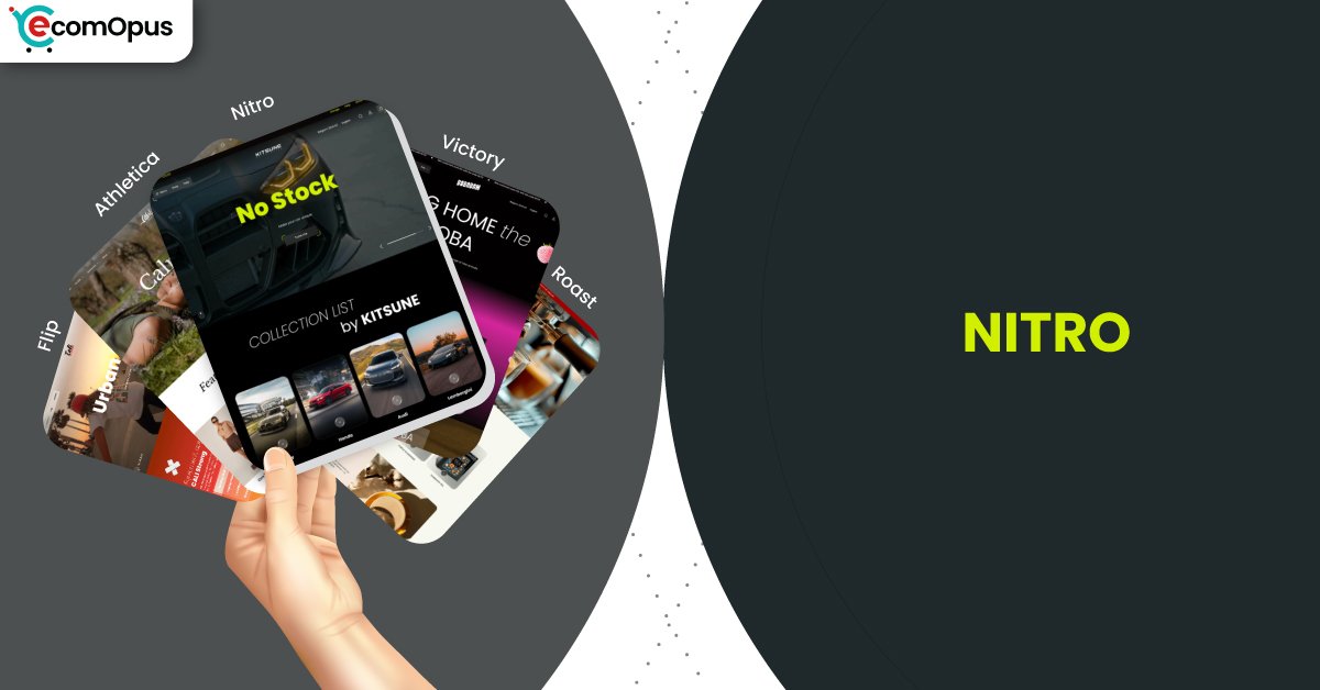
Nitro Shopify Theme Review: Speed-Led Design With Conversion Discipline
Nitro is a preset inside the Victory Shopify theme, designed for merchants who value clarity, momentum, and controlled visual intensity. Team eComOpus reviewed Nitro as a standalone theme experience, focusing on how its structure supports fast browsing, decisive shopping behavior, and performance-aware storefront builds.
- Speed-focused layout with restrained visuals
- Clear hierarchy for high-volume catalogs
- Product grids built for rapid scanning
- Checkout-first interaction design philosophy
- Lightweight sections with minimal clutter
- Mobile-friendly flow without excess motion
- Built for stores chasing efficiency

Introduction
Nitro positions itself differently from other Victory presets by prioritizing pace over spectacle. Where some presets lean into editorial storytelling or promotional drama, Nitro focuses on keeping shoppers moving with minimal friction and fewer visual interruptions. The overall layout feels deliberate, almost utilitarian, yet still polished enough to support modern brand expectations.
Team eComOpus approached Nitro by building a mid-sized demo store, testing dense collections, multiple filters, and repeated product interactions across mobile and desktop. The experience revealed a theme that rewards discipline, especially for merchants who want performance stability without stripping their brand personality down to bare bones. Nitro feels tuned for efficiency rather than experimentation, which shapes every part of the browsing journey.
Ideal For Niches With Supporting Features
Nitro adapts well to catalogs where speed, comparison, and repetition matter more than deep storytelling. The structure favors quick decisions, clean grids, and predictable navigation patterns that reduce cognitive load. Below is a breakdown of niches where Nitro’s feature set aligns naturally with shopper behavior and merchant goals.
This table is intended to help merchants assess fit before committing time to migration or redesign. Each niche listed reflects scenarios where Nitro’s strengths translate into measurable storefront efficiency rather than cosmetic appeal.
| Niches | Supporting Features | Why They Matter? |
|---|---|---|
| Supplements and wellness | Fast grids, concise product pages | Shoppers compare ingredients and pricing quickly. Clean layouts reduce hesitation and support repeat buying patterns. |
| Electronics and accessories | Structured specs, stable layouts | Buyers want clarity over flair. Predictable sections make comparison easier and reduce misclick frustration. |
| Automotive parts | Category clarity, strong filtering | Large catalogs need order. Nitro keeps navigation predictable, helping users find exact items faster. |
| Office supplies | Utility-first product pages | Repeat buyers value speed over storytelling. Straightforward layouts support bulk and return purchases. |
| Fitness equipment | Performance-led imagery placement | Products feel substantial without slowing pages. Clear structure helps shoppers assess quickly and move forward. |
Presets
Victory offers multiple presets, each shaping how content density and hierarchy behave across the storefront. Nitro stands out as the most efficiency-driven option, favoring structure over expressive design. Understanding how Nitro compares to its sibling presets helps merchants choose a direction that matches their operational rhythm.
The table below frames each preset as a design mindset rather than a cosmetic choice. While all presets share the same core theme foundation, their defaults influence how much effort is needed to maintain clarity as catalogs grow.
| Preset | Aesthetic Vibe | Where It Shines | Noteable Tweaks |
|---|---|---|---|
| Nitro | Clean, speed-first | High-volume catalogs, repeat buyers | Reduced motion and tighter layouts |
| Flip | Bold, campaign-ready | Launches, featured collections, sales pages | Strong promo hierarchy and punchy blocks |
| Pulse | Airy, modern minimal | Lifestyle brands with clean photography | More whitespace and softer pacing |
| Studio | Editorial, curated | High margin items and small catalogs | Typography-led sections and refined media |
| Market | Category-forward | Mixed catalogs with many collections | Navigation-first discovery patterns |
Key Features And Highlights
Nitro’s feature set is less about novelty and more about removing friction from everyday store operations. Team eComOpus evaluated each feature by how well it supports repeated use, frequent updates, and long-term catalog growth. The goal was to understand whether the theme stays manageable as stores scale.
The table below highlights the features that consistently influenced build speed, shopper comfort, and overall storefront stability during testing.
| Features | What It Is And Why It Matters? |
|---|---|
| Streamlined section library | Sections focus on utility rather than decoration. This keeps pages lighter and easier to maintain as content changes. |
| Dense collection grids | Products appear closer together without feeling cramped. Shoppers scan faster and compare more efficiently. |
| Predictable product templates | Layouts remain consistent across product types. Familiarity builds confidence and speeds up decisions. |
| Minimal animation usage | Motion is restrained and purposeful. This helps preserve performance and reduces distraction on mobile. |
| Navigation clarity | Menus prioritize logic over creativity. Shoppers reach categories with fewer steps and less confusion. |
| Performance-aware defaults | The theme discourages oversized media by design. Merchants are nudged toward faster builds naturally. |
| Cart flow simplicity | Cart interactions feel direct and uninterrupted. Fewer layers help maintain purchase momentum. |
| Content restraint | Story blocks exist but never dominate. Products remain the primary focus throughout the journey. |
| Mobile interaction discipline | Touch targets and spacing are practical. This reduces accidental taps and frustration on smaller screens. |
| Support-friendly architecture | Theme structure is easy to understand. Merchants and developers can troubleshoot without deep customization knowledge. |
Theme Experience!
Theme experience is about how a store feels after hours of real browsing, not just the first impression. Team eComOpus evaluated Nitro by simulating long sessions, repeated navigation, and rapid product switching across devices. The experience leaned heavily toward consistency and calm.
The table below breaks down shopper-facing moments and how Nitro shapes behavior during each stage of the journey.
| Experience Area | What Shoppers Feel In Practice? |
|---|---|
| First impression | The store feels efficient and intentional. Shoppers sense speed and clarity immediately, which builds quiet confidence. |
| Collection browsing | Grids remain steady and readable. Visual fatigue is low even during long scrolling sessions. |
| Product page comfort | Information is easy to locate. Layout familiarity reduces decision friction across multiple products. |
| Cart progression | Add-to-cart actions feel instantaneous. There are fewer interruptions between intent and checkout. |
| Mobile navigation | Navigation remains predictable. Touch interactions feel deliberate rather than cramped. |
| Brand perception | The brand feels focused and competent. Nitro supports professionalism over theatrical presentation. |
| Return visits | Familiar structure speeds repeat purchases. Shoppers remember where things are without relearning layouts. |
Performance, Explained!
Nitro Shopify Theme demonstrates a performance profile that aligns closely with its design philosophy. Mobile results show a solid baseline with room for improvement around interaction responsiveness, while desktop performance remains consistently strong. The Core Web Vitals signals suggest that Nitro is structurally efficient, but like most modern themes, final outcomes depend heavily on app usage and media discipline.
On mobile, LCP and CLS remain stable, indicating that content loads predictably without visual jumps. INP sits slightly above the ideal range, which typically reflects script execution and interactive elements rather than layout flaws. Desktop performance benefits from Nitro’s restrained design choices, producing faster interaction times and smoother navigation across complex catalogs.
| Performance Parameters | Mobile | Desktop | Remarks |
|---|---|---|---|
| Performance Score | 76/100 | 89/100 | Mobile performance is stable but sensitive to scripts. Desktop browsing feels noticeably responsive across sessions. |
| First Contentful Paint | 1.7 s | 0.9 s | Initial content appears quickly enough to reassure users. Desktop benefits from Nitro’s lightweight layout choices. |
| Largest Contentful Paint | 2.4 s | 1.4 s | Main content loads within healthy thresholds. Image discipline further improves perceived speed. |
| Cumulative Layout Shift (CLS) | 0.00 | 0.06 | Visual stability is a strong point. Shoppers experience minimal content movement during load. |
| Interaction to Next Paint (INP) | 210 ms | 86 ms | Mobile interactions can slow with heavy apps. Desktop interactions remain crisp and reliable. |
| Time to First Byte (TTFB) | 1.1 s | 0.1 s | Server response varies on mobile networks. Desktop shows an efficient delivery baseline. |
| Time to Interactive (TTI) | App dependent | App dependent | Interactivity improves with script deferral. Nitro’s structure helps isolate slowdowns. |
| Speed Index | Media dependent | Media dependent | Visual completeness improves when above-the-fold assets are optimized carefully. |
In practice, Nitro feels performance-ready rather than performance-fragile. Merchants who limit heavy third-party scripts and compress media assets are likely to see consistently smooth results. The theme does not rely on animation or oversized visuals to feel modern, which makes it easier to preserve speed as the store grows.
Pricing
Nitro follows Victory’s pricing model at $320 for a single storefront license, with the ability to preview and test before publishing. This pricing positions Nitro as a long-term infrastructure investment rather than a short-term cosmetic upgrade.
Value is strongest when the theme replaces multiple utility or layout apps. Stores with frequent catalog updates or high repeat purchase rates tend to recover the cost faster. Merchants with very small catalogs may find the investment harder to justify unless speed and clarity are top priorities.
Stores Build with Nitro Shopify Theme
Nitro is still early in its adoption cycle, which means publicly verifiable live stores remain limited. Team eComOpus avoids speculative listings and instead focuses on validated usage patterns and merchant feedback.
As adoption increases, we will continue monitoring storefront launches and gathering real-world observations. For now, Nitro appears most attractive to merchants who value operational efficiency and are comfortable being early adopters within the Victory ecosystem.
Themes Similar to Nitro
Nitro competes in a category focused on efficiency and conversion stability. Team eComOpus selected comparable themes that emphasize structure, speed, and predictable navigation rather than expressive design.
The table below highlights alternatives that share Nitro’s practical mindset while offering different trade-offs in cost or customization.
| Shopify Theme | FREE or Paid? | Why is it Similar? |
|---|---|---|
| Impulse | Paid | Designed for fast merchandising and frequent updates. Supports decisive browsing with minimal friction. |
| Impact | Paid | Emphasizes clarity and strong hierarchy. Suitable for stores prioritizing structure over decoration. |
| Dawn | FREE | Clean foundation for disciplined builds. Requires more manual refinement to match Nitro’s efficiency. |
| Warehouse | Paid | Built for large inventories and utility-driven navigation. Focuses on function rather than flair. |
| Craft | FREE | Minimal and content-light. Similar when simplicity matters more than advanced merchandising tools. |
Pros and Cons
This section highlights Nitro’s strengths and limitations without exaggeration. Team eComOpus focused on factors that impact daily store management rather than surface-level impressions. Pros outweigh cons when Nitro is matched with the right catalog and expectations.
| Pros | Cons |
|---|---|
| Fast browsing experience that scales. Structure stays intact as catalogs grow. | Visual expression is restrained. Brands seeking dramatic layouts may feel limited. |
| Clean grids support rapid comparison. Shoppers make decisions faster with less fatigue. | Mobile interaction depends on script discipline. Heavy apps can affect responsiveness. |
| Performance-aware defaults reduce tuning effort. Stability improves long-term maintenance. | Premium pricing requires scale. Smaller catalogs may see slower ROI. |
| Predictable layouts aid repeat buyers. Familiarity improves conversion efficiency. | |
| Navigation clarity reduces friction. Shoppers reach products with fewer steps. |
Our Rating
Team eComOpus rates themes based on consistency, scalability, and real-world usability rather than visual preference. Nitro scored highly in areas tied to operational efficiency and long-term maintenance.
The table below summarizes our ratings and the reasoning behind each score.
| Parameters | Our Ratings | Summary |
|---|---|---|
| Feature Depth | 4.4/5.0 | Features focus on essentials rather than excess. This keeps builds manageable as catalogs grow. |
| Design and Customization | 4.2/5.0 | Customization is structured and predictable. Merchants trade expressive freedom for stability. |
| Performance | 4.3/5.0 | Desktop performance is strong and reliable. Mobile responsiveness improves with disciplined app use. |
| Value for Money | 4.3/5.0 | Pricing makes sense for operationally focused stores. ROI improves with scale and repeat traffic. |
| Support and Updates | 4.4/5.0 | Early feedback points to attentive support. Ongoing updates add confidence for long-term use. |
| Overall | 4.4/5.0 | Nitro is a dependable choice for speed-led stores. It rewards structure, restraint, and efficiency. |
User Reviews: What Merchants Say
Merchant feedback for Nitro remains limited but encouraging. One early reviewer noted “Many customizable features, great customer service as well,” which aligns with Team eComOpus observations during setup and testing.
The developer response emphasizes ongoing updates and best-practice improvements, suggesting active maintenance rather than static release cycles. This matters for merchants planning multi-year storefront lifespans.
So far, feedback suggests Nitro works best when merchants embrace its structured approach instead of forcing excessive customization. Stores that align with the theme’s efficiency-first mindset appear more satisfied during early use.
Our Verdict
Nitro Shopify Theme is a strong choice for merchants who value speed, clarity, and operational consistency over visual experimentation. It is best suited for catalogs that demand structure and for teams that prefer predictable workflows.
Team eComOpus recommends Nitro for stores focused on repeat purchases, large inventories, or efficiency-driven growth. When paired with disciplined media and a lean app stack, Nitro delivers a calm, fast, and reliable storefront experience.
Who Should Not Buy Nitro
Nitro is not ideal for brands that rely heavily on immersive storytelling, experimental layouts, or animation-led engagement. The theme favors restraint and predictability, which may feel restrictive for highly expressive brands.
Merchants who plan to stack numerous third-party apps or rely on heavy visual effects should also proceed cautiously. Nitro performs best when its efficiency-first philosophy is respected rather than overridden.
GET THE BEST APPS IN YOUR INBOX
Don't worry we don't spam


