Flip Shopify Theme Review: High-Impact Layouts With Flexible Merchandising
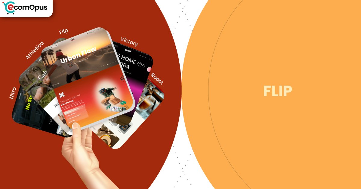
Flip is a preset inside Victory, built for stores that want sharp merchandising and clean storytelling. Team eComOpus found it keeps customization deep while the storefront stays orderly under pressure.
- Bold sections for campaign-first homepages
- Clean collections that stay easy to scan
- Product pages built for quick confidence
- Custom blocks that replace cosmetic apps
- Mobile flow that rewards lighter media
- Premium structure for growing catalogs

Introduction
Team eComOpus tested Flip Shopify Theme by setting up a demo store, building collections, and stress-testing common edits in the Shopify editor like typography swaps, image-heavy hero blocks, promotion banners, and checkout flow tweaks. Flip feels like a theme that wants you to make decisions on purpose, because every element has a clear role and a clean default. The experience is smooth from homepage to checkout. One reviewer summed it up with “Many customizable features,” and that matches how quickly we could shape pages without touching code.
We also noticed Flip looks best when content is curated rather than crowded, which is useful if your brand runs frequent launches or rotating featured collections. It presents collections in a clean, organized way. When we tested navigation, quick add patterns, and cart momentum, the flow stayed consistent instead of turning into a collage. If you want a storefront that feels premium but still practical for weekly merchandising, this preset is built for that rhythm.
Ideal For Niches With Supporting Features
Flip works across many categories, but it shines brightest when product discovery and promotion placement matter as much as aesthetics. Team eComOpus mapped typical niches to the supporting features that do the real conversion work, not just surface-level styling. The table below helps you sanity-check fit before you spend time rebuilding your storefront. Use it to match your catalog behavior to how Shopify shoppers browse and buy.
| Niches | Supporting Features | Why They Matter? |
|---|---|---|
| Apparel and streetwear | Promo tiles, quick add, tight grids | Drops need fast scanning and clear priority. The layout keeps attention on products, not noisy decoration. |
| Beauty and personal care | Story sections, detail-forward product pages | Buyers want reassurance before checkout. Clear benefit blocks reduce hesitation and improve trust. |
| Home decor and small furniture | Large imagery areas, clean collection navigation | Visual context sells, but browsing must stay calm. Predictable grids help shoppers compare styles without losing place. |
| Food and specialty goods | Bundling moments, cart adjacency upsells | Repeat purchases reward smart add-ons. Upsells near intent can lift AOV without feeling pushy. |
| Digital goods and templates | Focused product layout, simple navigation | Digital buyers want clarity and speed. Straightforward templates shorten the path from interest to purchase. |
Presets
Victory is designed around presets, and Flip is the most sales-ready option in the family based on how it frames promotions and product discovery. Presets matter because they set the starting rhythm of spacing, typography, and visual density across the entire store. The table below treats each preset as a direction, so you can pick the one that best matches your photography style and catalog complexity. Even if you start with Flip, you can borrow ideas from the others to fine-tune your storefront.
| Preset | Aesthetic Vibe | Where It Shines | Noteable Tweaks |
|---|---|---|---|
| Flip | Bold, campaign-ready | Launches, featured collections, sales pages | Strong promo hierarchy and punchy blocks |
| Pulse | Airy, modern minimal | Lifestyle brands with clean photography | More whitespace and softer pacing |
| Studio | Editorial, curated | High margin items and small catalogs | Typography-led sections and refined media |
| Market | Category-forward | Mixed catalogs with many collections | Navigation-first discovery patterns |
| Mono | Clean and utilitarian | Essentials, digital goods, repeat buyers | Reduced styling and faster decisions |
Key Features And Highlights
Team eComOpus evaluates features by asking one question: does this reduce work for merchants or reduce friction for shoppers. Flip leans toward practical merchandising tools rather than novelty effects, which keeps it useful over time. The table below explains the features we kept coming back to during testing and why they matter in real store scenarios.
| Features | What It Is And Why It Matters? |
|---|---|
| Section-first page building | Sections let you build landing pages without developer dependency. In our tests, rotating campaigns felt faster because blocks stayed consistent across edits. |
| Collection grid controls | Grid options keep product cards readable across device sizes. Shoppers compare faster when spacing and hierarchy remain stable during scrolling. |
| Product media layout | The product template gives images space without hiding details. Variant and media changes stayed steady in testing, which supports confident decisions. |
| Quick add momentum | Quick add reduces the gap between browsing and buying. It helped on mobile where fewer taps keeps intent strong, especially for repeat-friendly items. |
| Promotional messaging spots | Built-in promo placements make offers visible without drowning pages in banners. This keeps discounts clear while products stay the visual hero. |
| Navigation built for discovery | Menu structure supports browsing without becoming a maze. We found it easier to guide shoppers through categories with fewer dead ends. |
| Trust signal sections | Dedicated areas for shipping, returns, and reassurance reduce second-guessing. Clear presentation matters for higher-priced products and first-time buyers. |
| Flexible product templates | Multiple templates help you tailor layouts by product type. We used this to separate hero products from utility items without messy workarounds. |
| Performance-minded layout habits | The design rewards lightweight builds and fewer gimmicks. That matters because Shopify stores often slow down from oversized media and stacked scripts. |
| Support readiness | Merchants judge themes by what happens after install. Early feedback suggests helpful support, which lowers risk during setup and iteration. |
Theme Experience!
Theme experience is what a shopper feels during real browsing, not what a demo screenshot promises. Team eComOpus moved through Flip like a customer, then switched to merchant mode to see how fast we could change layouts without breaking flow. The table below breaks the experience into practical moments, from first impression to cart intent.
| Experience Area | What Shoppers Feel In Practice? |
|---|---|
| First impression | The homepage hierarchy feels deliberate, so the store looks planned. Shoppers understand category and offer quickly, which reduces early exits. |
| Collection browsing | Product grids stay scannable and evenly weighted. That consistency helps comparison, especially when shoppers skim during sales. |
| Product page comfort | Details feel easy to find without hunting. Media and variants change without jumpiness, which supports trust and decision comfort. |
| Cart momentum | Add-to-cart feels direct and keeps intent moving. Upsell moments can exist without making shoppers feel delayed or distracted. |
| Mobile navigation | Navigation choices stay thumb-friendly and simple. Fewer awkward taps makes mobile browsing feel smoother across longer sessions. |
| Brand storytelling | Content blocks add context without hijacking shopping. Shoppers can absorb your story and return to products without friction. |
| Search and finding | Structure encourages clear labels and categorization. When merchants name things consistently, shoppers reach specific items faster. |
Performance, Explained!
Flip Shopify Theme performs strongly on desktop, while mobile performance is good but more sensitive to interaction smoothness. The field signals show mobile can miss a pass mainly because INP sits slightly above the comfortable range, even when LCP and CLS are stable. Desktop results look clean, which supports browsing-heavy sessions and fast category hopping. If you compress media and treat scripts like a budget, the baseline here is friendly.
| Performance Parameters | Mobile | Desktop | Remarks |
|---|---|---|---|
| Performance Score | 76/100 | 95/100 | Mobile is solid but not perfect out of the box. Desktop feels crisp, which makes catalogs feel lighter and more responsive. |
| First Contentful Paint | 1.7 s | 0.9 s | Early paint arrives quickly enough to reassure users. Faster desktop paint helps above-the-fold merchandising feel immediate. |
| Largest Contentful Paint | 2.4 s | 1.4 s | Main content appears in a healthy window with optimized images. Desktop LCP supports premium photography without adding waiting time. |
| Cumulative Layout Shift (CLS) | 0.00 | 0.09 | Mobile stability is a strength, so content does not jump mid-scroll. Desktop stays acceptable, but image sizing and font loading can tighten it. |
| Interaction to Next Paint (INP) | 210 ms | 99 ms | Mobile interaction can feel slightly delayed with heavier scripts. Desktop interactions land cleanly, which improves filters, menus, and quick add feel. |
| Time to First Byte (TTFB) | 1.1 s | 0.1 s | Mobile response can vary with location and app calls. Desktop response suggests a healthy baseline worth protecting with restraint. |
| Time to Interactive (TTI) | Varies by app stack | Varies by app stack | TTI swings when chat, tracking, and personalization pile up. Delaying nonessential scripts can make pages feel usable sooner. |
| Speed Index | Varies by media weight | Varies by media weight | Visual completeness improves with disciplined above-the-fold media. Oversized imagery can still slow perceived speed even on a good build. |
In our testing, Flip felt performance-ready, not performance-finished, which is the realistic bar for modern storefronts. The mobile INP reading points to interactivity as the lever, so lighter apps and cleaner scripts usually matter more than cosmetic tweaks. We also like that Flip does not rely on heavy animation to look premium, so you can keep speed while still building a polished brand experience.
Pricing
Flip is priced at $320 as a one-time purchase per storefront license, and it is free to test inside Shopify before you publish. That window lets you validate layout fit, content workload, and speed impact with real products. One-time pricing keeps budgeting simple for most teams. ROI improves when the theme replaces one or two cosmetic apps, since subscriptions and extra scripts can slow pages too. Campaign-driven stores usually earn it back sooner because promos and landing pages are faster to build. If your catalog changes rarely, it can still be worth it, but payback may be slower.
Stores Build with Flip Shopify Theme
Flip is comparatively new, so verified examples in the wild are limited and can change quickly as more Shopify merchants publish. Team eComOpus is not comfortable publishing a list of store names yet, because guessing helps nobody and hurts trust. We will keep tracking storefront sightings and merchant feedback as adoption grows.
Themes Similar to Flip
Flip sits in a campaign-first lane, so comparisons only help when they share similar browsing behavior. Team eComOpus chose alternatives that support product discovery, promotion placement, and structured storytelling. The table below mixes free and paid options to help you compare cost against control.
| Shopify Theme | FREE or Paid? | Why is it Similar? |
|---|---|---|
| Prestige | Paid | Premium presentation with structured storytelling. Works well when photography does the selling and margins justify polish. |
| Impulse | Paid | Built for promotions and fast merchandising. Fits stores that run frequent drops and sales-driven navigation. |
| Impact | Paid | Bold layouts that keep browsing purposeful. Similar when you want strong hierarchy without constant custom work. |
| Dawn | FREE | Clean baseline for disciplined stores. Similar if you value simplicity, but it needs more polishing to feel premium. |
| Sense | FREE | Bright, detail-friendly templates for guided decisions. Similar when clarity and benefits matter more than heavy design tricks. |
Pros and Cons
This section is meant to be a shortcut to fit, not a dramatic takedown. Team eComOpus listed the pros that show up in real store work, plus the considerations that can surprise merchants later. Pros outnumber cons because Flip is genuinely capable when it matches the right catalog. Keep your app stack and content discipline in mind as you read.
| Pros | Cons |
|---|---|
| Campaign blocks stay easy to rotate. Pages keep their shape. | Mobile interactivity needs care. Heavy scripts can raise INP. |
| Product pages feel confident. Details stay readable fast. | Premium pricing is real. ROI depends on usage. |
| Collection browsing stays scannable. Comparison feels natural. | Best Practices score suggests tuning. Audit scripts and tags. |
| Desktop speed feels crisp. Catalogs feel lighter to browse. | |
| Customization depth stays manageable. Merchandising stays structured. |
Our Rating
Team eComOpus scores themes based on outcomes: how easily you can build, how confidently shoppers browse, and how stable the experience stays once real content is added. Ratings are not about personal taste, they are about repeatable storefront results. The table below breaks down the categories we use and why each score landed where it did.
| Parameters | Our Ratings | Summary |
|---|---|---|
| Feature Depth | 4.6/5.0 | Features cover practical merchandising needs without forcing app stacking. The depth feels usable because tools connect to workflows like launches and upsells. |
| Design and Customization | 4.7/5.0 | Preset styling is confident while still giving room for brand identity. Edits stay structured, so experiments do not create inconsistent pages. |
| Performance | 4.2/5.0 | Desktop is strong and supports fast browsing sessions. Mobile needs script discipline to keep interactivity snappy with multiple apps. |
| Value for Money | 4.3/5.0 | $320 makes sense when it replaces several cosmetic tools. Stores that iterate weekly typically feel the payoff sooner. |
| Support and Updates | 4.4/5.0 | Early sentiment suggests responsive support during setup. That reduces risk for merchants who need quick answers while building. |
| Overall | 4.5/5.0 | Flip Shopify Theme is a strong premium choice for structured flexibility. It rewards curated content, clear merchandising, and a performance-aware build. |
User Reviews: What Merchants Say
Merchant feedback for Flip is early-stage, but it already points to a clear theme: flexibility plus a supportive developer experience. A reviewer closed with “great customer service as well.” Team eComOpus reads that as a strong signal, because support quality becomes the difference between a smooth launch and a stressful one.
We did not see recurring complaints about broken layouts or confusing navigation, which is notable for a newer theme. In our own testing, edits felt controlled rather than fragile, so you can change sections without fearing a domino effect. That aligns well with the tone of the initial feedback.
The broader pattern is simple: merchants seem happiest when they treat Flip as a structured system and keep content lean. If you build with disciplined media and a trimmed app stack, you are far more likely to keep mobile interactions feeling smooth.
Our Verdict
Flip Shopify Theme is a premium option that fits merchants who run campaigns often and want the store to stay visually disciplined. It is strongest when you pair good photography with clear merchandising choices and a lean set of apps.
Team eComOpus recommends Flip for growing brands that want structure without stiffness. Install it, build a real homepage and two landing pages, then test mobile interactions early.
If interactivity stays smooth with your essential tools, the $320 investment is justified. If your app stack is heavy, prioritize performance work before you publish.
Who Should Not Buy Flip
Flip is not the best fit if your brand needs extreme layout freedom, custom-coded interactions, or experimental page behavior. The system prefers structured merchandising over constant reinvention, and that constraint can feel limiting.
Stores that rely on oversized uncompressed media, heavy animation apps, or a crowded stack of add-ons should also be cautious. Mobile interactivity is where things can slip first, so content discipline and script control are part of owning this preset.
GET THE BEST APPS IN YOUR INBOX
Don't worry we don't spam


